Customization
-
Create new project
Create a new project that depends on
PortalTemplate.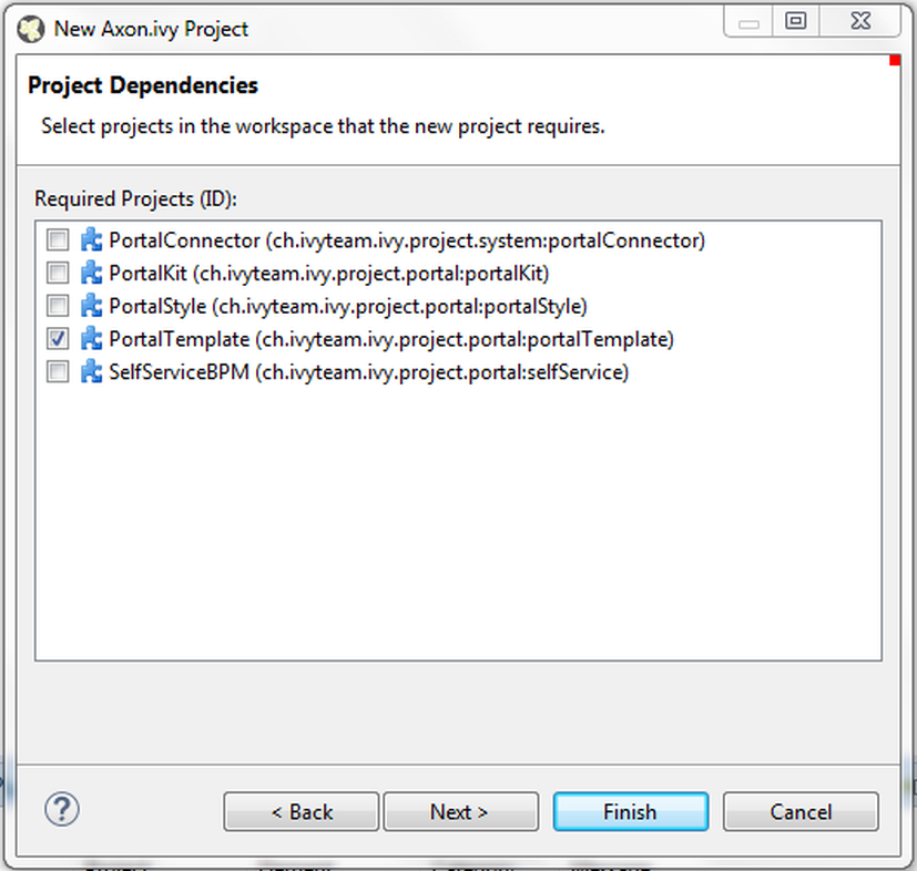
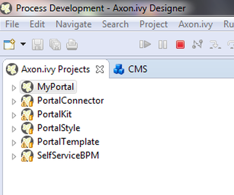
Project structure
-
Create new home page
-
Create a new
HTML Dialogfor your home page and then useui:compositionto define template which you use inside. If you want to keep the look of default homepage, then chooseDefaultHomePageTemplate.Tip
Find more information about templates at Layout templates.Important
Portal uses some template files in the folder"webContent/layouts"in Portal Template project. Do not create files with the same path and name in your project as they can override the Portal files. -
Create a new
Start processand connect toUser Dialogfor your home page.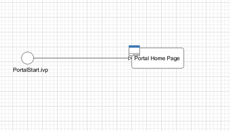
-
Run your application, start your newly created process and see result.
Tip
Your new homepage is the default portal homepage. You can customize it. Reference at Portal home.
-
-
Set category for tasks
To categorize tasks, set values for
Categoryfield. Task category can be multi-level if it is separated by slash/signs, as below.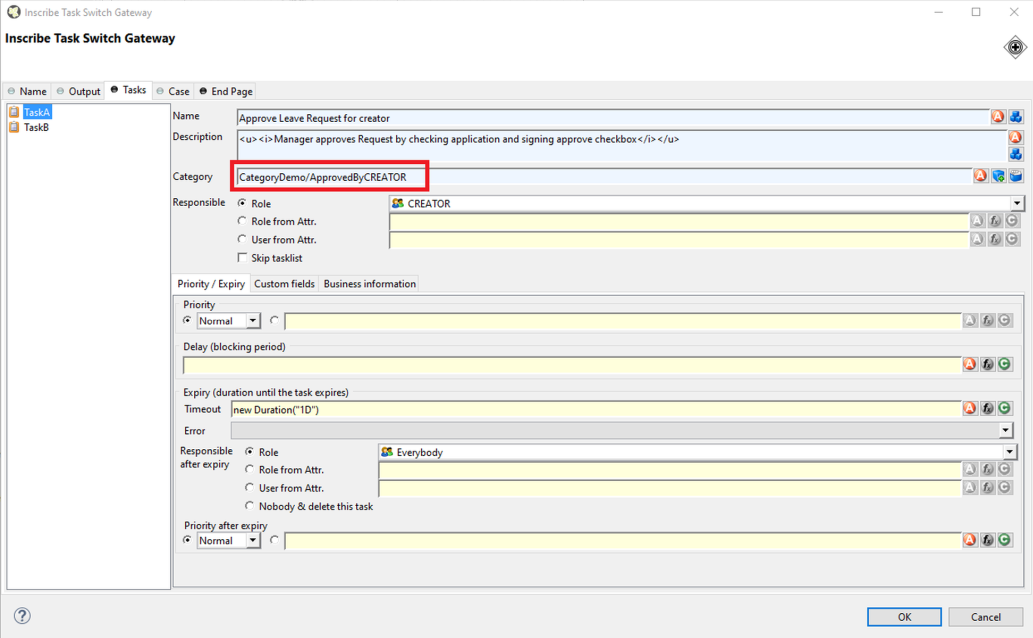
-
How to use feature warning on closing browser/tab
Sometimes when users are working on a task, if they close tab, browser or refresh page then they may lose their current work. It's a good idea to ask users to verify that they truly want to proceed with the action they just invoke. To use this feature, add
WarnOnClosingBrowserTabcomponent to the page you want to be affected.<ic:ch.ivy.addon.portalkit.feature.WarnOnClosingBrowserTab confirmMessage="You may lose your work in progress. Do you want to continue?" />Depending on browser, content of
confirmMessageand names of buttons may vary.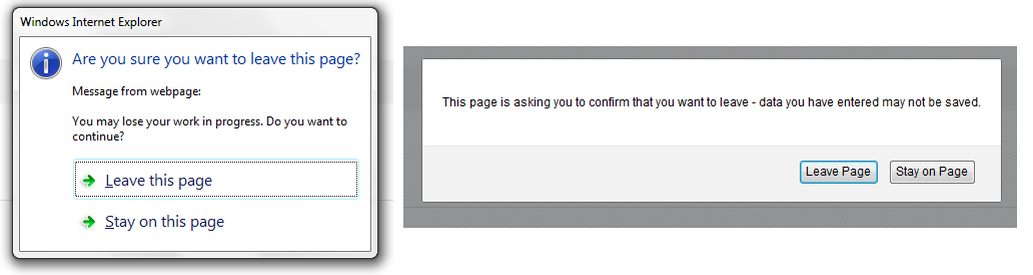
Tip
Normally, when using this component, actions that user invoked outside Portal area like closing tab/browser, refreshing page, clicking on a link on bookmark bar of browser will cause browser to display a confirmation dialog. That might cause the feature work incorrectly.
Actions that lead to navigation that user invoke inside Portal area like clicking on a link/button, submitting a form will not display any confirmation popup.
In some cases, user might use javascript to navigate to another page, for example: set value for
window.location.hrefor calllocation.reload().If that happens, add this to your javascript function:
showConfirmDialogBeforeUnload = false;
You can change logo and login logo by modifying default logo in PortalStyle project.
-
Modify cms entry
PortalStyle/images/logo/CorporateLogo.pngto update homepage logo. -
Modify cms entry
PortalStyle/images/logo/loginLogo.pngto update login logo. -
Override the variables:
@login-logo-height,@home-logo-heightincustomization.lessto scale your logos.
Portal applies
LESS
framework to support you in customizing styles of Portal. There are 4 files:
theme.less
(shouldn't be modified),
variables.less
(shouldn't be modified),
font-faces.less
,
customization.less
, they are placed at
PortalStyle/webContent/resources/less
.
-
font-faces.less: replace default font url-s by your font url-s and add/change other font styles to customize the Portal's font styles. -
customization.less: to change styles of Portal. E.g. Portal's component styles.Note
Portal provides several variables (@body-background-color,@menu-color,@sidebar-dimension-transition-duration,@sidebar-opacity-transition-duration,@process-chain-menu-color, etc.) to change Portal's style. To override variables, you should put overriding code (e.g.@body-background-color: red) atcustomization.lessfile.-
@body-background-color: Portal background color. -
@menu-color: application menu color, color of texts and icons on the menu will be calculated based on brightness of menu color. -
@sidebar-opacity-transition-duration: application menu text opacity transition duration. -
@process-chain-menu-color: process chain component color. -
@action-button-color: Portal action button color e.g: close, add, next ... -
@action-button-border-radius: action button shape, it's rectangle when set @action-button-border-radius:0px; -
@sidebar-dimension-transition-duration: expanding/collapsing transition duration of application menu. -
@cancel-button-background-color: cancel button background color. -
@task-priority-low-color,@task-priority-normal-color,@task-priority-high-color,@task-priority-exception-color: task priority color. -
@task-state-open-color,@task-state-in-progress-color,@task-state-done-color,@task-state-zombie-destroyed-color,@task-state-reserved-color,@task-state-system-color: task state color. -
@circle-step-number-color: circle process chain number step color.
-
Important
-
Do not change
font-familyproperty values. -
Limitation: the task priority color customization hasn't changed the task priority colors in statistic.
There is additional button type allows developer to configure its color and shape. Use it when you need different button types in your own project.
How to: use style class context-button for it. For example :
<p:commandButton value="My button" styleClass="context-button" >
There are 2 variables allow developers to change color and shape
-
@context-button-color: it is the color of context button -
@context-button-border-radius: it sets shape of action button, it's rectangle when set @context-button-border-radius:0px;
After you finish your customization, compile these above less files to build the css file named
theme.min.css and put it at PortalStyle/webContent/resources/css
. You are highly recommended to run the
mvn lesscss:compile
maven command in PortalStyle to do it quickly.
To replace default login page, extends existing templates with ui:define name="login" to define your new login component like below
<ui:composition template="/layouts/BasicTemplate.xhtml">
<ui:define name="login">
<ic:internaltest.ui.YourOwnLoginComponent />
</ui:define>
</ui:composition>
By default Portal main menu has 4 items: Processes, Tasks, Cases and Statistics. You can remove these items or add your own items.
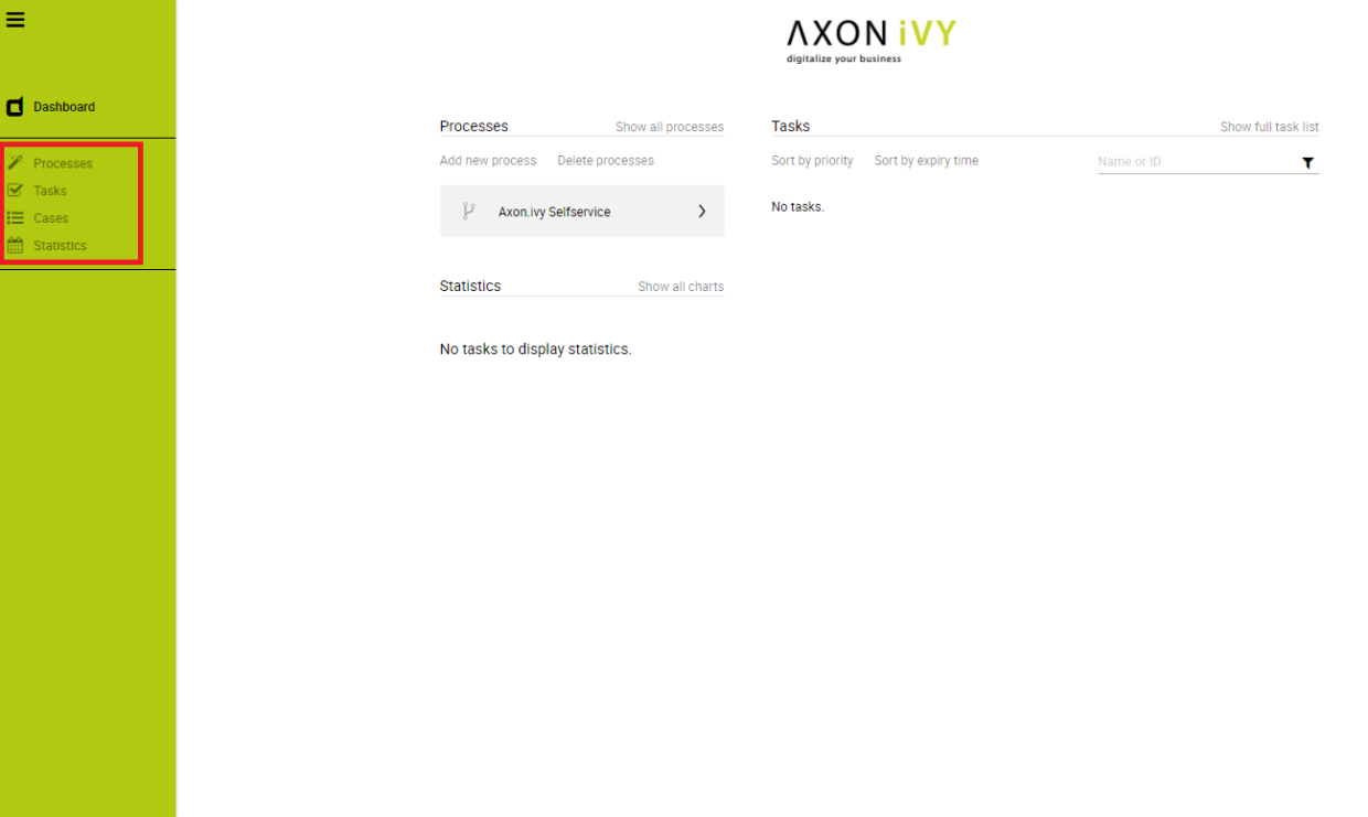
In your project, override the process LoadSubMenuItems in PortalTemplate and follow
the hints.
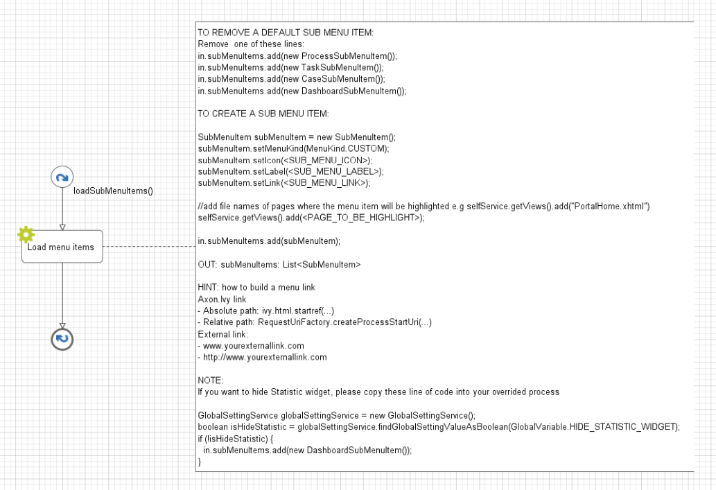
User can hide Statistic widget in Admin settings.
Therefore, if you want to hide Statistic widget in your overrided process, please take a look on NOTE section of LoadSubMenuItems in PortalTemplate.
This guide assumes that you are already familiar with CSS to integrate your own widgets.
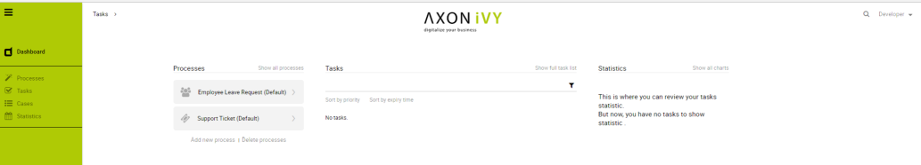
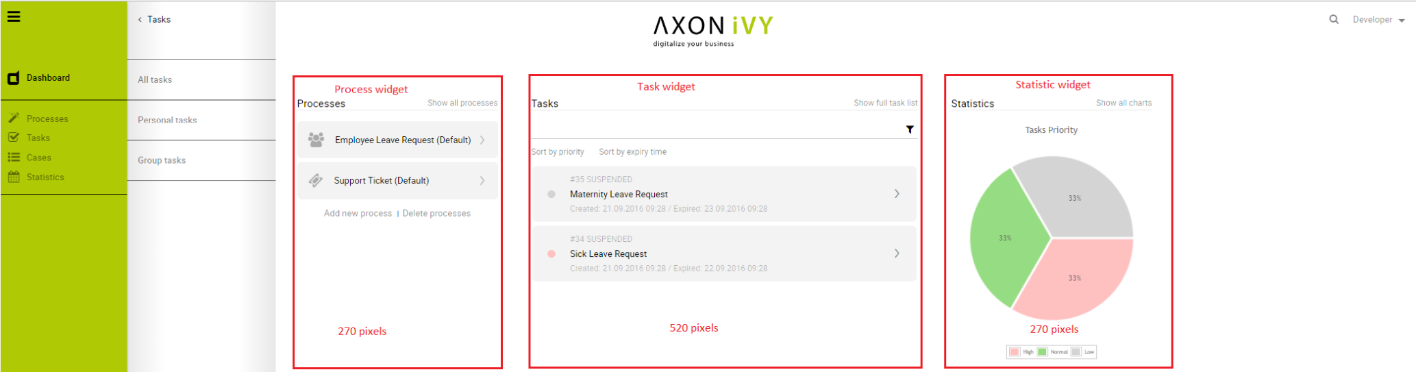
The default home page of Portal has three built-in widgets in order: Process widget, Task widget, Statistic widget. If it does not fit your needs, you can replace it by your own one.
We decided that based on screen size, widget may become hidden, not smaller. So we set fix length for each widget.
Length of Process widget is 270 pixels, Task widget is 520 pixels and Task widget is 270 pixels.
Following these steps to have your own Portal Home:
-
Create a new home page which uses the
DefaultHomePageTemplate.xhtmltemplate. By doing this, your new home page will inherit the widgets from the default home page and has a place holder for your own widgets.Your custom home page should look like below:
<ui:composition template="/layouts/DefaultHomePageTemplate.xhtml" ... ><ui:define name="customWidget">...</ui:define></ui:composition> -
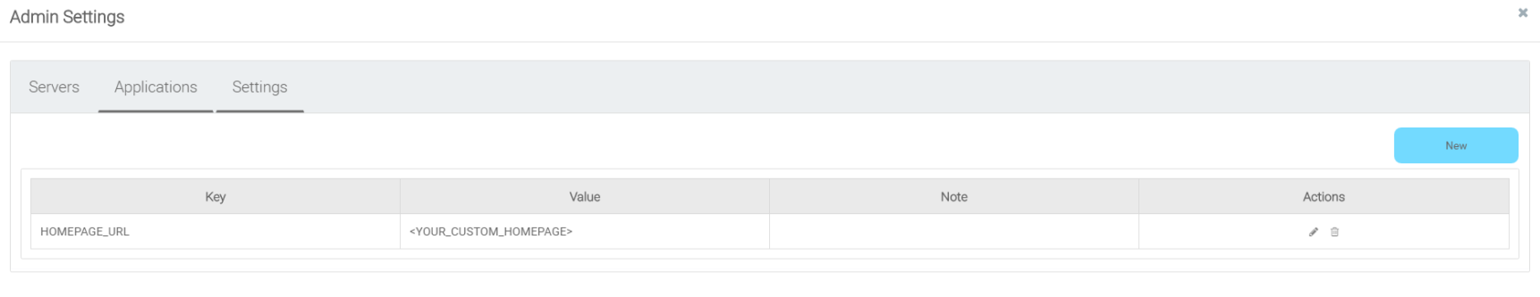
In case of single Portal: Create a new process start for the new home page. Now you will use this process start as the entry point of your portal instead of the default one. To let portal know about your new portal home, you have to go to the portal settings and set the portal home url to the new one. e.g: HOMEPAGE_URL=http://localhost:8081/ivy/pro/designer/CustomizePortalHome/157454FCA39C3844/start.ivp
In case of multi Portal: refer to Setup multi portals to setup.
Note
Currently, responsive custom home page is not supported.
The DefaultHomePageTemplate.xhtml template supports some customizations.
The template has a parameter: statistic to display the statistic data. Their default values are the tasks which the session user can work on.
<ui:composition template="/layouts/DefaultHomePageTemplate.xhtml" ... >
<ui:param name="statistic" value="#{logic.getStatistic()}" /> <!-- A method returns StatisticData -->
</ui:composition>
The template has three parameters: displayProcessWidget, displayTaskWidget, displayStatisticWidget to display or hide the default widgets. Their default values are true, you can set them to boolean values (true/false) to display or hide them as you need.
<ui:composition template="/layouts/DefaultHomePageTemplate.xhtml" ... >
<ui:param name="displayTaskWidget" value="false" />
</ui:composition>
Tip
Task widget now is hidden.
The template has the placeholders to redefine the default widgets' sections.
<ui:composition template="/layouts/DefaultHomePageTemplate.xhtml" ... >
<ui:define name="statisticWidget">
<div class="js-dashboard-main-content-3rd-col dashboard-main-content-3rd-col layout-col">
<h:panelGroup layout="block" styleClass="js-statistic-widget" id="statistic-widget-container">
<!-- KEEP THE STATISTIC WIDGET -->
<ic:ch.ivy.addon.portalkit.component.StatisticWidget id="statistics-widget" compactMode="true" tasks="#{tasks}" ... >
<!-- ADD THE WEATHER WIDGET BELOW STATISTIC WIDGET -->
<ic:my.namespace.WeatherWidget />
</h:panelGroup>
</div>
</ui:define>
</ui:composition>
The template has a placeholder to add your own widgets. Your own widgets' default positions are next to statistic widget, you can change them by setting the default widgets' positions.
<ui:composition template="/layouts/DefaultHomePageTemplate.xhtml" ... >
<ui:define name="customWidget">
<ic:my.namespace.ComponentName ... />
</ui:define>
</ui:composition>
Tip
This custom widget will show below the 3 default widget
TaskWidget is a built-in component of Portal which contains the tasks users can interact with. In order to show needed task's information, Portal supports overriding concept for TaskWidget. Each TaskWidget contains 2 parts:
-
UI: TaskHeader and TaskListHeader and TaskBody and TaskFilter
-
Data query: display the tasks as you want
Important
-
Task header customization does not support responsive design, smaller resolutions (iPad, etc.)
-
Additional properties cannot be displayed right now as a column
-
Task header's buttons cannot be modified (they stay where they are)
Refer to PortalExamples project for examples
-
Introduce an Axon Ivy project which has
PortalTemplateas a required library. -
To customize task widget, you must customize Portal Home first. Refer to Customize Portal home to set new home page.
-
Copy the
PortalStartprocess fromPortalTemplateto your project. Point PortalHome element to your custom home page in previous step. This process is new home page and administrator should register this link by Portal's Admin Settings. -
Override Task widget in: TaskList page, Task Search result, Relate tasks of a case, History tasks of a case.
-
Introduce a new HTMLDialog which uses template
/layouts/PortalTasksTemplate.xhtml(refer to Responsiveness to override responsiveness). You can take a look atPortalTasks.xhtmlto see how to customize it.Tip
Highly recommend to copy the
PortalTasksHTMLDialog in PortalTemplate and change the copied one's view. -
Use Axon Ivy Override to override the
OpenPortalTaskscallable. The original implementation of this callable is callingPortalTasks, change it to call the customized Page introduced in the step above. The signature of this callable isuseView(TaskView)and customized page must receive thisTaskViewinstance, put in the dialog'sDatawith the exact nametaskView.
-
-
After previous steps, you can override TaskHeader and TaskListHeader and TaskBody and TaskFilter
Refer to the taskListHeader and taskHeader sections in PortalTasks.xhtml of PortalTemplate. In case your task widget has new columns, you should override TaskLazyDataModel to make the sort function of these columns work:
-
Introduce a java class extends TaskLazyDataModel
-
Override the
extendSortmethod, theextendSortTasksInNotDisplayedTaskMapmethod and extend the sort function for the added columns (see the methods' Javadoc comments) -
Default taskList supports user to config display/hide column
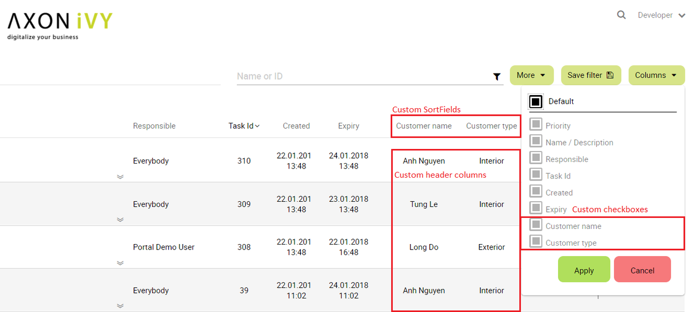
-
In case you has new columns, override method
getDefaultColumnsof the extended class from TaskLazyDataModel to display checkboxes in Config columns panel and display/hide sortFields (see the methods' Javadoc comments) -
To add cms for checkboxes's label, add new entries to folder
/ch.ivy.addon.portalkit.ui.jsf/taskList/defaultColumns/inPortalStyleor override methodgetColumnLabel(see the methods' Javadoc comments) -
In
taskListHeadersection, useTaskColumnHeadercomponent -
In
taskHeadersection, useTaskCustomFieldcomponent for each additional columns. This component will handle display/hide new columns on task list.Currently, TaskCustomField only supports text field. If you want to create your own component, remember to add rendered="#{taskView.dataModel.isSelectedColumn('YOUR_CUSTOM_COLUMN')}"
For example: Show custom field
customer namewhich stored intask.customVarCharField5<ic:ch.ivy.addon.portalkit.component.task.column.TaskCustomField id="customer-name-component" componentId="customer-name" column="customVarCharField5" dataModel="#{taskView.dataModel}" labelValue="#{task.customVarCharField5}" />
-
-
Use Axon Ivy Override to override the
InitializeTaskDataModelcallable and initialize data model by your customized one. -
In your customized portal tasks HTMLDialog, the customized data model should be passed as a parameter to components (refer to
PortalTasks.xhtml).
Refer to the taskBody section in PortalTasks.xhtml of PortalTemplate.
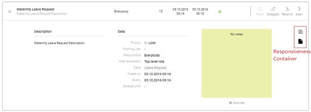
If you need to apply the responsiveness behavior of Portal for task details, there are 2 components which can be used: ResponsivenessHandleContainer and ResponsivenessHandleButton:
-
ResponsivenessHandleContainer: a container contains
ResponsivenessHandleButtonand your javascript which contains the onstart and oncomplete function ofResponsivenessHandleButton. -
ResponsivenessHandleButton: contains the params which handle responsiveness:
-
icon: the icon of button
-
displayedSelectors: css selectors of the components which need to be displayed.
-
hiddenSelectorsInLargeScreen: css selectors of the components which need to be hidden in large screen (width: 1920).
-
hiddenSelectorsInMediumScreen: css selectors of the components which need to be hidden in medium screen (width: 1366).
-
hiddenSelectorsInSmallScreen: css selectors of the components which need to be hidden in small screen (width: 1024).
-
fadeTime: the fade in/out time.
-
onstart: client side callback to execute before responsiveness execution.
-
oncomplete: client side callback to execute after responsiveness execution.
-
For example:
<ui:composition template="/layouts/PortalTasksTemplate.xhtml">
<ui:param name="useOverrideBody" value="true" />
<ui:define name="taskBody">
Customized content
<ic:ch.ivy.addon.portalkit.component.ResponsivenessHandleContainer styleClass="hidden-lg">
<ic:ch.ivy.addon.portalkit.component.ResponsivenessHandleButton icon="fa fa-file js-note-column-responsive-button" displayedSelectors="['#task-note']" hiddenSelectorsInMediumScreen="['.task-details .replaced']" hiddenSelectorsInSmallScreen="['.task-details .replaced']" />
<h:outputScript library="js" name="task-detail-default-responsiveness.js" />
</ic:ch.ivy.addon.portalkit.component.ResponsivenessHandleContainer>
</ui:define>
</ui:composition>
-
Refer to the
taskFiltersection inPortalTasks.xhtmlof PortalTemplate. -
In order to introduce new filter, create a new java class extends TaskFilter and override its methods (see javadoc comments)
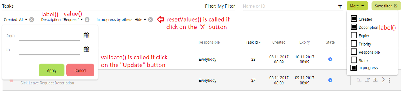
-
Introduce a java class extends TaskFilterContainer. This filter container contains your filters, you can reuse default filters, refer to
DefaultTaskFilterContainer.javaTip
StateFilter is added as default to container. If you don't need it, use this code in constructor:
filters.remove(stateFilter); -
Introduce a java class extends TaskLazyDataModel. Override the
initFilterContainermethod and initialize filter container (see javadoc comments) -
Use Axon Ivy Override to override the
InitializeTaskDataModelcallable and initialize data model by your customized one. -
In your customized portal tasks HTMLDialog, the customized data model and filter container should be passed as parameters to components (refer to
PortalTasks.xhtml). -
Advanced usage: Portal supports storing/restoring filters. Your filter class (extends
TaskFilter) is stored in business data. Properties stored user input values should be persisted, properties controlled logic should not be persisted to reduce persisted data size in business data. Use annotation@JsonIgnoreto exclude properties. By default, Portal takes care storing/restoring filters. If you want to customize storing/restoring filter data, do it in your data model class (extendsTaskLazyDataModelclass).By default, filters are stored/restored in process model level. You can change this by setting the ui:param
filterGroupIdinPortalTasks.xhtmlto a new Long value.Tip
If you have multiple case lists in your project, you may want to set
filterGroupIdto an unique identifier for each of yourPortalTasks.xhtml across your projects
Override the BuildTaskJsonQuery callable process of PortalKit and build your own query to effect the data of task widget, task categories and statistic widget.
Apply the following steps in case you would like to provide data for task list after navigating to task list from your page, e.g. clicking on a bar chart then opening the tasks of that bar:
-
Use the
OpenPortalTaskscallable process with theTaskViewparameter. It is used to define which information are displayed in TaskWidget. -
Refer to TaskView, TaskSearchCriteria, TaskQueryCriteria to build your TaskView
TaskLazyDataModel dataModel = new TaskLazyDataModel();
// Set your TaskQuery
dataModel.getQueryCriteria().setTaskQuery(YOUR_TASK_QUERY);
// Use this code line if you would like to display the tasks for all users
dataModel.getSearchCriteria().setInvolvedUsername(true);
out.taskView = TaskView.create().dataModel(dataModel)
.showHeaderToolbar(false).createNewTaskView();
Portal allows to customize the list of users and roles that a task can be delegated to. This can be done following these steps:
-
Introduce a Axon Ivy project which has
PortalTemplateas a required library and its ownPortalStartprocess. Refer to step 1, 2, 3, 4 in override task widget's UI guide. -
In your project, override the callable subprocess
CalculateTaskDelegate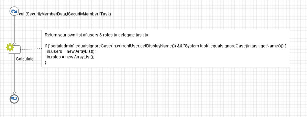
-
The callable subprocess data contains the current user
in.currentUserand the current task to be delegatedin.task. The listsin.usersandin.rolescontain all possible users and roles that the task can be delegated to. Modify those two to have your own delegate list.
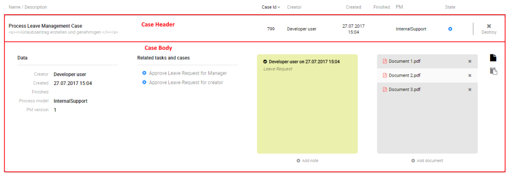
CaseWidget is a built-in component of Portal which contains cases users can interact with.
In order to show needed case's information, Portal supports overriding concept for CaseItem (inside CaseWidget).
Each CaseItem contains two part: CaseHeader and CaseBody.
Important
CaseHeader area is not supported to override yet.
-
Introduce an Axon Ivy project which has
PortalTemplateas a required library. -
Copy the
PortalStartprocess fromPortalTemplateto your project. -
Introduce a new HtmlDialog Page which uses the template
/layouts/PortalCasesTemplate.xhtml(refer to Responsiveness to override responsiveness). ThePortalCasesTemplateis designed such that it will insert the content between its predefined place holder.Put your customized content in there. There is a placeholder named:caseBody. The effect only takes place when theui:paramnameduseOverrideBodyis set totrue. Clients can set this parameter to a value expression for flexibility. For example:<ui:composition template="/layouts/PortalCasesTemplate.xhtml"><ui:param name="useOverrideBody" value="#{not case.getCustomVarCharField1().isEmpty()}" /><ui:define name="caseBody">This is the customized content of the case: #{case.getId()}<ui:fragment rendered="#{case.getCustomVarCharField1().equals('I am a secret')}"><h:outputText value="I'm a secret case so I'm displayed differently" /></ui:fragment><ui:fragment rendered="#{case.getCustomVarCharField1().equals('I am even more secret')}"><!-- Put your secret content here --></ui:fragment></ui:define></ui:composition> -
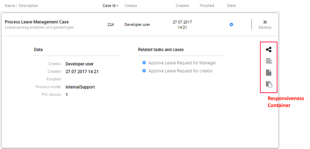
If you need to apply the responsiveness behavior of Portal, there are 2 components which can be used:
ResponsivenessHandleContainerandResponsivenessHandleButton:-
ResponsivenessHandleContainer: a container contains
ResponsivenessHandleButtonand your javascript which contains the onstart and oncomplete function ofResponsivenessHandleButton. -
ResponsivenessHandleButton: contains the params which handle responsiveness:
-
icon: the icon of button
-
displayedSelectors: css selectors of the components which need to be displayed.
-
hiddenSelectorsInLargeScreen: css selectors of the components which need to be hidden in large screen (width: 1920px).
-
hiddenSelectorsInMediumScreen: css selectors of the components which need to be displayed in medium screen (width: 1366px).
-
hiddenSelectorsInSmallScreen: css selectors of the components which need to be displayed in small screen (width: 1024px).
-
fadeTime: the fade in/out time. (metric: millisecond)
-
onstart: client side callback to execute before responsiveness execution.
-
oncomplete: client side callback to execute after responsiveness execution.
-
-
-
Use Axon Ivy Override to override the
OpenPortalCasescallable . The original implementation is callingPortalCases, change it to call the Page introduced in the step above. The signature of this callable isuseView(CaseView)and your customized Page must receive thisCaseViewinstance, put in the dialog'sDatawith the exact namecaseView. -
Introduce a Business Process which starts the page
PortalHome. To make the overriding take effect, the client must use this process to startPortal(instead of the original one onPortalTemplate). Remember to set the home page variable to the new home page url (see Portal home for more details). -
In case you want to use the
CaseTempatetemplate, you may want to define thecaseStatusTabwith your customized content. For example:<ui:composition template="/layouts/CaseTemplate.xhtml"><ui:define name="caseStatusTab">This is the customized content of the case: #{caseId}</ui:define></ui:composition>
Override the BuildCaseJsonQuery callable process of PortalKit and build your own query to effect the data of case widget.
Apply the following steps in case you would like to provide data for case list after navigating to case list from your page:
-
Use the
OpenPortalCasescallable process with theCaseViewparameter. It is used to define which information are displayed in CaseWidget. -
Refer to CaseView, CaseSearchCriteria, CaseQueryCriteria to build your CaseView
CaseLazyDataModel dataModel = new CaseLazyDataModel();
// Set your CaseQuery
dataModel.getQueryCriteria().setCaseQuery(YOUR_CASE_QUERY);
// Use this code line if you would like to display the cases for all users
dataModel.getSearchCriteria().setInvolvedUsername(true);
out.caseView = CaseView.create().dataModel(dataModel)
.withTitle("My Cases").buildNewView();
-
Refer to the
caseFiltersection inPortalCases.xhtmlof PortalTemplate. -
In order to introduce new filter, create a new java class extends CaseFilter and override its methods (see javadoc comments)
-
Introduce a java class extends CaseFilterContainer. This filter container contains your filters, you can reuse default filters, refer to
DefaultCaseFilterContainer.javaTip
StateFilter is added as default to container. If you don't need it, use this code in constructor:
filters.remove(stateFilter); -
Introduce a java class extends CaseLazyDataModel. Override the
initFilterContainermethod and initialize filter container (see javadoc comments) -
Use Axon Ivy Override to override the
InitializeCaseDataModelcallable and initialize data model by your customized one. -
In your customized portal cases HTMLDialog, the customized data model and filter container should be passed as parameters to components (refer to
PortalCases.xhtml). -
Portal supports storing/restoring filters. Your filter class (extends
CaseFilter) is stored in business data. Properties stored user input values should be persisted, properties controlled logic should not be persisted to reduce persisted data size in business data. Use annotation@JsonIgnoreto exclude properties. By default, Portal takes care storing/restoring filters. If you want to customize storing/restoring filter data, do it in your data model class (extendsCaseLazyDataModelclass). -
By default, filters are stored/restored in process model level. You can change this by setting the ui:param
filterGroupIdinPortalCases.xhtmlto a new Long value.Tip
If you have multiple task lists in your project, you may want to set
filterGroupIdto an unique identifier for each of yourPortalCases.xhtml across your projects
In Portal homepage, the Process widget displays default processes, you can customize them so that project important starts are displayed.
Create a callable sub process in your project with the createDefaultUserProcesses() signature, make sure this signature is unique in your application. It must return a list of user processes: defaultUserProcesses(List<UserProcess>) (you can override this process in PortalKit):
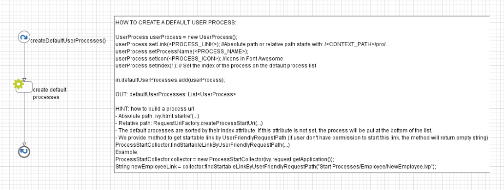
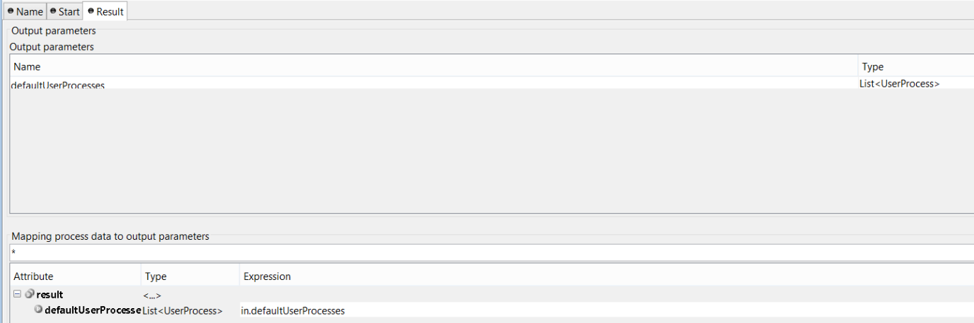
Tip
We provide the method to generate link from UserFriendlyRequestPath inProcessStartCollector class: findStartableLinkByUserFriendlyRequestPath(String requestPath).
This method will return startable link if user has permission to start the process, otherwise return emtpy string.
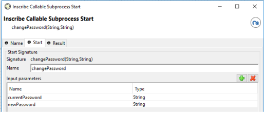
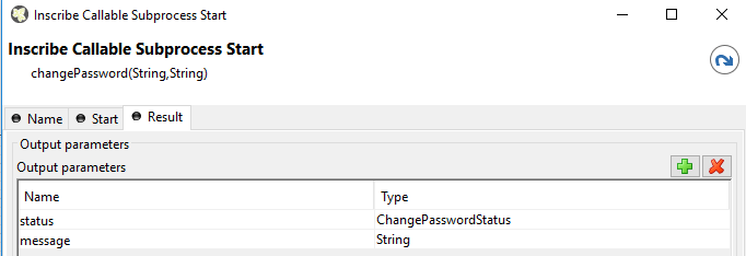
In Portal, the Change password process helps users to change their current password, you can customize this process to add more handling when user change password.
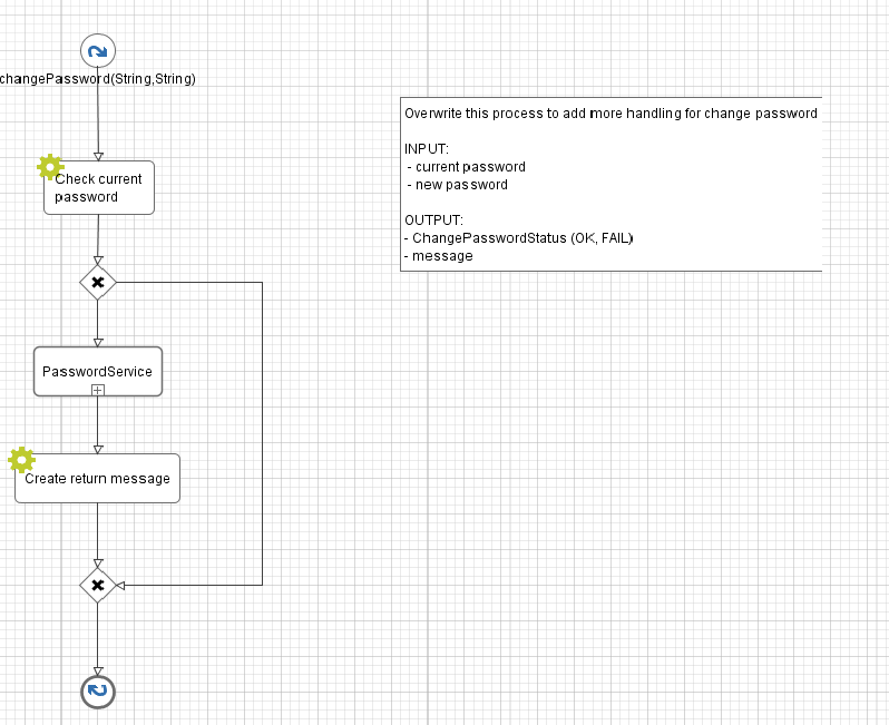
-
Introduce an Axon Ivy project which has
PortalTemplateas a required library. -
Copy the
PortalStartprocess fromPortalTemplateto your project. This process is new home page and administrator should register this link by global -
Refer to Customize Portal home to set new home page.
-
Override the
Logoutprocess to customize the logout behavior. -
Override the
LogoutPageprocess to customize the page which will be redirect to after logout, default is Portal home page.
When the last task of Axon Express finish, express end page will be displayed. You can customize this by provide your own page.
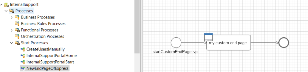
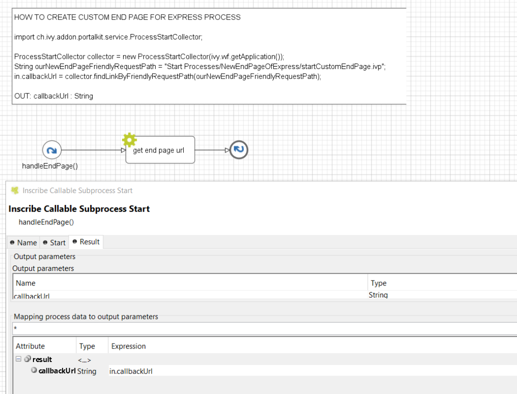
-
When a task finish, Portal will navigate back to previous page. For example if a task is started from homepage, then go back to homepage. In case task is started from task list, then go back to task list after finish.
-
Developer can also apply this feature to their own button e.g Cancel a task.
-
Just call
PortalNavigator.navigateToPortalEndPage()in your button function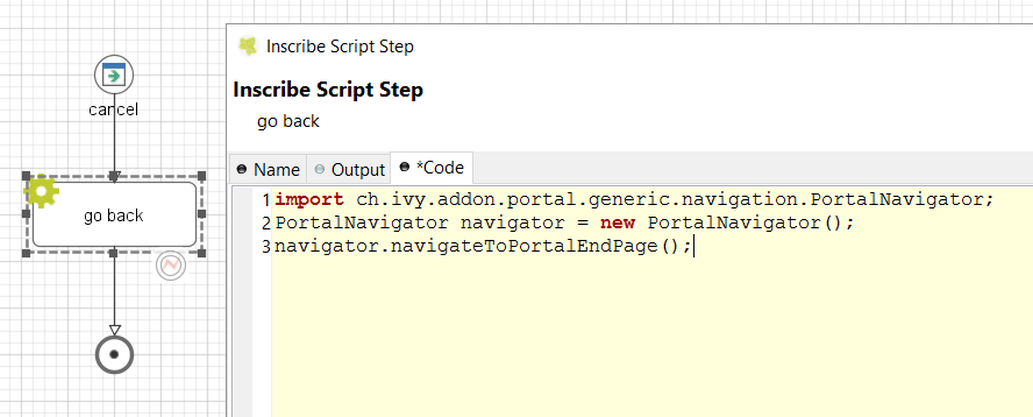
A technical role is the role which is not displayed anywhere (e.g. delegate, absence management). AXONIVY_PORTAL_ADMIN is a technical role by default.
To mark a role as a technical role, set the HIDE property with any value to the role.
Tip
Use the utility method of Portal to set property:
ch.ivy.addon.portalkit.util.RoleUtils.setProperty([YOUR_ROLE], ch.ivy.addon.portalkit.util.HIDE, [ANY_VALUE])
A technical task is the task which is not displayed in any task lists of Portal.
To mark a task as a technical task, make sure Ivy global variable PortalHiddenTaskCaseExcluded is set to true. Then depends on value of PortalHiddenTaskCaseCustomField, it will
mark task as technical. Follow tip
Tip
Use the utility methods of Portal:
-
Set task as technical: ch.ivy.addon.portalkit.util.TaskUtils.setHidePropertyToHideInPortal(ITask)
-
Reverse it: ch.ivy.addon.portalkit.util.TaskUtils.removeHidePropertyToDisplayInPortal(ITask)
A technical case is the case which is not displayed in any case lists of Portal.
Tasks belong to the technical case is considered as technical tasks and should be hide as well.
To mark a case as a technical case, make sure Ivy global variable PortalHiddenTaskCaseExcluded is set to true. Then depends on value of PortalHiddenTaskCaseCustomField, it will
mark case as technical. Follow tip
Tip
Use the utility methods of Portal:
-
Set case as technical: ch.ivy.addon.portalkit.util.CaseUtils.setHidePropertyToHideInPortal(ICase)
-
Reverse it: ch.ivy.addon.portalkit.util.CaseUtils.removeHidePropertyToDisplayInPortal(ICase)
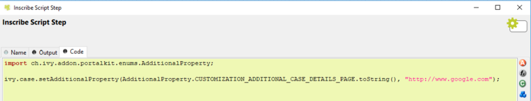
The additional case details page shows all custom fields of a case by clicking on "Show details" link in case details.
You can customize this page for each case by providing a relative URL to case.
-
Create a new additional case details UI and a start process which will display the new UI.
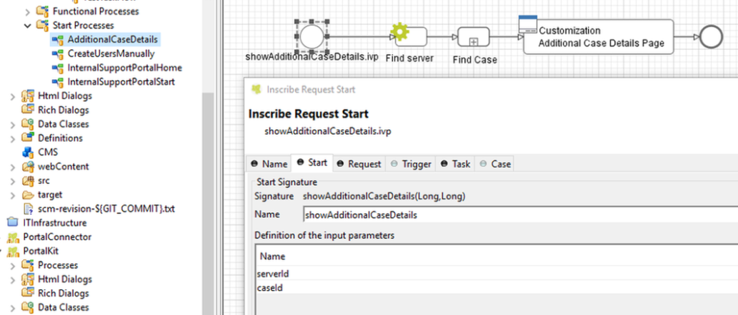
-
Store the URL of start process in "CUSTOMIZATION_ADDITIONAL_CASE_DETAILS_PAGE" additional property of case. You could use
SetAdditonalCaseDetailPage.modcallable process, and input the friendly URL of process as parameter.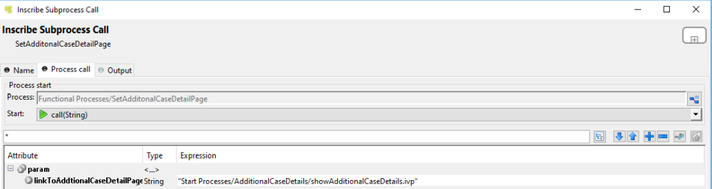
Tip
If you want to redirect user to external link, simply store that external link to "CUSTOMIZATION_ADDITIONAL_CASE_DETAILS_PAGE" additional property of case.