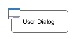
User Interface
A User Dialog is one of the two possibilities to interact with the user in a process. The other possibility are simple Web Pages as already used in pre Xpert.ivy 4.x releases. User Dialogs are provided in Axon.ivy 5.x using either the Java Server Faces (JSF) technology from Oracle or a Rich Internet Applications (RIA) technology from Canoo with the name ULC.
In Axon.ivy we use Html Dialog - or HD for short - as the name for a User Dialog Component built with JSF. On the other side a User Dialog Component based on the Canoo ULC Rich Internet Application Technology is called Rich Dialog or RD respectively.
The concept of a User Dialog follows the famous Model-View-Controller pattern. It consist of the following parts:
-
Data - The internal data of the User Dialog (the model)
-
View / Panel - The visual representation of the User Dialog (the view)
-
Logic - The implementation of the functionality (the behavior) of the User Dialog (the controller)
-
Interface - A description of the capabilities of the User Dialog
-
(Data Binding) - A mapping of widget properties with data members
-
(Event Mapping) - A mapping of an UI event with a process in the User Dialog Logic
The logic (i.e. controller) of User Dialogs is implemented in a process based manner. This means that all the GUI events (which are generated by the user who interacts with the dialog) are handled by means of a corresponding UI processes in the logic of the User Dialog component. So the behaviour of the User Dialog is not implemented by writing source code in a programming language (such as Java, Visual Basic or C# ) but rather by graphically modelling a process logic in Axon.ivy.
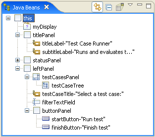
The multi-part structure of a User Dialog becomes also evident when looking at it's representation in the Axon.ivy project tree:
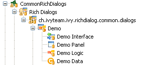
The interface of a User Dialog defines its behavior in an abstract way and independent of it's implementation. In other words it defines what a User Dialog is capable to do. In more detail, the interface defines Start Methods and Methods of a User Dialog.
The interface is edited and defined using the Interface Editor.
The logic of a User Dialog defines how a User Dialog performs its work by means of a process model. For each UI Event (triggered by the actual user, e.g. by clicking on a button) and for each Start Method and Method defined on the interface you may implement a process to handle these events.
The logic of a User Dialog is edited and defined using the Process Editor.
To build the logic of a User Dialog the Process Editor offers a set of process elements that is somewhat different from the standard set. The extra User Dialog drawer of the Process Editor palette contains elements, which can only be used within User Dialog logic:
| Icon | Title | Short Description |
|---|---|---|
| User Dialog | Opens another User Dialog |
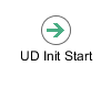
| Init Start | Invoked when the User Dialog is started. This element is executed at most once and initializes the User Dialog and its data. |
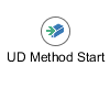
| Method start | Invoked when one of the methods declared in the User Dialog Interface is called. |
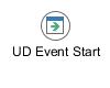
| Event Start | Invoked when a mapped widget event is received from the view of the User Dialog. |
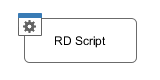
| Script | Encapsulates IvyScript code or changes in the User Dialog data. |
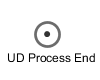
| Process End | Ends a User Dialog UI process. |
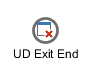
| Exit End | Exits and closes this User Dialog and continues with the calling process (if opened synchronously). |
Table 6.1. Process elements only available in User Dialog Logic
On the other hand, some elements of the Dialog &
Control drawer are missing, because they are forbidden:
| Icon | Title | Short Explanation |
|---|---|---|
| Request Start | The normal Request element is replaced with the User Dialog start element. |
| Web Page | The Page element is HTML-specific and thus not available in the User Dialog logic. |
| Tasks | The Tasks element is not available because role change and task data persistence can only happen between User Dialogs. |
| Task | The Task element is not available because role change and task data persistence can only happen between User Dialogs. |
| Event Start | Start Event Beans are currently not supported inside User Dialogs. |
| Intermediate | Intermediate Events are currently not supported inside User Dialogs. |
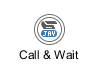
| Call & Wait | Call & Wait are currently not supported inside User Dialogs. |
| Process End | The regular Process End element is replaced with the User Dialog End element. |
| End Page | The End Page element is HTML-specific and thus not available in the User Dialog logic. |
Table 6.2. Process elements that are forbidden in User Dialog Logic
Warning
When invoking Callables from inside a User Dialog you have to bear in mind, that the Callable process will be executed within the scope of the User Dialog that executes it, i.e. the same restrictions apply as if the Callable was defined right inside the User Dialog's logic. This ultimately means that you have to ensure that the called (business) process does not contain any of the forbidden elements mentioned above. Otherwise you will experience failures or unpredictable results during execution of the Callable process.
The data of a User Dialog define its internal state (if you are familiar with the MVC pattern, you should consider the data as the Model of a User Dialog). The data of a User Dialog has private scope (i.e. is not visible from outside). Access can be granted by defining and implementing methods that return or manipulate internal data.
The data of a User Dialog is edited with the Data Class Editor.
The User Dialog Interface editor is used to define the API (Application Programming Interface) of a User Dialog. Since User Dialogs are components which are intended for reuse, they must define a stable interface on which other clients (i.e. processes or User Dialogs) can rely upon. An interface is defined independently from the implementation of the User Dialog and therefore separates the way of how a User Dialog performs it's work from the declaration of what it is capable to do.
Axon.ivy Project Tree -> double click on the Interface node
below a User Dialog in the tree: 
The User Dialog Interface editor consists of the sections for the declaration of Start methods and Methods. Each section can have multiple entries, which can be added, edited and removed with the respective buttons. You can also edit an entry by simply double clicking on it (with the exception of the initially present default start() method).
Tip
It is strongly recommended to write a short description for each declared interface part in the Description area of the details pane. This will help clients of the User Dialog to understand the characteristics of the respective part.
Start methods define different entry points into a User Dialog. A User Dialog can be started with different parameters and return different values, depending on which entry point is chosen at call time.
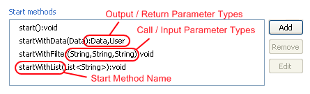
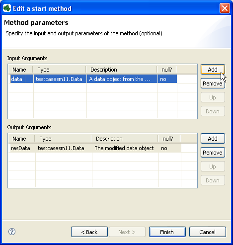
When a new Start method is added (or edited) you must provide a name as well as input and output parameters. The name of the method is entered on the first page of the opened wizard.
The second page of the wizard is used to define the input and output parameters of the method. Both lists may be left empty. By clicking on the add button a new entry can be generated. Each method parameter consists of a name, a type, an optional description and the definition of whether null should be accepted at this position or not.
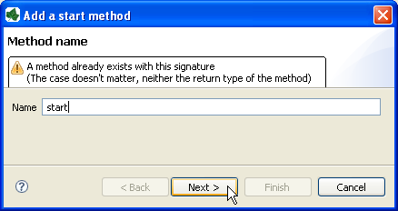
Tip
If the name/parameter combination (the so called signature) of the Start method as defined so far is identical to the signature of another Start method, then a warning will be displayed. The warning disappears when either arguments are added or argument types are changed or if the name of the method is altered accordingly, i.e. the signatures are no more identical.
Tip
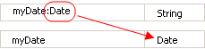
You may already specify the type of the parameter here by adding a colon ':' to the parameter name, followed by desired type (e.g. myDateParameter:Date). When only adding a colon to the name without a type, the data type selection dialog will appear.
Note
Start methods defined in the User Dialog Interface can be selected inside a User Dialog Process element when the respective User Dialog is chosen to be started.
In the Methods section of the User Dialog Interface Editor the regular interaction methods of a User Dialog are defined. Those methods become available when a User Dialog is accessed with scripting, e.g. when used as an embedded User Dialog.
The declaration of Methods is absolutely similar to the declaration of Start methods, with the sole difference that a Method can only have a single return parameter (or none).
You can define a textual description, a set of tags (keywords) for each User Dialog. These can be searched by the Ivy search page.
- Description
-
A description of the User Dialog
- Tags
-
The tags are a space separated list of keywords used to categorize User Dialogs. We suggest to define a vocabulary of tags within your team/company to always use the same terms.
The New User Dialog wizard lets you create a new User Dialog. This can be a Rich Dialog, an Html Dialog or an Offline Dialog.
The wizard creates several resources for the new User Dialog:
- View
-
The visual component of the User Dialog (different technologies are possible).
- Process
-
The Process that contains the logic of the User Dialog.
- Data Class
-
The Data Class that holds the data of the User Dialog.
- Interface
-
The Interface defines the ways of interaction with other User Dialogs or business processes.
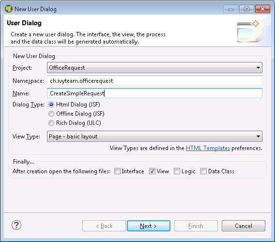
- Project name
-
Choose the project that your User Dialog belongs to.
- Namespace
-
Enter a namespace for your User Dialog. Use namespaces to group your User Dialogs. The grouping hierarchy is separated by the dot character. This is a similar concept as packages in the Java programming language.
- Name
-
Enter the name of the User Dialog that you want to create.
- Dialog Type
-
Select the type of the User Dialog that you want to create.
Tip
Since Html Dialog as well as Offline Dialog both base on JSF technology, it's possible to switch between those two dialog types after creation. Whereas it's not possible to switch from or to a Rich Dialog once it's created.
- View Type
-
A view type defines the base layout of a User Dialog. Depending on the dialog type the view layouts vary and have the following attributes:
For the dialog types Html Dialog (JSF) and Offline Dialog (JSF) the view type could be selected from a predefined list of layouts. The list contains page and component layouts. Use a page layout for a standalone Html page, select a component layout to create a reusable Html component. See the corresponding chapter layouts and templates for more information.
For the dialog type Rich Dialog (ULC) one of the following view types could be selected: GridBagLayoutPane, BoxLayoutPane and BorderLayoutPane.
Tip
Changing the view type of a Rich Dialog after it has been created may be tricky, therefore you should be aware of layout requirements that your new Rich Dialog might have. Select a GridBagLayout if you're not sure, it is the most flexible and used layout.
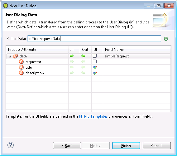
This page provides the functionality to create necessary configuration of a User Dialog simple and quickly. The starting point is a data class. e.g. the data class of the process that calls the User dialog. Based on this data class the following configuration could be created:
- Start-Method
-
A start method is created based on the selected In and Out attributes. The necessary parameter mapping will be automatically generated.
- Data Class fields
-
For each selected In/Out attribute a field will be created in the Data Class of the User Dialog. The name of the created field could be defined in the column 'Field Name'.
- Form (for Html/Offline Dialogs)
-
For each selected UI attribute a form field is created in the View. E.g. for a field birthday, of type Date, a Label and a Datepicker will be generated.
Tip
Create a User Dialog in the context of a User Dialog Process Element: If the New User Dialog Wizard is opened on a User Dialog Process Element, the initial Caller Class will be the class of the calling process and the in/out parameter mapping from the process to the User Dialog and back will be generated automatically.
Tip
Create a User Dialog in the context of a Data Class: If the New User Dialog Wizard is started via the context menu on a Data Class, the initial Caller Class will be the selected Data Class.
An Html Dialog (in the following abbreviated as HD) is one of two possibilities to implement a User Dialog Component. HDs are implemented using the Java Server Faces technology from Oracle
This means, that the view of an HD is defined with the means of an XHTML document and that it is displayed in a web browser.
Axon.ivy is bundled with the JSF component library PrimeFaces, an open source JSF component library developed by Prime Teknoloji. It provides a collection of mostly visual components (widgets). These can be used by JSF programmers in addition to the small set of basic components that are shipped with the core JSF platform. A very good starting point to learn more about PrimeFaces can be found in the PrimeFaces Showcase. Detailed PrimeFaces widget API documentation can be found in the PrimeFaces VDL doc.
Tip
The Html Dialog Editor supports PrimeFaces during design time. This means that you can profit from code completion support, tag validation, structured properties in the property view and a graphical representation in the preview part for all PrimeFaces widgets.
The elements of the PrimeFaces library are introduced with the <p:>
namespace on your XHTML page. In addition also the primefaces-extension<pe: and primefaces-mobile
<pm: widget libraries are included in the Axon.ivy installation.
Note
It is also possible to install and use additional JSF libraries. To do so you copy the concerning .jar file into the folder /webapps/ivy/WEB-INF/lib of Axon.ivy Designer and Axon.ivy Engine respectively. Then you have to add a namespace attribute xmlns:xx on your html pages to use the widgets.
With themes the visual appearance of the application such as the color scheme and the decoration of components can be changed. PrimeFaces comes with a number of predefined themes where you can choose from. Or you can create your own theme using the theme generator tool jQuery ThemeRoller. To learn more about PrimeFaces themes, the web site PrimeFaces Themes is the right starting point:
The theme called modena-ivy is configured as default. However, you can easily configure another default theme with the following steps:
-
The PrimeFaces Community Themes are already included in the product. To use a own theme copy your themeXY.jar file into the folder /webapps/ivy/WEB-INF/lib of Designer and Engine respectively
-
Edit the theme setting parameter
primefaces.THEMEin the file /webapps/ivy/WEB-INF/web.xml -
Restart Axon.ivy
Tip
By using the ch.ivyteam.ivy.jsf.primefaces.IvyPrimefacesThemeResolver the theme can be configured by application and session. See Engine Guide > Miscellaneous > Html Dialogs > Primefaces Theme
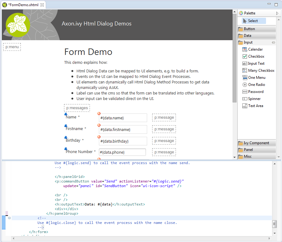
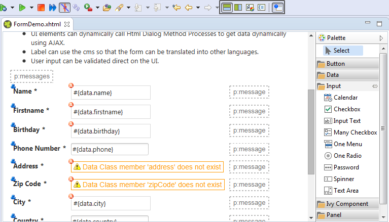
An Html Dialog follows the model-view-controller pattern of the Axon.ivy User Dialog concept. So part of an implemented HD is a data class (the model) whose data fields can be bound to widget properties of the view. To define such a binding, Axon.ivy provides the special object data.
On the other hand, the controller part of an Html Dialog is implemented by a series of UI processes that can be mapped to events on the view such as mouse clicks. To define such an event mapping, Axon.ivy provides the keyword logic to call an event process or a method process in the logic.
Look at the following small code sample of a form with a mapped data attribute on an input text field and a button with a bound event process:
  <h:body>
    <h3>My JSF Form</h>
    <h:form id="myForm">
        <p:outputLabel value="#{ivy.cms.co('/labels/street')}" for="street" />
        <p:inputText value="#{data.address.street}" id="street" />
        <p:commandButton value="#{ivy.cms.co('/labels/submit')}" actionListener="#{logic.submit}"/>
    </h:form>
  </h:body>
Data Classes are automatically initialized if an Html Dialog sets a property on it.
E.g. If data.address is null and a form is submitted with a
value for data.address.street then a data.address object is
automatically created.
See also Public API
ch.ivyteam.ivy.scripting.objects.jsf.el.AutoInitializable.
The Html Dialog editor allows to implement the view of an Html Dialog (i.e. the JSF view). The Html Dialog editor consists of two views, the source view and the graphical view. In the source view you can read and edit the JSF (or xhtml) source in a text-based editor. In the graphical view you can preview and edit the visual representation of the JSF page. Both views are linked to each other and every change is synchronized to the other view. So a change in one view is automatically reflected in the other one, e.g. if I change the text of a h1 HTML element in the source view then the design view is immediately updated and shows the new text. There are options to arrange the two views in horizontal or vertical panes or to show only one of them.
The third element is a palette with drawers for the most important Primefaces and JSF components and widgets that can be used in views. Such components/widgets can be dragged from the various palette drawers and then be dropped onto both the design view or onto the source view As well the rearrangement of already positioned widgets is possible in both views.
The graphical view of the Html Dialog editor allows to compose an Html Dialog view in a graphical mode by selecting a UI element from the palette and positioning it on the view. Similarly, already positioned elements can be dragged to another position on the view, simply by selecting and dragging them with the mouse. In the same way, just select an element and press the delete key to remove an element from the JSF page. As the graphical and the source views are linked together, all these actions are synchronized to the source view.
Tip
The graphical view displays the JSF page as realistic as possible. It also shows all the content from the template or from includes. But you cannot select or edit these elements.
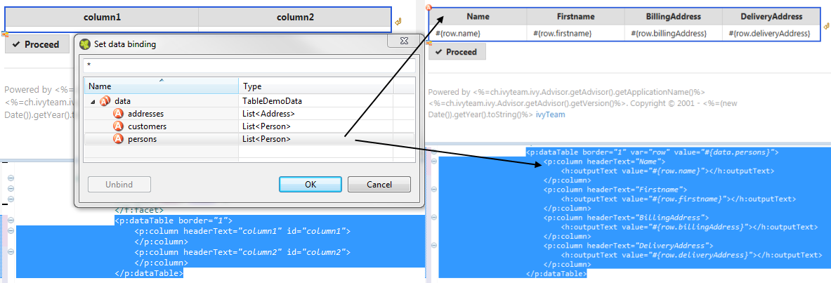
If you double click on one of the most important elements (the ones that you find in the palette) then the default action of this element is triggered. It depends on the element what happens. For example for a Primefaces OutputLabel you can edit the text of the label or choose a CMS content object for it. On the other hand, for the Primefaces DataTable you can select which list from the data class will be used as data source for the table.
The graphical view displays overlay markers for some elements:
-
CMS markers are displayed if you use the CMS for displaying text or an image. This helps you to verify very fast whether your JSF page is properly translated/internationalized.
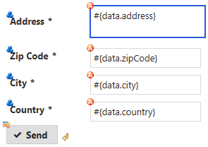
-
Data binding markers are visible when the value of an input element is bound to a data element with an EL expression. You can use these markers to verify whether all your inputs are bound to data or a backing bean.
-
You see Logic mapping markers if you call a Html Dialog logic element in a button or link. Use these to verify if all your actions are properly mapped to logic elements.
For each element that has been dropped on the view the corresponding code is generated in the source. Alternatively you can use the auto completion support in the source editor. Just enter the first letter(s) of a valid code fragment and a selection list of matching elements pops up.
In addition to the auto completion support you get further assistance for writing expressions if you press Ctrl+Space on an expression to get a pop-up with context aware list of proposed code fragments to select from.
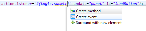
There are Quick Fixes available to create missing events, methods and data attributes on the current Html Dialog. Simply press Ctrl+1 on a logic or data expression respectively.
There are Quick Assists available to create or use content objects in the current Html Dialog. Simply press Ctrl+1 on a text attribute or on text between xml tags.
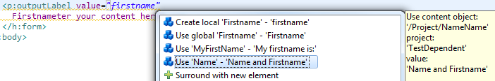
Tip
If a new content object is created with the Quick Assist you can directly rename the created content object in the Html Dialog Editor. Just type a new name and confirm with Enter, to abort the renaming press Esc.
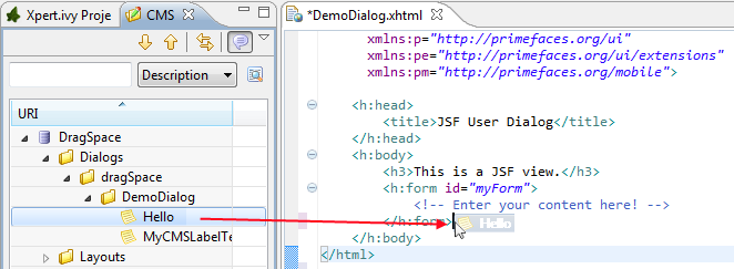
CMS contents can directly be dragged from the CMS View into the Html Dialog Editor. The dropped content will be automatically converted into a valid JSF tag or EL-expression. Currently the content types String and Text as well as all Images-types support drag & drop operations.
There is a shortcut to navigate to CMS content. Simply press F3 on a ivy.cms.co(...) expression to jump to the corresponding object in the CMS. Alternatively press Ctrl and click on the link.
There is a shortcut to navigate to a data class definition. Simply press F3 on a data.xyz expression to jump to the corresponding Data Class. Alternatively press Ctrl and click on the link.
An Html Dialog is either a page or a component. Both are complete Html Dialogs and have therefore their own view, model (data class) and controller (logic). This concept allows to build up component oriented UI design.
Note
The templates for page and component are configured in the Html Preferences.
An Html Dialog page represents a full page that is finally displayed in the web browser. Therefore a page can be opened by a User Dialog Process Step.
An Html Dialog Page uses an Html Dialog Layout. An Html Dialog Layout is the concept of a master page that defines a common layout for a number of similar dialogs. An Html Dialog Page references a layout and implements defined parts of it. For example the layout provides the header- and footer-area whereas the content-area is individually implemented on each dialog.
Axon.ivy brings a set of predefined layouts. The layout (together with the View Type) is chosen in the New User Dialog wizard.
For more information about templating have a look at the official JSF documentation.
Axon.ivy is not limited to the usage of the built-in Html Dialog Layouts. Custom layouts can be added with small effort.
In order to add a custom layout - which is a normal .xhtml file - it needs to be stored into the folder webContent of the project. In doing so, the custom layout can now be referenced as a layout inside an Html Dialog.
To make the custom layout show up in the New User Dialog wizard
(for selection of the View Type), it must be stored in the folder
webContent/layouts of the project.
The folder structure of
webContent/layouts should follow the following contract:
-
webContent/layouts/[MyTemplateName].xhtml -
webContent/layouts/[A sub folder]/[for additional template
                                content]
A component can be embedded into other Html dialog or again in another component.
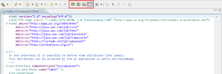
The view consists of two parts, an interface and the implementation. The interface is
constituted by a <cc:interface componentType="IvyComponent"> tag and
is followed by an optional list of component attributes. The implementation part
starts with a <cc:implementation> tag and the component attributes
can be accessed with the expression cc.attrs.attributeName
The following code fragment defines an example Html Dialog component:
        <cc:interface componentType="IvyComponent">
            <cc:attribute name="caption" />
        </cc:interface>
        <cc:implementation>
            <p:fieldset legend="Address Component">
                <h:outputLabel value="#{cc.attrs.caption}" />
                <h:panelGrid columns="2">
                    <p:outputLabel value="Street" for="street" />
                    <p:outputLabel value="Country" for="country" />
                    <p:inputText value="#{data.address.street}" id="street" />
                    <p:inputText value="#{data.address.country}" id="country" />
                </h:panelGrid>
            </p:fieldset>
        </cc:implementation>
A component could be inserted with the <ic:-tag. E.g.
<ic:my.namespace.ComponentName ... />.
Tip
In the Html Dialog Editoryou have pretty nice tool support for inserting components. You can drag and drop an available component from the palette. You can select one from the auto completion popup list and you can define required attributes in the properties view.
Optionally you can define the start method that should be used to start the
embedded component with the attribute startMethod. If you do not define
the start method, then a default start method will be used. Parameters of the start
method can be defined by adding them as named attributes. Parameters are mapped by
name, i.e. an attribute of the tag will be mapped to the start method parameter with
the same name. Furthermore you can set the component attributes that you defined in
the interface of the component by simply adding them as attributes of the tag
too.
Note
You can not override start methods. So do not use multiple start methods with the same name but different parameter lists.
See the following code fragment that inserts a Html Dialog component. The start method
start(data.person.BillingAddress:address) will be used, the current value
of the data class property billingAddress will be used as parameter for the
start method and the component attribute caption will be set to the value
"Billing Address"
    <h:panelGrid columns="2">
        <ic:ch.ivyteam.htmldialog.demo.component.AddressComponent
            startMethod="start" address="#{data.person.billingAddress}"
            caption="Billing Address">
        </ic:ch.ivyteam.htmldialog.demo.component.AddressComponent>
    </h:panelGrid>
In the Axon.ivy Designer preferences you can configure the templates used for the creation of Html Dialogs and Offline Dialogs.
Note
There are different templates for Html Dialogs and Offline Dialogs. Whereas Html Dialog templates are targeted to make use of the full JSF stack, Offline Dialog templates are designed to work without enduring connection to the Engine and are optimized for use on rather small mobile devices with touch input.
Axon.ivy Designer Menu -> Windows -> Preferences -> Web -> HTML Files -> Editor -> Templates
View Type Page and View Type Component are the predefined view types for Html Dialogs. Furthermore every template with a name that starts with 'View Type' is considered as an Html Dialog View Type and therefore listed in the New User Dialog Wizard.
Offline Dialogs have only one predefined view type called Offline View Type Page. Custom templates for Offline Dialogs have to start with 'Offline View Type'
Tip
When the template for a View Type contains <ui:composition template="${layout}">, it will be a template for an Html Page. Otherwise it will be a template for an Html Component.
Every template with a name pattern 'form field [Type]' (for Html Dialogs) respectively 'offline form field [Type]' (for Offline Dialogs) is considered as a form field template of the specified type. The form field templates are used during the creation of a Html Dialog by the New User Dialog Wizard.
Tip
Each template can be inserted into an Html Dialog view via the auto complete function (CTRL+Space).
To implement a user interaction that consists of several pages (for example a wizard), one Html Dialog can be have multiple views (.xhtml files). This allows to enclose a complex user interaction in one Html Dialog and to abstract it from the business process.
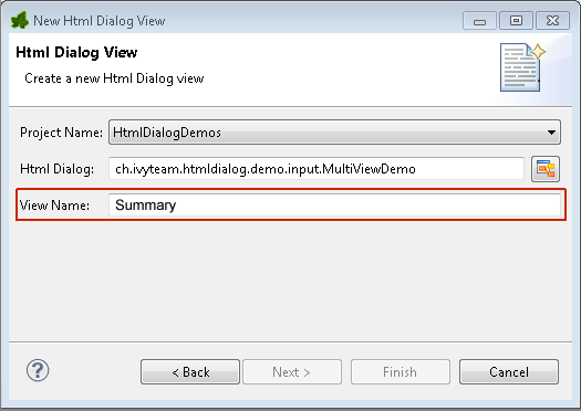
In the New menu in the Axon.ivy project tree you find the New Html Dialog View wizard to add a view to a Html Dialog. Just enter the name of the view and the xhtml file for the view is created and added to the Html Dialog. In the ivy project tree all view files of a Html Dialog are displayed below the main node of that Html Dialog.
If you have created a Html Dialog with several views you have to implement the
navigation between the views for the user on your own. The basic solution is a
commandButton with an update attribute to load the next
view.
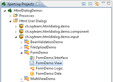
You find an example of a multi view Html Dialog in the HtmlDialogDemos project that is provided with the Axon.ivy Designer.
<h:form id="myForm">
    <p:panel header="Multi View Demo" id="panel">
    <h3>Payment - Credit Card</h3>
    <p:messages id="msgs"/>
    <h:panelGrid columns="2">
        <p:outputLabel value="Credit Card Number"/>
        <p:inputMask required="true" value="#{data.creditCardNumber}"
            id="CreditCardNumber" mask="9999-9999-9999-9999"></p:inputMask>
    </h:panelGrid>
    <p:commandButton value="Next" update="myForm" action="#{logic.nextView('CreditCard')}"/>
    </p:panel>
</h:form>
Converters are used to convert number or date/time values for string represnetation and
vice versa. If you want to display a Number or
Date/DateTime process data attribute well formated in an input
widget then use the basic converters provided by the JSF core framework: convertNumber and convertDateTime.
See this code fragment from an input form:
<p:calendar id="Birthday" value="#{data.birthday}" navigator="true"
        required="true" pattern="dd.MM.yyyy">
    <f:convertDateTime pattern="dd.MM.yyyy" />
</p:calendar>
The JSF core framework provides a number of basic validators that can be used to validate the entered values in an input form.
-
validateDoubleRange
-
validateLength
-
validateLongRange
-
validateRegex
-
validateRequired
Example code fragment from an input form:
            <p:inputText value="#{data.zipCode}" id="ZipCode" required="true">
                <f:convertNumber integerOnly="true" groupingUsed="false"/>
                <f:validateLength minimum="4" maximum="5"/>
            </p:inputText>
In some cases it makes sense to perform the validation of the entered values before they are sent to server (e.g. in an Offline Dialog). For this reason, Primefaces provides a client side validation framework. Client side validation is added as addition to the JSF validators. Thus, it can give instant feedback - even while typing - to the user. Since the JSF validators (see above) remain still active, the data is also validated on server side after the form has passed client side validation and is submitted.
Example code fragment from an input form:
<p:inputText value="#{data.zipCode}" id="ZipCode" required="true">
<f:convertNumber integerOnly="true" groupingUsed="false"/>
<f:validateLength minimum="4" maximum="5"/>
<p:clientValidator event="keyup" />
<p:clientValidator event="blur" />
</p:inputText>
<p:message for="ZipCode" display="text" showDetail="true" />
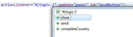
<p:commandButton actionListener="#{logic.close}" value="Proceed" validateClient="true" icon="ui-icon-check" />
Tip
It's useful, to add the client validators to the desired input field and also to trigger client side validation on the submit button. This way you make sure, that client side validation is performed during field modification, but also if the user tries to submit the from without any modification.
In order to provide a good instant feedback, a message element dedicated to the input field might be quite helpful.
In Html Dialogs it is possible to communicate with normal Java objects by using ManagedBeans. Use the following annotations to define the lifecycle scope of the managed bean:
-
@ApplicationScoped - the bean instance is created at creation of the application or at the engine startup and destroyed when the application is either deleted or the engine shuts down.
-
@SessionScoped - the bean lives for the whole duration of the session
-
@RequestScoped - an instance of the bean is created for each new request and thrown away after the response has been sent. This is the default scope that will be used when no scope is set specifically.
Note
JSF 2.0 introduced an additional scope @ViewScoped and offers the possibility to define custom scopes. This is basically also supported in Axon.ivy, but it is recommended to use it with care since it might not behave as expected.
In the HtmlDialogDemo Project that is included in the Axon.ivy Designer you find an example.
The JSR 303 is a specification that defines a metadata model for Bean Validation. The fields of the JavaBean classes that are used for storing the data are annotated to describe the constraints and their validation. Experienced programmers can use JSR 303 annotations in Axon.ivy projects. The validation information will then be considered by Html Dialogs when the field of the class is bound to a widget. There is no validation information given in the *.xhtml file of the Html Dialog itself. However, the Html Dialog uses the annotations of the fields to validate the user input.
All annotations defined in the package javax.validation.constraints are supported. For the validation messages you can use Ivy macros to get the message content from the CMS. For example:
-
@NotNull "means that a value is required"
-
@Size "restricts the length of a string or array or the size of a collection or map"
-
@Max "restricts the maximum allowed value"
-
@Min "restricts the minimum allowed value"
-
@Pattern "restricts a string to a given regular expression"
-
@Digits "restricts the maximum number of digits of the integer and faction part"
-
@Future "restricts a date to the dates in the future"
-
@Past "restricts a date to the dates in the past"
@SessionScoped
public class Person
{
	@Size(min=3, max=10, message="<%=ivy.cms.co(\"/ch.ivyteam.htmldialog.demo/BeanValidationDemo/between3And10Characters\")%>")
	@NotNull(message="<%=ivy.cms.co(\"/ch.ivyteam.htmldialog.demo/BeanValidationDemo/notnull\")%>")
	private String name;

	@Pattern(regexp="[1-9][0-9]{2}\\.[0-9]{2}\\.[1-8]([0-8][0-9]|9[012])\\.[0-9]{3}", message="<%=ivy.cms.co(\"/ch.ivyteam.htmldialog.demo/BeanValidationDemo/socialSecurityNumber\")%>")
	@NotNull(message="<%=ivy.cms.co(\"/ch.ivyteam.htmldialog.demo/BeanValidationDemo/notnull\")%>")
	private String socialSecurityNumber;
There will always be validation requirements for which these standard annotation will not suffice. For these cases it is possible to create your own annotation. You find an example in the HtmlDialogDemo project that is included in the Axon.ivy Designer.
public class Person
{
	@LicensePlate(message="<%=ivy.cms.co(\"/ch.ivyteam.htmldialog.demo/BeanValidationDemo/licensePlate\")%>")
	private String vehicleLicense;
// re-use other existing constraints:
@NotNull
@Size(min=4, max=20)
@UpperCase // custom constraint in same package
@StartsWith(prefix="ZG") // custom constraint in same package

//only show the validation message from this annotation and not from it's re-used types:
@ReportAsSingleViolation

@Target( { METHOD, FIELD, ANNOTATION_TYPE })
@Retention(RUNTIME)
@Constraint(validatedBy = {})
@Documented
public @interface LicensePlate {
    String message() default "Field does not contain a valid license plate";
    Class<?>[] groups() default {};
    public abstract Class<? extends Payload>[] payload() default {};
}
Methods of a Html Dialog can be called with JavaScript through a REST like Interface. This Ajax method call API of Axon.ivy can be used to integrate JavaScript libraries like D3, jQuery or your own JavaScript scripts. See the Ajax Method Call Demo in the Html Dialog Demo Project:
		<script type="text/javascript">
				// jQuery is used to intercept the click on the Button with id #hello
				$("#hello").click(function(){

						// The ivyajaxapi.js script provides the logic object,
						// which contains a function for each method available on the dialogs interface.
						// If you would like to use the REST API in a more advanced way or without jQuery,
						// have a look at the generated ivyajaxapi.js script to see how the REST API is used.
						logic.helloWorld(

							// The first parameter is a data structure, which represents the list of parameters
							{"name": "World"},

							// The second parameter is a function, which is called on a successful response.
							function(returnData)
							{
								// returnData is a JavaScript Object containing one field for each Method return value.
								// returnData.result accesses the return value named result.
								$("#result").html(returnData.result);
							});
				});
		</script>
The exception handling in HTML Dialogs can be customized. Depending on the request type the customization differs.
If an exception occurs in a non-ajax HTTP request, the user will be redirected to the specified error page. The customization of these error pages is described in the chapter Configuration / Error Handling of the engine guide.
If an exception occurs in an ajax-based HTTP request, the configured Primefaces ajax
exception handlers comes into play. The handler must be defined as part of the
*.xhtml file. In the provided standard layouts, handlers are
already configured. See webContent/layouts/includes/exception.xhtml for
details.
<p:ajaxExceptionHandler update="ajaxExceptionDialog" onexception="PF('ajaxExceptionDialog').show();"/>The
above ajax exception handler will catch every exception of every type. If an exception
occurs the action in onexception will be executed. In this example, a
Primeface dialog will be shown.
<p:p:dialog id="ajaxExceptionDialog" header="Error" widgetVar="ajaxExceptionDialog" height="400px">
	<p:h:outputText value="Error Id: #{errorPage.exceptionId}"/>
	<p:br/>
    ...
<p:/p:dialog>
The
errorPage bean is available within the ajax exception handling.
Properties like exceptionId or message can be used to provide
specific error information to the user.
If the view or the session of a user expires then there is a possibility to catch that exception with a specialized ajax exception handler. Instead of catching all exceptions you can specify the type of the exception to catch.
<p:ajaxExceptionHandler
    type="javax.faces.application.ViewExpiredException"
    update="viewExpiredExceptionDialog"
    onexception="PF('viewExpiredExceptionDialog').show();"/>
This
handler will only catch exceptions of type
javax.faces.application.ViewExpiredException. The exception handler
with the most specific type of exception will be used.
<p:dialog id="viewExpiredExceptionDialog" header="View or Session Expired" widgetVar="viewExpiredExceptionDialog" height="50px">
	<h:outputText value="The view or session has expired."/>
	<br/>
	<h:outputLink value="#{ivy.html.loginRef()}">Please login again.</h:outputLink>
</p:dialog>A Rich Dialog (in the following abbreviated as RD) is one of two possibilities to implement a User Dialog Component. RDs are implemented in Axon.ivy using a Rich Internet Applications technology from Canoo with the name ULC
Process based Rich Dialogs are components that follow the MVC based User Dialogs of Axon.ivy. But Rich Dialogs differ in some portions to normal User Dialogs.
The 4-part structure of a process based Rich Dialog becomes also evident when looking at it's representation in the project tree:
Like for all other User Dialogs, the logic of a Rich Dialog defines how a Rich Dialog performs its work by means of a process model. But in addition to UI Events, Start Methods and Methods also the Fired Event and Accepted Broadcast that are defined on the interface are implemented as a process.
For Rich Dialogs, the Process Editor offers a few additional elements. The User Dialog drawer of the Process Editor palette contains elements, which can only be used within the Rich Dialog logic:
| Icon | Title | Short Description |
|---|---|---|
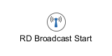
| Broadcast Start | Invoked when the Rich Dialog receives an accepted broadcast event as declared on it's interface |
|
| Script | Encapsulates IvyScript code or changes in the Rich Dialog data (replaces the normal Script element). |
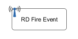
| Fire Event | Fires one of the events declared on this Rich Dialog's Interface. |
Table 6.3. Process elements only available in Rich Dialog Logic
For Rich Dialogs, you have extended Data Binding support for automatic update or synchronization.
The panel represents the UI of a Rich Dialog, it defines the screen mask with which the user interacts.
The panel of a Rich Dialog is edited with the Visual Editor.
The UI of a Rich Dialog consists of multiple widgets, such as buttons, labels and text fields, which can be nested and grouped using containers with a specific layout.
Different widgets offer different events that are triggered when the user interacts with the application (i.e. clicking a button). Those events can be mapped to event process starts, where they invoke a process in the Rich Dialog Logic and thus may change internal data or perform other work.
All widgets of a Rich Dialog offer certain properties which can be manipulated using the Widget Configuration View. Properties of the panel's widgets can also be bound to the Rich Dialog data for automatic update if either the UI (e.g. user enters input on a text field widget) or the mapped data (e.g. data of a list is read from a Web Service) changes.
Data binding is a mechanism that allows to map (i.e. bind) widget properties and Rich Dialog data either two-way or one way. If a widget property is bound to a data field it will be updated whenever one of the two changes. This process happens automatically; once a binding is defined, the programmer no longer needs to update the fields explicitly.
We differentiate two kinds of data binding: UI-to-Data and Data-to-UI. UI-to-Data bindings are responsible for updating the Rich Dialog data fields, based on the current value of the UI. The are also called downbinding. On the other hand, Data-to-UI bindings are responsible for updating parts of the Rich Dialog panel if internal data changes. This kind of binding is also called upbinding.
The downbinding is performed whenever a process in the Rich Dialog logic is triggered (with the exception of the Rich Dialog Start method). An upbinding is performed whenever a process in the Rich Dialog logic ends.
Note
It is very important to understand that data binding is only performed if a process inside the Rich Dialog logic is executed! Normally an upbinding takes place the first time at the end of the Rich Dialog Start method.
Data bindings are defined either indirectly with the Widget Configuration View or directly inside the Data Binding View.
Event mappings "attach" the UI of a Rich Dialog to it's implementation, by defining links between widget events and processes that will be executed when those events are triggered. Every widget on a Rich Dialog Panel offers a different set of events that it can generate (e.g. clicking on a button or hitting a key inside a text field) and each of those events can be mapped individually to an Event Start element in the Rich Dialog Logic.
Event mappings are a potential n:m (many-to-many) association between the Rich Dialog Panel and the Rich Dialog Logic. In other words: different events from different widgets can be mapped onto the same process start, and also a single event can be mapped to multiple process starts.
Events are generally executed synchronous (see the default Delivery Mode below). If a synchronous event is executed, then the UI will be blocked until the mapped process has finished. If a asynchronous event is executed, then the UI will stay responsive during the execution of the mapped process. Because the UI stays responsive more events can be triggered during the execution of the first event. It is ensured that the execution order of the events is always chronological and no events are executed in parallel.
| Event | Delivery Mode |
|---|---|
| Key-Event | Asynchronous |
| Focus-Events | Asynchronous |
| Others | Synchronous |
Table 6.4. Default Event Delivery Mode
To change the default behaviour the Delivery Mode can be
set for each component by API, see:
ClientContext.setEventDeliveryMode(...).
Note
Per default the Event Delivery Mode is synchronous. The Default Event Delivery Mode in the table above is only valid, when at least one corresponding Event Mapping exists for this event. Therefore, if an event listener is added manually (e.g. in the Rich Dialog Java Code) but no corresponding event-mapping exists, then the Event Delivery Mode for the event is synchronous.
Warning
Please note, changing the Event Delivery Mode to asynchronous can result to inconsistent data and it will be hard to debug such problems.
Existing event mappings of a Rich Dialog can be inspected with the Event Mapping View. New event mappings are created with the New Event Mapping Wizard.
In addition to the normal User Dialog Interface Editor, the Rich Dialog Interface Editor consists of two more sections, the declaration of Fired Events and Accepted Broadcasts.
The Fired Events section defines the events that the given Rich Dialog is capable of firing during it's lifetime. An event has a name and may carry one optional parameter. When fired, it is distributed to the correct recipients according to the specified scope.
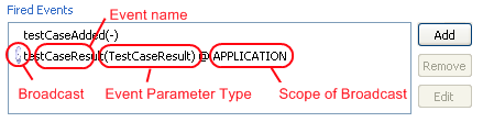
When a new Fired Event is added (or edited) you must provide a name on the first page of the wizard dialog.
The second page of the wizard is used to define a scope for the distribution of the event and one optional parameter that can be passed along with the event (i.e. an attachment).
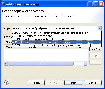
The scope of a Fired Event can be one of the following:
- SUBSCRIBERS (no broadcast)
-
The Fired Event will not be distributed as Broadcast event. Only selected components that had themselves registered for the specific event at the Rich Dialog will be notified.
- CHILDREN (broadcast)
-
All embedded Rich Dialogs (and their children) will be informed about the Rich Dialog Fired event. This includes the dynamically loaded Rich Dialogs that are located on any Display below the current Rich Dialog.
- SIBLINGS (broadcast)
-
All Rich Dialogs that are located on the same component hierarchy as the current Rich Dialog will be notified about the fired event. This includes the dynamically loaded Rich Dialogs that may be located on the same Display as the current Rich Dialog as well as any other embedded Rich Dialogs with the same parent Rich Dialog.
- APPLICATION (broadcast)
-
All Rich Dialogs of the current application that are instantiated in the current user session will be informed, no matter whether located on the same window or in a different window.
- SYSTEM (broadcast)
-
All Rich Dialogs that are instantiated for the current application instance will be informed, across all user sessions. This scope is identical to
APPLICATION, but with the difference that all sessions (not just the current one) will be included in the broadcast. Check out the section about system events to learn more about this concept.
Tip
The selected scope is shown with an @ sign in the Fired Events list of the interface. If the selected scope is a broadcast scope, then a satellite dish icon is displayed in front of the entry.
Please note that the event can only be processed if it is declared with a matching signature (i.e. name/parameter combination) in the Accepted Broadcast section in the interface of any potentially receiving Rich Dialog!
Note
The Fired Events defined for a Rich Dialog are selectable inside any Rich Dialog Fire Event Element that is located in the logic of the defining Rich Dialog. The element also allows to specify the (optional) parameter object that should be sent along with the event:
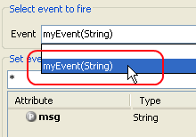
Alternatively all defined Fired Events can also be specified by means of
scripting. For each declared event there is a fireXYZ method
available on the panel variable of the Rich Dialog that defines it,
e.g.:
        panel.fireMyEvent(in.myMessage);
        // if no parameter should be passed
        panel.fireMyEvent();
The Accepted Broadcasts section defines the broadcast events that the given Rich Dialog is interested in receiving. For each accepted broadcast at least a name must be given.
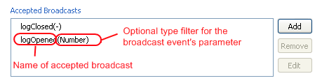
By defining the type of the optional event parameter an additional
filter can be defined. In other words: if
logOpened(Number)l is defined as an Accepted Broadcast, then any received
events with the name logOpened but with a parameter of type
String (instead of the required Number) will be ignored.
The declaration of an Accepted Broadcast works similar to the declaration of Fired Events and Rich Dialog Methods explained above.
Note
The Accepted Broadcasts declared for a Rich Dialog are selectable inside any Rich Dialog Broadcast Start Element that are located in the logic of the defining Rich Dialog.
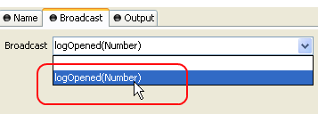
Please note, that each Accepted Broadcast can only be mapped once. A declared accepted broadcast event will no longer be selectable (i.e. will not be shown for selection) if it is already mapped in another Broadcast Start element.
See description of the Rich Dialog Broadcast Start Element to learn about how to access the optional event parameter object.
For Rich Dialogs it is possible to store a screenshot in the metadata. If create screenshot automatically is checked, every time the panel of the rich dialog is saved, the screenshot is replaced with the actual one.
Using the Change button you can replace the automatically created screenshot with your own. Don't forget to uncheck create screenshot automatically if you want to keep your screenshot after the next change of the panel.
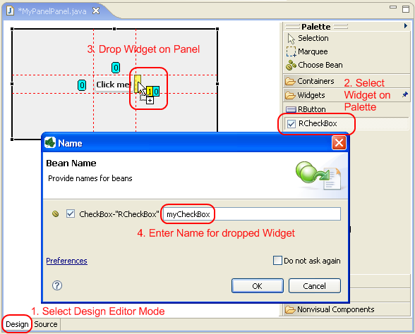
The Rich Dialog editor (also called Visual Editor) allows to compose and edit the visual representation of a Rich Dialog (i.e. it's Panel). The panel editor consists of an editor area and a palette with drawers. Widgets (i.e. UI elements) can be dragged from the various palette drawers and be dropped onto the panel. Rearrangement of already positioned widgets is also possible. Container widgets can be used to arrange related widgets and support different layout policies for its members.
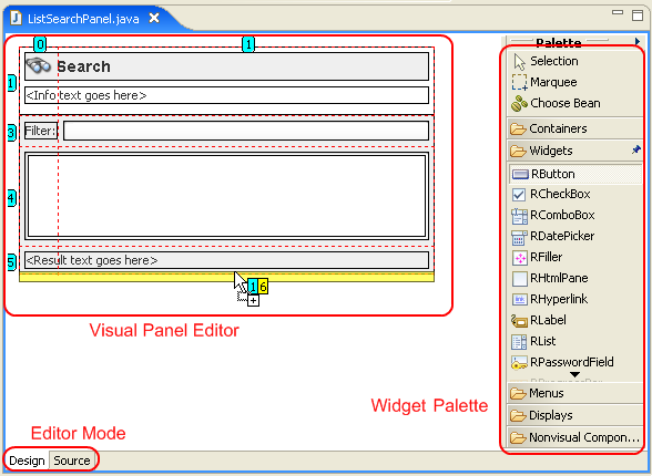
The Rich Dialog editor consists of two areas: the actual Editor Area and the Palette where the widgets to build the UI can be selected. Both are described in more detail in the sections below.
Axon.ivy Project Tree -> double click on the Panel
node below a Rich Dialog in the tree: 
The Rich Dialog editor offers two modes for editing a Rich Dialog panel: Design and Source.
The design mode of the Rich Dialog editor allows to compose Rich Dialog panels in
a WYSIWYG (what you see is what you get) mode by
selecting a widget from the palette and positioning it on the panel area. Similarly,
already positioned elements can be dragged to another position on the panel, simply
by selecting and dragging them with the mouse. The layout of the used containers
defines the way how widgets are positioned in the final end. By default, the top
level container (i.e. the panel itself) has a GridBagLayout. If you are
not used to Layouts and Layout Managers, please read the related section.
The different container layouts are explained in the following Layout Managers section.
Note
The widgets that are positioned on the panel area and sub containers thereof form a hierarchical structure that can be inspected with the Rich Dialog editor Beans view. Positioned elements can also be selected in this view, which may sometimes be necessary, if e.g. a container widget is completely covered by other widgets and can thus no longer be selected on the visual representation.
All visual content which is created by using the Rich Dialog editor is transformed into Java code in the background. The Java code that describes and creates the panel UI can also be edited directly. To do so, you simply select the Source tab at the bottom of the editor area:
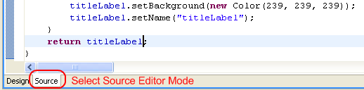
Warning
Be very careful if you edit the source code of a panel directly! The Rich Dialog editor requires a very strict coding convention and may fail to re-parse the source if that convention is not followed. In such a case the panel can no longer be visually edited. In general it is strongly discouraged to edit the code of a Rich Dialog panel manually.
The palette offers some special operations.
| Operation | Description |
|---|---|
| This is the default mode. If selection is enabled then the mouse pointer will select single elements in the editor area only. Nonetheless, you can select multiple widgets by keeping the CTRL key pressed down. |
| This is the multi-selection mode, it is not selected by default. If enabled, the mouse spans up a selection area which allows to select multiple widgets at once. Please note that the Axon.ivy Widget Configuration currently does not permit to alter properties of multiple selected widgets. |
| The Choose Bean operation can be used to insert (ULC) widgets that are not available from the palette. In fact this operation allows to insert arbitrary Java objects from classes that adhere to the Java Bean standard (see Sun Java Beans home page for more information). The usage of this operation is only recommended for advanced users. |

| By default, the Rich Dialog editor palette drawers do close if another drawer is opened. Clicking the pin of a drawer keeps the drawer always open, even if other drawers are opened. The available vertical space is then divided evenly among all opened and pinned drawers. |
Table 6.5. Palette Operations
Containers are widgets that allow to group widgets (including other containers)
together using a specific layout.
| Widget | Name/Link | Short Description |
|---|---|---|
| RBorderLayoutPane | Groups widgets with a border layout (north,east,south,west,center). |

| RBoxPane | Groups widgets with a box layout. |

| RCardPane | Holds multiple sub-components in a "card stack" (only the top most component is visible). |
| RCollapsiblePane | A panel that can expand and collapse a single sub component. |
| RFlowLayoutPane | Groups widgets with a flow layout. |
| RGridLayoutPane | Groups widgets with a grid layout (cells of equal size arranged in rows and columns). |
| RGridBagLayoutPane | Groups widgets with a grid bag layout. This is the most flexible layout pane of all. |
| RScrollPane | Holds a single sub-component. Allows to scroll that component if it is larger than the available space. |
| RSplitPane | Holds two components in a vertical or horizontally split area which is separated by a slider. |

| RTabbedPane | Holds multiple sub-components in register tabs (only top component is fully visible, other components can be selected by tab). |

| RTaskPaneContainer | A container for Task Panes only. |

| RTaskPane | Similar to Collapsible Pane but with a title bar and collapse/expand button. Intended to be used with Task Pane Container. |
| RToolBar | Groups widgets (typically buttons with an icon) in a tool bar fashion. |
Table 6.6. Containers
Regular widgets are the atomic building blocks of a Rich Dialog user interface.
They provide functionality to enter, edit and display data in various ways.
| Widget | Name/Link | Short Description |
|---|---|---|
| RButton | A button with text and/or icon. |

| RCheckBox | A check box to select or deselect an option. |

| RComboBox | A combo box offers to select one item from a list of options. |

| RDatePicker | Enter or select a date from a pop-up calendar. |
| RFiller | A component that takes up space, either flexibly or fixed-size. |
| RHtmlPane | A multi line label which can render HTML. |
| RHyperLink | A label with a hyperlink that can be clicked. |

| RLabel | A (single line) label with text. |
| RList | List of arbitrary size which allows to select elements with text and optional image. |
| RLookupTextField | A text field that shows a list of hints while typing. |
| RPasswordField | An encrypted text field to enter sensitive data. |
| RProgressBar | Shows progress (relative or indefinite). |

| RRadioButton | A radio button (used in combination with a Button Group to select exactly one item from a list of options). |
| RScrollBar | A scrollbar (can be used to select a position). |

| RSlider | Allows to select from a range of numerical values. |

| RTable | Displays data in a spread sheet fashion, i.e. cells arranged in columns and rows. |

| RTableTree | A combination of RTree and RTableTree where the first column of the displayed table contains a tree. |

| RTextArea | A multi-line input text field. |

| RTextField | A single-line text input field. |
| RToggleButton | A button that stays on or off. |

| RTree | Displays data in a hierarchical way. |

| RBrowser | An embedded browser that can be used to display HTML pages from an URL. |
Table 6.7. Widgets
Menus are widgets that offer a selection of options for the user to select. Menus
can be offered either as pop up menus or as part of a menu bar on the panel.
| Widget | Name/Link | Short Description |
|---|---|---|
| RMenuBar | A common menu bar that may contain multiple menus. |

| RMenu | Groups different menu items together, intended to be used in an RMenuBar. |

| RPopupMenu | Defines a context menu that can pop up anywhere on a component (e.g. on right mouse click). |

| RMenuSeparator | A menu item used to separate groups of other menu entries. |

| RMenuItem | A regular menu item for use inside a RMenu or a RPopupMenu. |

| RCheckBoxMenuItem | A menu item with a check box, use for options that can be selected or deselected. |
| RRadioButtonMenuItem | A menu item with a radio button, use to select exactly one from multiple options. |
Table 6.8. Menus
Displays are place holders on a panel that serve as target locations for the dynamic
loading of Rich Dialogs at runtime.
| Widget | Name/Link | Short Description |
|---|---|---|

| RTabbedDisplay | Shows dynamically loaded Rich Dialogs as tabs on a tabbed pane. |
| RCardDisplay | Shows dynamically loaded Rich Dialogs on a card stack, i.e. only top Rich Dialog is visible. |
| RTaskPaneDisplay | Shows dynamically loaded Rich Dialogs as expandable/collapsible panels on a task pane container. |
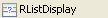
| RListDisplay | Shows dynamically loaded Rich Dialogs in a scrollable list. |
Table 6.9. Displays
Non visual Components are UI elements that do not have a visual representation.
They may serve as supporting objects for visual components and are placed next to the panel
rather than onto it. The user can not see those objects on his screen.
| Widget | Name/Link | Short Description |
|---|---|---|

| ButtonGroup | Logically groups exclusively selectable widgets such as RRadioButton. Ensures that not more than one element from the group is selected at the same time. |
Table 6.10. Non visual Components
Cell Widgets are elements for table editing, used for displaying an manipulate data
of a RTable.
| Widget | Name/Link | Short Description |
|---|---|---|
|
| RTextFieldCellWidget | A single-line text input field. |
|
| RComboBoxCellWidget | A combo box offers to select one item from a list of options. |
|
| RBooleanCellWidget | A check box to display or change the boolean cell value. |
|
| RButtonCellWidget | A Button to start an action with a text. The cell value are displayed as text. |
Table 6.11. Cell Widgets
Tip
If you right-click on a palette drawer or palette entry, a popup-menu opens which allows you to configure the appearance and the behavior of the palette.
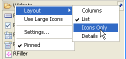
For example, all entries can be displayed by their icons only. This saves a lot of space and allows you to keep all drawers open at the same time to access all widgets at once. It is recommended that you try some of the palette settings until you find a configuration that suits your personal needs. The configuration is saved and reused for all projects in this workspace.
Components in a container are arranged according to the layout manager that the specific container is using. Layout managers are mainly responsible for arranging the widgets within a container, and especially for re-arranging if the size of the container changes (e.g. if the size of a window is changed, then the layout of all the contained components will be done again).
The Rich Dialog editor offers containers with different layouts (all links are pointing to pages of the Sun Java Swing Tutorial):
| Layout Name | Short Description |
|---|---|
| Border Layout | BorderLayout object has five areas: NORTH, EAST,
SOUTH, WEST and CENTER. If the window is enlarged, the center area
gets as much of the available space as possible. The other areas
expand only as much as necessary to fill all available space. Often
a container uses only one or two of the areas of the
BorderLayout object — just the center, or the
center and the bottom. See Border Layout for more information. |
| Box Layout | BoxLayout either stacks its components on top of
each other or places them in a row — your choice. You might think of
it as a version of FlowLayout, but with greater
functionality. Working with nested box layout containers is very
similar to working with HTML tables for layouting. See Box Layout for more information. |
| Card Layout | The CardLayout class manages two or more components
(usually other containers) that share the same display space. Only
the component on top is visible. The stacked components that are not
visible can be shown by setting properties on the
CardLayoutPane. See Card Layout for more information |
| Flow Layout | The FlowLayout class puts components in a row and
sizes them according to their preferred size. If the horizontal
space in the container is too small to put all the components in one
row, the FlowLayout class uses multiple rows. By
default, if the container is wider than necessary, the row is
centered horizontally within the container. See Flow Layout for more information. |
| Grid Layout | A GridLayout object places components in a grid of
cells. Each component takes all the available space within its cell,
and each cell has exactly the same size. If the window is resized,
the GridLayout object changes the cell size so that the
cells are as large as possible in relation to the given space. See
Grid Layout for more information. |
| GridBag Layout | GridBagLayout is one of the most flexible — and
complex — layout managers of Swing. A GridBagLayout
layouts components in a grid of rows and columns, allowing specified
components to span multiple rows or columns. Not all rows
necessarily have the same height. Similarly, not all columns
necessarily have the same width. Essentially,
GridBagLayout places components in rectangles (cells)
in a grid, and then uses the components' preferred sizes to
determine how big the cells should be. See GridBag Layout for more information. |
Table 6.12. Summary of different Layout Managers
Tip
Because GridBagLayout is the most powerful and flexible layout available, it is generally recommended to use a GridBagLayoutPane as container, unless specific demands are favouring another layout manager.
Warning
Once you've selected a layout it is not so easy to change it again afterwards. So you should quickly think about your layout requirements before selecting a specific layout.
The Java Beans View (or just Beans View for short) is used to visualize the structural hierarchy of all widgets on the Rich Dialog. It can be used as an alternative to the Rich Dialog editor area when dropping or arranging widgets from the palette.
Inside the Rich Dialog editor it can sometimes be impossible to select a container with the mouse if it's children are maximized; i.e. completely cover the space of their parent container. In such a case the "covered" component can still be selected inside the Java Beans view. The same holds true for components that are located inside a container that uses a layout hides it's child components (examples are RCardPane or RMenu).
- Synchronize
-

Will synchronize the selection in the Java Beans view and in Rich Dialog editor area.
- Collapse All
-

Will collapse the widget hierarchy tree completely.
- Overview
-

Shows an overview (thumbnail) of the edited panel. May be helpful if the Rich Dialog editor area is too small to show the whole edited panel. The view point of the editor (shown as blue area over the panel) can be dragged around (watch the Rich Dialog editor scroll while doing this). Positioning of the view point only works if editor area is smaller than the panel.
The Properties view of the Rich Dialog editor offers an alternative way to the Widget Configuration View for setting the properties of a widget. The view will always show the available properties for the currently selected widget (Java Beans view and/or Rich Dialog editor).
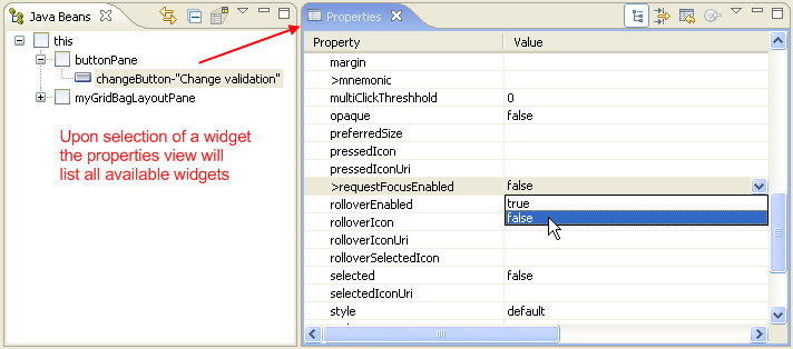
Warning
The Properties view shows and allows to alter the complete set of properties and attributes of widgets. Most of them are of no relevance for the creation of applications with Axon.ivy. The explanation of all available properties for each widget type goes far beyond the scope of this document and is thus generally left undone.
The reason why the Properties view is available to the user, is that currently not (yet) all relevant properties can be edited through the Widget Configuration View. Some of the properties that are documented in the Widget Reference chapter, you have to set or alter inside the Properties view because there is currently no other way to do it.
Generally, however, we strongly discourage the usage of the Properties view. One reason being that it offers far too much information and at the same time is less powerful than the widget configuration view. Another reason being that some harm may be done if undocumented attributes are altered without a complete understanding of the consequences.


In the Axon.ivy Widget Configuration view you can manipulate the most important configuration issues of the selected widget in the Rich Dialog editor or Java Beans view.
Note
Open the Properties View to configure advanced properties that are not visible in the Widget Configuration.
The configuration is split up in several tabs, which depend on the selected Widget. In this section all the tabs are described.
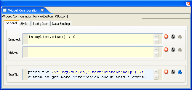
The General tab groups together general properties that all Widgets have in common.
Note
Enter IvyScript into a IvyScript text field if the background color of the text field is yellow, enter IvyScript macros if the background is blue and enter normal text if the background is white.
- Properties
-
Enabledt: Enter a IvyScript that evaluates to a boolean to set the enabling of the widget.
Visible: Enter a IvyScript that evaluates to a boolean to set the visibility of the widget.
Tooltip: Enter the tool tip for the widget, IvyScript macros syntax may be used.
The Style tab shows the graphical user interface style information for the selected widget. This includes formatting options such as colors or fonts, positioning options for alignment, filling of empty space or inset size and as well graphical options such as border style and color.
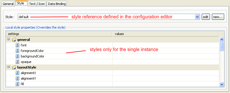
In the first section you can select a reference to a predefined style configuration in your project. You are also able to select a style configuration from a dependent project. The edit button opens the configuration editor on the currently selected style. You can then edit that style or define a new one before returning to the widget's style configuration. See here for information about how to create your own style configurations.
In the second section you define style parameters that are only applied to the current selected widget. The table shows you, how the widget is configured at the moment. If the widget inherits a style from the global style configuration, then a light gray value will be displayed in the table cell.
Note
Use the configuration editor to configure styles that all widgets of the same type have in common. E.g. set the fill characteristic for all scroll panes to FILL_BOTH in the configuration editor.
Warning
Do not use the properties view to set style properties, unless the property you want to adjust is not on the widget configuration.
The Data Binding tab shows a table displaying all data bindings that depends on the selected widget. See the Data Binding View section for more information.
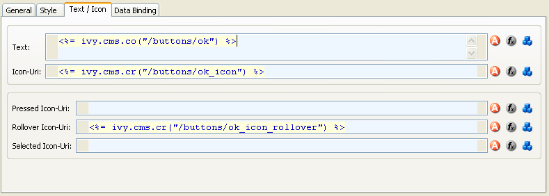
The Text/Icon tab shows the configuration for text/icon based widgets like buttons and labels.
- properties
-
Text: The text displayed on the widget (e.g. button)
Icon-Uri: Default icon displayed next to the text on the widget. Access the icons from the CMS via the
ivy.cms.crfunction.Pressed Icon-Uri: The icon that should be displayed if the button was pressed. If this field is empty, then the default icon from the text field Icon-Uri is displayed.
Rollover Icon-Uri: The icon that should be displayed if the mouse is over the widget. If this field is empty, then the default icon from the text field Icon-Uri is displayed.
Selected Icon-Uri: The icon that should be displayed if the widget is selected. If this field is empty, then the default icon from the text field Icon-Uri is displayed.
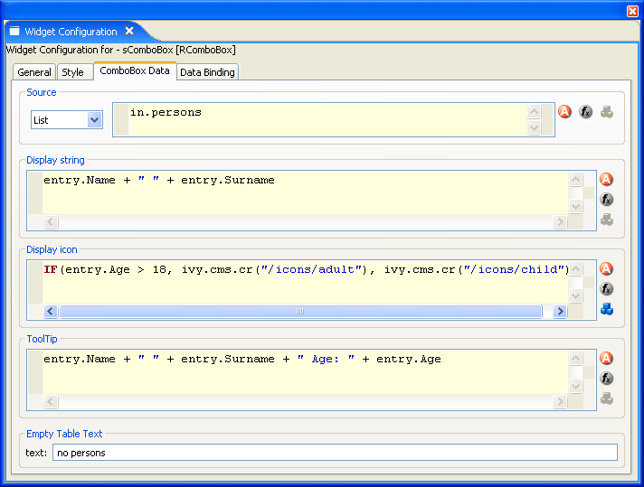
On the ComboBox Data tab you configure what to show in the combo box. You can configure the label, icon and the tool tip text for each entry in the combo box.
- sections
-
Source: Select the type of the source for your combo box. Either
ListorRecordset. Define in the IvyScript text field the path to your source.Display String: Use the IvyScript text field to enter what text to show for each entry in the combo box.
Display Icon: Use the IvyScript text field to enter which icon to show for each entry in the combo box, if any.
Tool tip: Use the IvyScript text field to enter what text to show as tool tip for each entry in the combo box.
Empty table text: Enter a plain text that will be displayed if the data source is empty.
On the Lookup Data tab you configure what to use in the lookup list of the lookup text field. A lookup text field shows only entries of the look list that match the search criteria specified in the RLookupTextField. You can set up the filter that interprets what the user types and searches accordingly. Per default a filter is set that filters the lookup list according to the user input with following characteristics. It searches case insensitive, and assumes free text between two words user types (e.g. typing "sun time" would show up lookup entries like "Sunday times", or "monsoon weather sometimes"). Right now you can configure the way the displayed text entries in the lookup list should be calculated using the listData (or recordData) just like on the combo box or on the list.
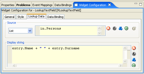
- sections
-
Source: Select the type of the source for your combo box. Either
ListorRecordset. Define in the IvyScript text field the path to your source.Display String: Use the IvyScript text field to enter what text to show for each entry in the lookup text field's lookup list (that appears when the user types a search expression).
On the List Data tab you configure what content to show in the list widget. You can configure the label, icon and the tool tip text for each entry in the List.
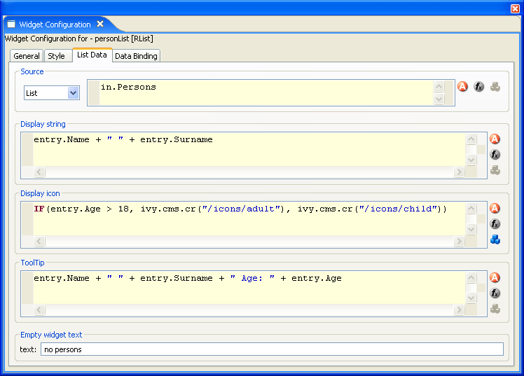
- sections
-
Source: Select the type of the source for your list. Either
ListorRecordset. Define in the IvyScript text field the path to your source.Display String: Use the IvyScript text field to enter what text to show for each entry in the list.
Display Icon: Use the IvyScript text field to enter which icon to show for each entry in the list, if any.
Tool Tip: Use the IvyScript text field to enter what text to show as tool tip for each entry in the list.
Empty Widget Text: Enter a plain text that will be displayed if the data source is empty.
On the Table Data tab you configure what content to show in the table. You can configure the data source for the table, but you can too filter the source to show only a certain part of the data source. Furthermore, you can influence the visual look and feel and set options such as label texts, icons and tool tip texts for each entry in the table.
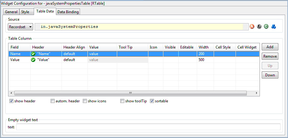
- Source
-
Select the type of the source for your Table. Either
ListorRecordset. Define in the IvyScript text field the path to your source. - Table column:
-
- Columns
-
Field: Define the name of the field of your data source to map to the current column. If your data source is a list, then the list elements (i.e. the runtime data class(es) of all list members) must contain a field with the configured name. If your data source is a recordset, then the records must have a field with the configured name. The value of the field is mapped to the variable
valuewhich you can use in the IvyScript text field.Header: Enter a text to display as header of the column. Use IvyScript macros if needed. example:
<%=ivy.cms.co("/labels/header")%>. Note hat this has only an effect if the Show Header check box is selected.Header Align: Select the alignment of the header text (default, left, center, right). Note that this has only an effect if the Show Header check box is selected.
Value: Enter a IvyScript expression to configure what label that should be displayed in the table cell.
Tool tip: Enter a IvyScript expression to configure what tool tip text that should be displayed in the table cell.
Icon: Enter a IvyScript expression to configure which icon should be displayed in the table cell.
Visible: Enter a IvyScript expression which results in a Boolean value, to configure the visibility of the column.
Editable: Enter a IvyScript expression which evaluates to a Boolean value, to configure the editable-state of the column. Note: also a simple
trueorfalseis allowed.Width: Enter the number of pixels the column should have in width, only works if the configured
autoResizeModeis set toAUTO_RESIZE_OFFCell Style: Select a table cell style if needed. To create new table cell styles use the configuration editor.
Cell Widget: Select a cell widget to customize the table cell rendering and editing. The cell widgets must be created in the Visual Editor, placed beside the panel. Each created cell widget must only be used once.
- Actions
-
Add: Adds a new column configuration to your table definition. The column configuration will be shown as row in the table columns configuration.
Remove: Removes the selected column configuration from your table columns configuration.
Up: Moves a table columns configuration up in the table. This means that the column moves one position to the left in the resulting table.
Down: Moves a table columns configuration down in the table. This means that the column moves one position to the right in the resulting table.
Show header: Activate this check box if you want your table to have a header row.
Autom. header: Activate this check box if you want the system to label your headers.
Show icons: Activate this check box if you want to decorate your table with icons.
Show tool tip: Activate this check box if you want your table to support tool tips per table cell.
Sortable: Activate this check box if you want your table to be sortable. Clicking on the header of a column triggers then a sorting of the whole table according to the selected column.
- Empty widget Text
-
Enter a plain text that will be displayed if the data source is empty. Note that the column titles will be hidden when the text is shown.
Note
When a entry of a data source was changed, a call to elementChangedAt() on the source is needed. Otherwise the UI will not be updated. This is only required when the effected entry was not added to the list and the change of the entry has an effect to the UI.
Short example: When a list myList is bound to a RTable, after the instruction
myList.get(x).myAttribute = 123 a call to
myList.elementChangedAt(x) is needed, otherwise the new value
123 isn't displayed in the UI.
Note
When an expression of a column definition includes the in-object AND
a row-based variable (entry, recordset or
value) and only the in-attribute has changed, then you have to call
RTable.refresh() in order the changes getting effect on the UI. Otherwise there is no
guarantee, that the ui side is up to date after the data binding.
Short example: An editable expression looks like: "in.editable &&
entry.editable", when now only the attribute in.editable has
changed, a call to RTable.refresh() is required. Otherwise the change
on in.editable has no effect on the ui.
The Cell Widget tab shows the configuration data mapping between the combo box and the cell.
The tab is only visible if a RComboBoxCellWidget is selected.
If it is not visible, go to: Window -> show View -> Widget Configuration and select the tab Cell Widget in the opened view "Widget Configuration".
- Cell Binding
-
Specify the data binding between the combo box and the table cell value, if needed. Per default (empty) the whole selected entry is mapped to the table field.
Field: Specify the field (or a sub field/value) of the combo box entry, which is used for the data binding between the combo box and the table cell. The returned value from the defined field will be set to the cell value on user selection. Also backwards, the cell values from the table are compared with each defined field value. The found entry will be displayed in the combo box. Note: The mapping values are cached after the first usage.
On the Tree Data tab you configure what content to show in the Tree widget. You can configure the tree, based on the type or information of the tree node by adding some filters.
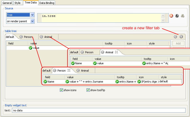
- Source
-
The type of the source must be
Tree. Define in the IvyScript text field the path to your source. The second combo box lets you configure the rendering behaviour of the tree. If you select on render parent or on expand parent then the tree is lazy loaded and the tree widget firesTreeLoadevents to let the user populate the tree. The difference between the two modes is the moment when the tree widget fires theTreeLoadevent. If you set the mode to on render parent then the tree widget fires the event as soon as the parent gets visible on the user interface. If you select on expand parent then the event fires only if the user really expand the parent node. If you configure the last mode (on expand parent) then the '+' sign is always rendered for the parent node unless you set themayHaveChildrenflag of the tree node to false. - Table Tree
-
- Columns
-
Field: Define the name of the field of your data source to map to the current column. This is only allowed on a object-type based filter tab. The name entered in the filed cell must map to a property of the value of the Tree node. The value of the field is mapped to the variable
valuewhich you can use in the Ivy Script text field.Value: Enter a IvyScript expression to configure what label should be displayed in the tree row.
Tool tip: Enter a IvyScript expression to configure what tool tip text should be displayed in the tree row.
Icon: Enter a IvyScript expression to configure which icon should be displayed in the tree row.
Style: Select a table cell style to use as style for the tree row if needed. To create new table cell styles use the configuration editor.
- Actions
-
Show Icons: Activate this check box if you want to decorate your tree with icons. The check box is only visible on the default filter tab.
Show Tool Tip: activate this check box if you want your tree to support tool tips per row. The check box is only visible on the default filter tab.
- Empty Widget Text:
-
Enter a plain text that will be displayed if the data source is empty.
On the TableTree Data tab you configure what content to show in the TableTree widget. You can configure the TableTree, based on the type or information of the tree node by adding some filters.
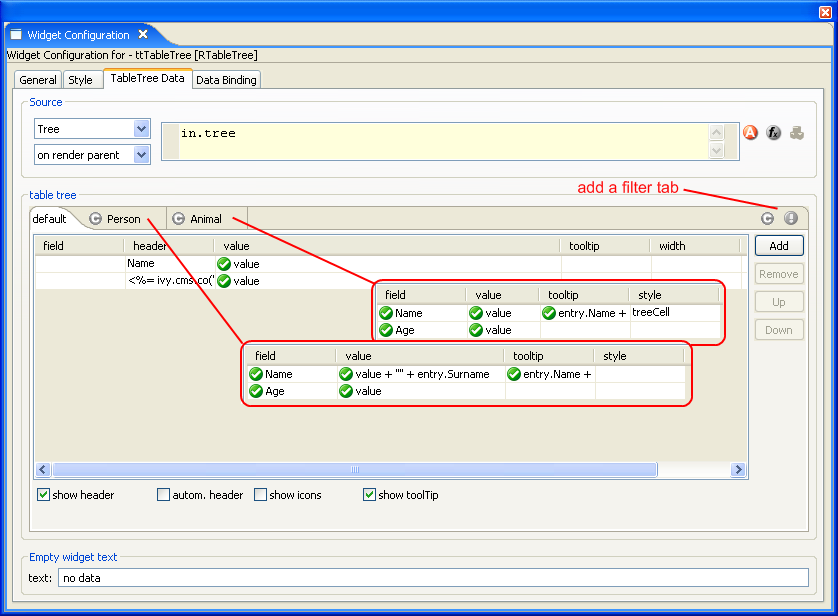
- Source
-
The type of the source must be
Tree. Define in the IvyScript text field the path to your source. The second combo box lets you configure the rendering behaviour of the tree. If you select on render parent or on expand parent then the tree is lazy loaded and the tree widget firesTreeLoadevents to let the user populate the tree. The difference between the two modes is the moment when the TableTree widget fires theTreeLoadevent. If you set the mode to on render parent then the TableTree widget fires the event as soon as the parent gets visible on the user interface. If you select on expand parent then the event fires only if the user really expand the parent node. If you configure the last mode (on expand parent) then the '+' sign is always rendered for the parent node unless you set themayHaveChildrenflag of the tree node to false. - Table column:
-
- Columns
-
Field: Define the name of the field of your data source to map to the current column. This is only allowed on a object-type based filter tab. The name must map to a property of the data source. The value of the field is mapped to the variable
valuewhich you can use in the IvyScript text field.Header: Enter a text here to be displayed as header of the column. Use IvyScript macros if needed. example:
<%=ivy.cms.co("/labels/header")%>Value: Enter an IvyScript expression to configure what label should be displayed in the tree row.
Tool Tip: Enter an IvyScript expression to configure what tool tip text should be displayed in the tree row.
Icon: Enter an IvyScript expression to configure which icon should be displayed in the tree row.
Width: Enter the number of pixels the column should have in width. Only works if the configured
autoResizeModeis set toAUTO_RESIZE_OFFStyle: Select a table cell style to use as style for the TableTree cell if required. To create new table cell styles use the configuration editor.
- Actions
-
Add: Adds a new column configuration to your TableTree definition. The column configuration will be shown as row in the TableTree columns configuration.
Remove: Removes the selected column configuration from your TableTree columns configuration.
Up: Moves a TableTree columns configuration up in the table. This means that the column moves one position to the left in the resulting TableTree.
Down: Moves a TableTree columns configuration down in the table. This means that the column moves one position to the right in the resulting TableTree.
Show Header: Tick this check box if you want your TableTree to show a header row. The check box is only visible on the default filter tab.
Autom. Header: Tick this check box if you want the system to label your headers. The check box is only visible on the default filter tab.
Show Icons: Tick this check box if you want to decorate your TableTree with icons. The check box is only visible on the default filter tab.
Show Tool Tip: Tick this check box if you want your TableTree to support tool tips per row. The check box is only visible on the default filter tab.
- Empty widget Text
-
Enter a plain text that will be displayed if the data source is empty.
The Validation tab shows the configuration for the client side validation for widgets the user can input data into.
- Mandatory
-
Activate this check box if the user must enter a value in the text field.
- Type
-
Select the type of validation that should be applied to the value entered by the user. See the Configuration Editor for information about how to create your own input validation configurations.
The IvyScript editor widget allows you to enter IvyScript expressions, IvyScript snippets or IvyScript macros combined with plain text. The background color of the IvyScript Widget signals what syntax is allowed. Is the background color yellow, then you have to enter pure IvyScript. Depending on the context this IvyScript Widget is embedded, you have to enter a expression or a whole IvyScript snippet.
If the background color of the IvyScript Widget is blue, then only the IvyScript macro syntax is accepted. Enter plain text combined with IvyScript macros.

-
Code completion (Ctrl+Space): By pressing the '.' character or by pressing Ctrl+Space the code completer shows you some code completion proposals depending on the already entered expression.
-
Quick Assist (Ctrl+1): There are Quick Assists available to create or use content objects in the current Rich Dialog. Simply press Ctrl+1 on a text. A newly created content object can directly be renamed in the IvyScript Editor. Just type a new name and confirm with Enter, to abort the renaming press Esc.
-
Zoom: By pressing the F2 key, a new dialog opens with the zoomed IvyScript editor.
-
Link to CMS (F3 or Ctrl)Press the F3 key on a ivy.cms.co(...) expression to jump to the corresponding CMS content object. Alternatively press Ctrl and click on the expression.
-
Smart Buttons:
 Use the smart buttons to insert predefined IvyScript expressions or
IvyScript macros into your editor.
Use the smart buttons to insert predefined IvyScript expressions or
IvyScript macros into your editor.
The Axon.ivy Outline view shows outline information of the current Rich Dialog and offers some actions to configure it. Furthermore, the Outline view helps you to compose Rich Dialogs by supporting Drag and Drop of elements from the outline tree into the Rich Dialog editor to create data bindings and event mappings.
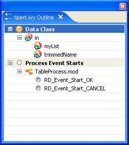
- Shows a tree containing two root elements:
-
- Data Class Fields
-
Data Class fields are decorated with data binding arrows. A green left arrow indicates a up binding (data to UI), a blue right arrow indicates a down binding (UI to data) and a left-right arrow indicates a bidirectional binding. The decoration should also work if the binding is complex (includes #, line breaks, brackets,...).
- Event Process Starts
-
The Event Process Starts are decorated with blue right arrows if they are mapped to a UI element.
- Refresh
-
The outline tree should refresh itself whenever a resource changes. (Data Class, Rich Dialog, Event Process Starts)
- DnD
-
Drag tree items onto the visual editor to add mappings and bindings to your rich dialog. See DnD for more information.
- Context menu - Create Rich Dialog Widgets
-
Creates a label and a data widget in the currently opened Rich Dialog for the selected data class field. A Dialog pops up asking you to specify the details of the widgets you want to create.
- Menu "Refactor Label Text"
-
Create CMS node: Creates a CMS node for the text of the label. The name of the CMS reference is configured by the string that is currently defined as "Label Name".
Guess from CMS (CONTENT): Looks up in the CMS if it can find a node with the content string that is equal to the one set as "Label Name".
Guess from CMS (URI): Looks up in the CMS if it can find a node whose URI contains the string that is equal to the one set as "Label Name".
- Dialog
-
The details of the pair are shown in the dialog. Not all details are configurable for all type of "Label Widget - Data Widget" pairs. If you select more than one element in the tree, then only all the common configuration details are enabled, the varying options cannot be manipulated.
Property Node Name: Prefix for the name of this "Label Widget - Data Widget" pair in the panel data class, e.g. the label for the pair eRMMessagenumber will be referenced by eRMMessagenumberRLabel.
Label Name: The string that will be shown in the GUI as label text.
Label Style: The style of the label of the "Label Widget - Data Widget" pair
Data Widget Type: The type of the data widget e.g. RTextField, RComboBox, ...
Data Widget Style: The style of the data widget used for the data widget chosen above.
Data Binding Direction: The direction of the data binding
Data Binding UI Field: The field on the Rich Dialog side of the data binding. e.g.
textortoolTipTextfor a "Label Widget - Data Widget" pair that has a RTextField as its type of the data widget.Validation (only for RTextField) Mandatory: If the user must enter a value in this field
Validation (only for RTextField) Type: The name of the validation configuration reference.
At last, you have to place the widgets into your Rich Dialog using the Rich Dialog editor. First you have to place the label and secondly you have to place the data widget, e.g. the RTextField. Press the ESC key to cancel the action.
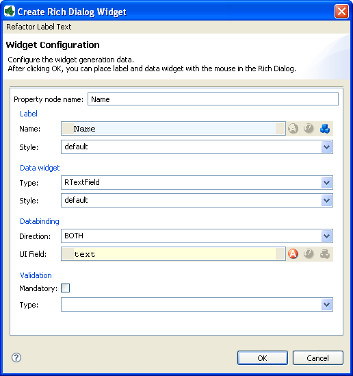
The Data Binding view shows which process data fields are bound to which user interface widget properties. See Data Binding section for a more detailed explanation of the concepts of data binding.
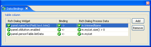
Note
The -> (down) data bindings will be executed at every Rich Dialog Start element (e.g. Rich Dialog Event start or Rich Dialog Method start) except the Rich Dialog Start method element. The <- (up) data bindings will be executed at every Rich Dialog Process End element.
- Columns:
-
Rich Dialog Widget: Enter the path to the rich dialog widget's property that you want to use for your binding.
Direction:
- ->
-
A down data binding. Maps the data from the user interface widget property to your process data property.
- <-
-
An up data binding. Maps your process data property to the user interface widget property.
- <->
-
A bi-directional data binding. Maps in both directions, from the widget property to your process data at Rich Dialog process starts and back to the user interface at the end of them.
Rich Dialog Process Data: Enter the path to your Data Class attribute that you want to bind to the widget's property. Use IvyScript functions to manipulate your data before the binding. If you do so, then you are only allowed to bind the data in one direction (from process data to ui).
panel.myWidget.text        "from/to "          in.name
panel.myWidget.text.trim() "to (ui to data)"   in.name
panel.myWidget.text        "from (data to ui)" in.name.trim()
- Refresh
-
The table should refresh itself whenever a resource changes.
- Cell Editing
-
Use the F2 Key to enlarge the cell editor.
Use the Smart buttons, to get a faster access to your properties.
Use the auto completer to find your properties easier.
The New Event Mapping wizard lets you map a user interface events (e.g. a
RButton) to Rich Dialog events.
With the wizard you can create several types of mappings:
- GUI Events
-
GUI (graphical user interface) events are triggered by the user, e.g. a mouse click leads to an
Actionevent on aRButton. - Display Events
-
On the panel you have access to the
LOADandUNLOADevent of the Rich Dialog panel. - Embedded (inner) Rich Dialog Events
-
If you embedded a inner Rich Dialog onto your current Rich Dialog then the
Fired Eventsof the embedded Rich Dialog are displayed to map to a process start of your current (outer) Rich Dialog.
Make your choice from left to right. Start with the selection of the source widget from the tree widget on the left. The configuration propositions on the right change when the selection changes on the left.
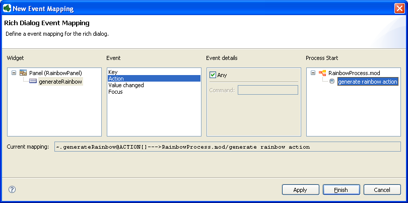
Rich Dialog editor -> context menu of a widget (e.g. a RButton) -> New Widget-Event to Process Mapping
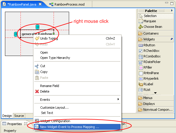
- Widget
-
Choose the source widget from whose events you want to map one.
- Event
-
Choose the event to map.
- Event details
-
Depending on the chosen widget and event, you have here the opportunity to configure the details of the event.
- Process Start
-
Finally select the Rich Dialog process start that should be triggered after the chosen widget event was fired.
Note
If the tree is empty, then you have to define some
Rich
                                    Dialog Event starts
in your Rich Dialog logic first.
Tip
It is also possible to define the event mappings by Drag and Drop. Open the Ivy Outline View to use it.
The Axon.ivy Event Mapping view shows which widget events are mapped to which Rich Dialog events.
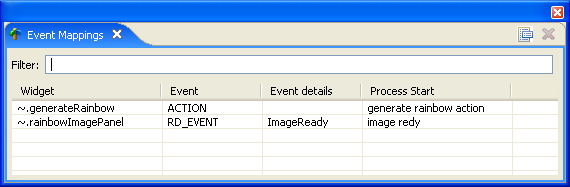
- Focus

-
Lists only the event mappings of the selected widget in the Rich Dialog editor.
- Delete

-
Removes the selected event mapping.
- Filter
-
Enter a string to filter the listed event mappings.
- Widget
-
Shows the source widget of the event that is mapped.
- Event
-
Shows the mapped event of the chosen widget.
- Event details
-
Shows the details of the mapped event if any.
- Process Start
-
Shows the Rich Dialog event that should be triggered after the widget event has been fired.
- Edit an Event Mapping
-
To edit a event mapping, just double click on the list entry. The Event Mapping Wizard will open. Make sure that the Rich Dialog editor is the active editor and a widget is selected.
The Axon.ivy Designer offers you to use Drag and Drop while creating your Rich Dialog panel. Drag and Drop can be used to:
-
map Rich Dialog Event starts to your Rich Dialog widget events
-
create data bindings from Data Class attributes to your Rich Dialog widgets
-
associate CMS objects to widget properties
As Drag source you need the Ivy Outline view or the CMS view. As Drop target you need to point to a widget in an open Rich Dialog editor.
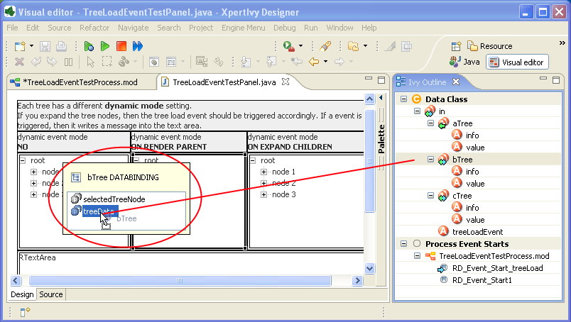
If you drag an element (e.g. a Data Class field in.myName) onto the Rich
Dialog editor over a label widget, then after some milliseconds a popup window appears
and shows the possible mapping destinations. If you wait longer, more mapping proposals
will appear. Drop your in.myName over the proposal text in the
popup and the data binding is created.
If you do not wait until the popup appears, and you drop the in.myName
over the label widget, then a predefined proposal will be used to create the data
binding. The generation of the proposals in the popup is configurable as well as the
auto-bind if you do not wait until the popup appears. But this configuration is out of
scope of this document.
The Rich Dialog User Context is a concept to store data for a Rich Dialog for the user currently logged in. E.g. it is possible to store the last search string of a search dialog inside the context to show this string next time the user opens the panel again. Therefore the Rich Dialog User Context only works when a user is logged-in. When no user is logged-in, the context is empty and each interaction with the context has no effect.
- Following Public API allows you to set and get data from the Rich Dialog User Context:
-
ivy.rd.context.setAttribute(String key, String value): Associates the specified value with the specified key in the current Rich Dialog User Context.ivy.rd.context.getAttribute(String key) : String: Returns the value of the specified key from the current Rich Dialog User Context.
Axon.ivy itself uses the Rich Dialog User Context to store the UI-State of certain widgets.
Restrictions
Do NOT use the Rich Dialog User Context for business relevant data. It is not guaranteed, that the data can be restored in each situation. When the structure of the a Rich Dialog changes (e.g. the field name of a component inside the Rich Dialog) to lookup of the context can fail, without any message.
Basically the context is designed for non business-critical information like UI-State.
The configuration of the Rich Dialog User Context will be done in the Rich Dialog Call element inside a Process and in the Rich Dialog Start element inside a Rich Dialog logic.
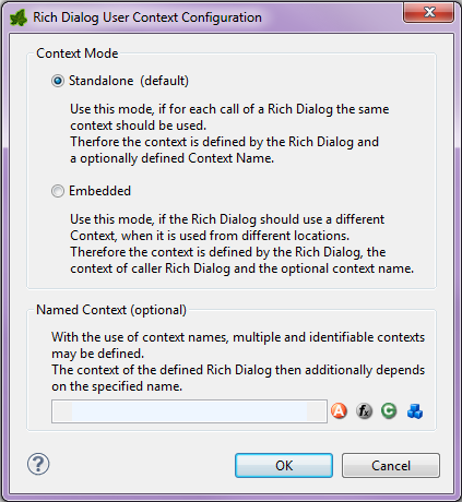
The context mode allows to configure two modes, Standalone and Embedded:
Use this mode, if for each call of a Rich Dialog the same context should be used. Therefore the context is defined by the Rich Dialog (e.g. ch.foo.bar.MyRichDialog) and a optionally defined Context Name (e.g. MyContext).
If this configuration is made for a Rich Dialog Call element the configured Rich Dialog is used. If this configuration is made for a Rich Dialog Start element, then the embedded Rich Dialog is used.
The context identification is: User, Rich Dialog and
optional Context-Name
Use this mode, if the Rich Dialog should use a different Context, when it is used from different locations. Therefore the context is defined by the Rich Dialog, the context of parent Rich Dialog and the optional context name.
If this definition is made for a Rich Dialog Start element, the parent Rich Dialog of the embedded Rich Dialog is used as parent Rich Dialog. If this configuration is made for a Rich Dialog Call element , the Rich Dialog which triggers the call of this element is used as parent Rich Dialog.
The context identification is: User, Rich Dialog,
parent Rich Dialog and optional Context Name
With the use of context names, multiple and identifiable contexts may be defined. The context of the Rich Dialog then additionally depends on the specified name. This configuration can be done for both modes, the context name is simply added to the context identification.
The Rich Dialog Call
element is by default configured as Standalone. Therefore by
default such a Rich Dialog will always have the same Context.
For embedded Rich Dialogs inside the Rich Dialog Start element the
default context-mode is configured as Embedded. Therefore all embedded
Rich Dialogs are linked to the parent Rich Dialog context.
This section describes how to configure the context for a small application, like a News Reader.
Each time the Rich Dialog NewsReader is called, the same context should
be used. So the user will get the same context each time when he opens the Rich Dialog
NewsReader.
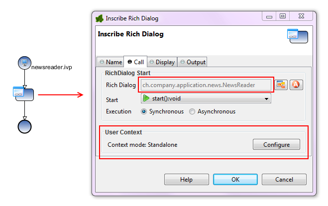
The Rich Dialog NewsReader is used e.g. for financial and local news. The
context should be different. The user likes to have one context for financial news and
one for local news.
Each time the Rich Dialog NewsReader is opened with the context-name
FINANCE, this specific Rich Dialog User Context will be used. There
is no difference from which location (Rich Dialog Call element) the Rich Dialog is
opened.
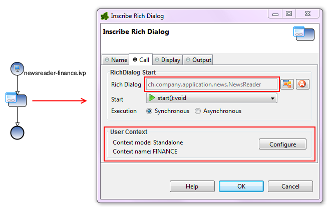
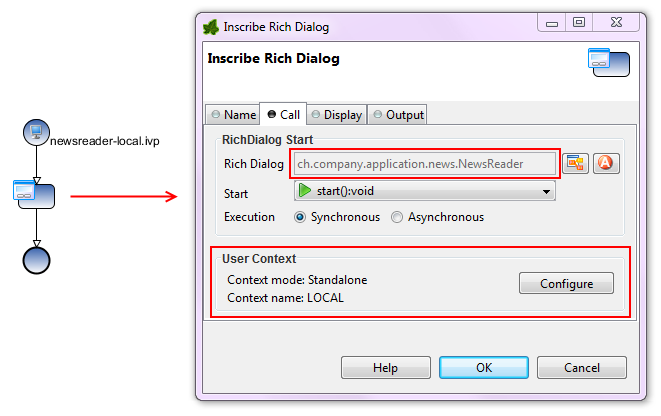
The Rich Dialog NewsReader contains two embedded Rich Dialogs, the
NewsList and the NewsConfiguration. The embedded Rich
Dialog NewsList has configured the context mode Embedded,
because the context is depending on it parent Rich Dialog Context, the
NewsReader context. Therefore separate contexts will be used for financial
and local news, as defined in the NewsReader Rich Dialog. The embedded Rich
Dialog NewsConfiguration contains the global configuration of all news
readers in the application. Therefore the context mode is Standalone. It
should always use the same context without dependency to the context of the
NewsReader.
The context of the Rich Dialog NewsList is linked to the parent Rich
Dialog NewsReader. Therefore, related to the configuration of the
parent Rich Dialog two contexts will be created. One for finance news and one for
local news.
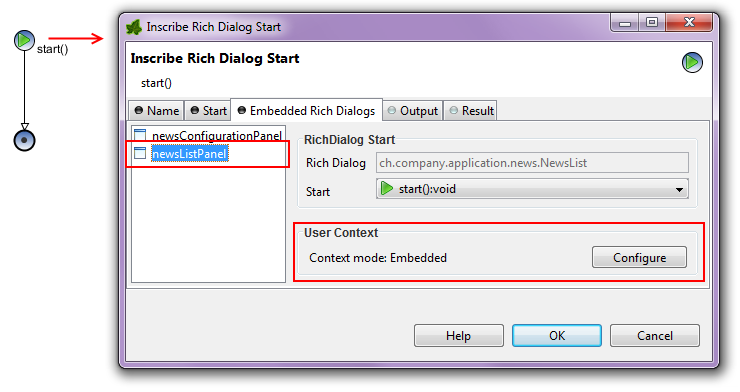
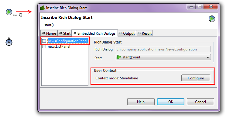
The Rich Dialog UI State stores and restores a part of the UI state. The state is stored automatically when a windows closes. At startup of a window, the last known state is restored automatically too.
The data is stored on the Rich Dialog User Context. Therefore, when no user is logged-in, this functionality is disabled.
- Following public API allows to force a store or restore of the UI State:
-
ivy.rd.context.storeUiState(): Stores the UI state in the context of the called Rich Dialog. Also the UI State of all embedded Rich Dialogs will be stored too.ivy.rd.context.restoreUiState(): Restores the UI state in the context of the called Rich Dialog. Also the UI State of all embedded Rich Dialogs will be restored too.
Currently the following widgets are supported:
- Supported widgets:
-
Dialog / Window: The size and the location of a window / dialog on a screen.RSplitPane: The relative position of the divider in the RSplitPane.RTable: The column position, width and order.
This chapter explains the usage and configuration of all available Rich Dialog widgets. All widgets are sorted alphabetically, regardless of their category.
Button groups are used to logically group exclusively selectable widgets (e.g. radio buttons or toggle buttons). In order for a button group to effectively control the select state of it's guarded components it must be associated specifically with each widget that it contains.
Button groups do not have a visual representation and must therefore be placed next to the panel rather than on the panel itself:
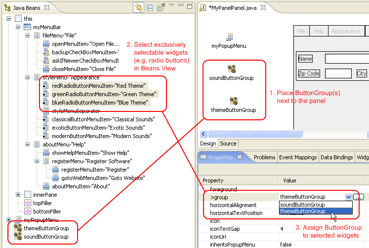
To associate a button group with a widget, you first select the widget(s) inside the Visual Editor or inside the Beans View and then set the button group object to be associated on the group attribute in the Properties View, as demonstrated above.
| Symbol on Palette |
|
| Category | Non Visual Widgets |
| Purpose | Logically group a number of selectable items and ensure that at most one is selected at a time. |
| Events | - |
| Important Properties | - |
Table 6.13. ButtonGroup Summary
 |
 |
The chart widgets can be used to display numeric data in a graphical way. Two types of charts are supported, pie charts for small one-dimensional data sets and and bar charts for two-dimensional data. The charts widgets must be primarly used with a Java API, there is only limited tool support in Axon.ivy, e.g. there is no Drag and Drop of events for the event mapping or there is no widget configuration view.
To add a chart widget to a Rich Dialog use the Choose Bean entry from the palette in the Visual Editor. Then choose
either the ULCVPieChart or the ULCVBarChart and place it on the
Rich dialog. Alternatively you can use the widgets by adding the corresponding code in the
Java source of the Rich Dialog yourself. You can set most of the properties in the
properties view of the Rich Dialog perspective. But full support for the widgets is only
given in code, either in Java by enhancing the Rich Dialog source file manually or by
accessing the widget with IvyScript.
Both charts can be used in 2D or 3D, for 3D charts use the appropriate constructors
ULCVPieChart(boolean is3DChart) and ULCVBarChart(boolean
is3DChart) respectively. Both charts can optionally display a legend, can use
titles and sub titles and both offer adding a listener to be notified when the user clicks
on the pie or bar. Use addMouseListener(IChartMouseListener<EV extends
ChartMouseEvent>) then you get either a BarMouseEvent or a
PieMouseEvent that you can query for more information about the
click.
Pie charts are ideal to display small one-dimensional data sets with only some values. Use
addPieSlice(PieSlice slice) or setPieSlices(List<PieSlice>
slices) to add data to the pie chart. In addition to the value it is possible to
set a solid color or a gradient and a title (only by constructor) for each slice.
For two-dimensional data, bar charts are better suited. You can add data by using
addDataSeries(DataSeries series) or setDataSeries(List<DataSeries>
series). A data series is a list of values that belong together and each value is
represented as a bar in the same color/gradient. The other axis is defined by categories
that group together the values with the same index from different data series. In other
words, the values of the data series represent the y-values where as the categories are the
x-values. For data series with lots of values, the bar chart widget supports paging. Switch
it on with setPagingEnabled(true). It's even possible to configure the number
of values per page and whether the coordinate system should be the same for all pages or
whether it should be scaled.
Both widgets support the most important visual settings for charts such as background colors/gradients and transparency, shadows, tool tips and setting the fonts and font sizes of the texts used in the charts (values, axis labels, titles).
The RBooleanCellWidget is like a check box for table editing. Check boxes are used to let the user select an option.
The mapped table cell value shout be a boolean value, like true or
false.
The check box will generate both an Action Event and a Value Changed event if it is selected or deselected.
You can provide your own selected and unselected icons (if you want to replace the standard check mark).
| Symbol on Palette |
|
| Category | Action / Selection widget |
| Purpose | A check box to display and change a boolean cell value. |
| Events | Action, Focus, Key |
| Important Properties | text, icon, pressedIcon,
rolloverIcon, selectedIcon,
toolTip |
Table 6.14. RButtonCellWidget Summary
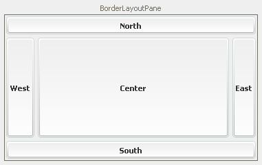
A border layout pane is a container which arranges its components using a Border Layout. Essentially, a border layout consists of 5 areas: North, East, South and West which are arranged around the Center. The component in the center always consumes as much of the available space as possible. The surrounding components are stretched accordingly.
You can specify the amount of vertical and horizontal spacing in between the 5 areas by setting
the vGap and hGap properties, respectively.
Tip
Not all areas of a border layout have to have a component assigned. If an area stays empty, it will not consume any space (except for the center, which will also consume all available space if it does not have a component assigned). It is common practice to use only the center in combination with one or two of the remaining sections.
| Symbol on Palette |
|
| Category | Container widget |
| Purpose | A container which uses a Border Layout to arrange its components. |
| Events | Focus, Key |
| Important Properties | hGap, vGap |
Table 6.15. RBorderLayoutPane Summary
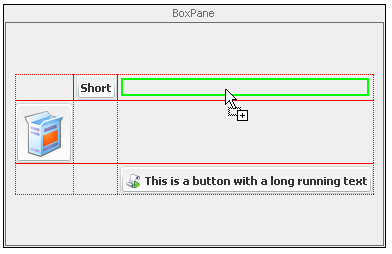
A box pane is a container which arranges its components using a Box Layout. Essentially, working with a Box Layout is similar to layouting with HTML tables. A box layout consists of n rows and mcolumns, where the height of each row and the width of each column are determined by the tallest or widest component, respectively. If a widget does not fill the available cell space, then it may be stretched and/or positioned inside the cell by defining its widget style properties accordingly.
You can specify the amount of vertical and horizontal spacing that is used between the rows and columns by setting
the verticalGap and horizontalGap properties, respectively.
| Symbol on Palette |
|
| Category | Container widget |
| Purpose | A container which uses a Box Layout to arrange its components. |
| Events | Focus, Key |
| Important Properties | horizontalGap, verticalGap |
Table 6.16. RBoxPane Summary
The browser widget can be used to show an embedded web browser.
Note
The web browser widget has no preview at design time in the Visual Editor. Instead the widget is rendered as a label of the configured size, which shows a Embedded Web Browser : <no preview> message.
The browser widget will generate Web Browser - COMPLETED event, every time a new web page is loaded.
Tip
You can also use the web browser to display HTML pages or other content that you prepared yourself. The content to display by the native browser can be set as a String on the content attribute.
| Symbol on Palette |
|
| Category | Information / Input widget |
| Purpose | An embedded native browser which can be used to display web pages. |
| Events | Web Browser, Focus, Key |
| Important Properties | Url, Content |
Table 6.17. RBrowser Summary
Buttons are typically used to start an action or to generate an event. The button generates an Action Event if it is clicked.
| Symbol on Palette |
|
| Category | Action widget |
| Purpose | A button with text and/or icon. |
| Events | Action, Focus, Key |
| Important Properties | text, icon, pressedIcon,
rolloverIcon, selectedIcon,
toolTip |
Table 6.18. RButton Summary
The action event of a RButton will be fired as soon as the
user clicks the mouse on it. It will also be fired, if the RButton owns the
focus and the user hits ENTER or SPACE.
If the focus owner does not support the action event, then the default button of the frame will be fired.
Note
To set a RButton as the default button of a Rich Dialog you have to
map the DISPLAY load event of the panel and implement the following
code snipped on the code tab of the event start
process element:
panel.getRootPane().setDefaultButton(panel.okButton);
The RButton can be rendered like a smart phone like badge, a clickable
icon paired with an overlay that displays a number. Such badges are typically used to
start dialogs, tools or processes that work on a list of entities, e.g. a badge could be
used to start a mail inbox dialog using the overlay to display the number of new unread
messages.
Set the setShowBadge() method to change between normal button and badge
mode and use the setBadgeValue() method to set the overlay content.
Buttons are typically used to start an action or to generate an event. The button generates an Action Event if it is clicked. The Button text, icon and tooltip are taken from the cell value.
To process the action event of the button, map the event to a Rich Dialog Process start in the Rich Dialogs panel logic. In the code tab of the Event Start Process step enter the following code:
import ch.ivyteam.ivy.richdialog.widgets.components.customrenderers.RButtonCellWidget;
RButtonCellWidget button = event.getSource() as RButtonCellWidget;
int row = button.getRow();
int column = button.getColumn();
| Symbol on Palette |
|
| Category | Action widget |
| Purpose | A Button with a text to start an action. The cell value are displayed as text. |
| Events | Action, Focus, Key |
| Important Properties | text, icon, pressedIcon,
rolloverIcon, selectedIcon,
toolTip |
Table 6.19. RButtonCellWidget Summary
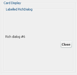
Displays are placeholder widgets onto which Rich Dialogs can be loaded dynamically at runtime. A Card Display works like a "stack of cards": only the last loaded Rich Dialog on top is visible. The previously loaded Rich Dialogs will become visible again if the top component is unloaded (i.e. removed).
A card display generates a Selection Changed Event if a new Rich Dialog is loaded onto it.
Warning
In order to being able to address a display widget (when loading a Rich Dialog with a RD Process Element) you must not forget to assign the display an unique id on the displayId property. If you fail to do so then the display might not be found at runtime and Rich Dialogs may not be loaded correctly.
| Symbol on Palette |
|
| Category | Display widget |
| Purpose | Placeholder for Rich Dialogs that are loaded dynamically at runtime. Shows only last loaded component. |
| Events | Selection Changed, Focus, Key |
| Important Properties | displayId, toolTip |
Table 6.20. RCardDisplay Summary
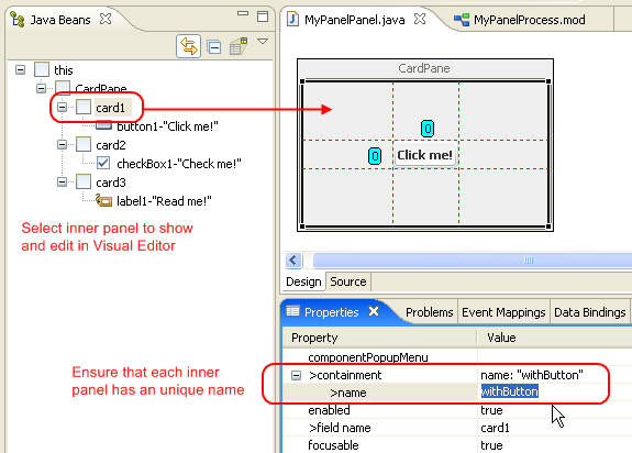
A card pane is a container which arranges its components using a
Card Layout. The components or containers
that are managed with a Card Layout are handled like a "stack of cards" where
only the top component is visible. In order to identify the contained elements (i.e. cards)
must be provided with an unique name. By setting a
name to the selectedName property of a card pane
the currently shown (i.e. top) component can be changed.
Any kind of widget or container can be a "card" on a card pane. Typically cards are containers, i.e. sub-panels, with an individual layout.
Tip
You can use the following example code to cycle through the cards of a card pane at runtime:
List<String> names = panel.CardPane.getNames();
panel.myCardPane.selectedName = names.get(in.cardIndex);
in.cardIndex = (in.cardIndex + 1) % names.size();
Place a button next to your card pane container on the main panel and associate it's action with a process that executes the above code. Each time when you click the button, the currently shown card will be changed.
Tip
When you work with a card pane in the Visual Editor then the editor area will only show the currently selected card. To change this (i.e. make another card visible) simply select one of the sub components of the card pane the Java Beans view.
Warning
It is absolutely crucial that each added card has an unique name assigned. Otherwise selection of the cards will not work correctly.
| Symbol on Palette |
|
| Category | Container widget |
| Purpose | A container which uses a Card Layout to arrange its components (only component is visible). |
| Events | Focus, Key |
| Important Properties | selectedName |
Table 6.21. RCardPane Summary
Check boxes are used to let the user select an option. The check box will generate both an Action Event and a Value Changed event if it is selected or deselected.
You can provide your own selected and unselected icons (if you want to replace the standard check mark).
| Symbol on Palette |
|
| Category | Action / Selection widget |
| Purpose | A check box with text that allows to select/deselect an option. |
| Events | Action, Focus, Key, Value Changed |
| Important Properties | text, toolTip, selected |
Table 6.22. RCheckBox Summary
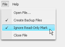
Check box menu items are menu entries that represent on/off options. They can be used both inside RMenu and RPopupMenu widgets. The standard check-box icon of a check box menu item can be replaced by setting a different Icon Uri and Selected Icon Uri in the Widget Configuration Text/Icon Tab. Generally, check box menu items behave exactly the same as a RCheckBox widgets.
Check box menu items generate both an Action event and a Value Changed event if they are selected or deselected.
Since check box menu items do not have a direct visual representation they should be placed directly on or below a menu widget inside the Java Beans View. This view allows you to comfortably set up menu hierarchies using sub menus and menu items:
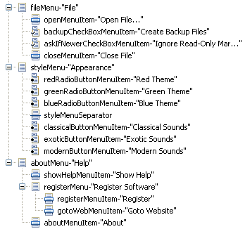
| Symbol on Palette |
|
| Category | Action widget |
| Purpose | A selectable (on/off) option item in a menu. |
| Events | Action, Value Changed, Key, Focus |
| Important Properties | text, selected, toolTip |
Table 6.23. RCheckBoxMenuItem Summary
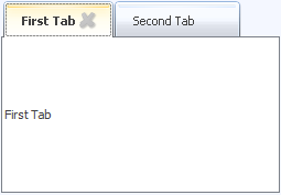
The RCloseableTabbedDisplay is an extension of the RTabbedDisplay but with closable tabs. Please consult the documentation of RTabbedDisplay
for general information about tabbed displays.
In addition to the RTabbedDisplay the RCloseableTabbedDisplay displays a close icon for each tab.
A Tab Closing Request event is generated, when a user clicks the
close icon of a tab. Processes that are mapped to this event can cancel the closing of the
tab by calling the cancel method on the event. If none of the mapped event
processes call the cancel method on the event, then the tab will be closed automatically at
the end of the event process.
The following process and ivyScript snippets show how to cancel the closing somewhere in the event process of the Tab Closing Request event:
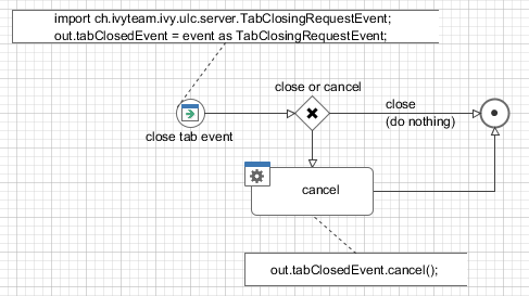
The close icon of the tab can be changed. For that the properties
tabCloseIconUri and tabInactiveCloseIconUri are provided. Set
a path to a CMS icon (for example /myIcons/closeIcon) to change the icons. If
only the tabCloseIconUri is specified, a gray version of it is used as the
inactive close icon.
| Symbol on Palette |

|
| Category | Display widget |
| Purpose | Extension of RTabbedDisplay to handle closing of tabs. |
| Events | TabClosingRequest, SelectionChanged, Focus, Key |
| Important Properties | displayId, tabPlacement, toolTip, tabCloseIconUri, tabInactiveCloseIconUri |
Table 6.24. RCloseableTabbedDisplay Summary
A collapsible pane is a container for exactly one sub component
(e.g. another container) which can be collapsed and expanded programmatically by setting
the property collapsed to true or
false respectively. By default a collapsible pane collapses
vertically.
You can switch off the animated collapse by setting the animated
property to false. In this case the embedded component will simply disappear or appear at once.
When working with a collapsible pane, a few things have to be taken into consideration. If a collapsible pane collapses with all it's content (i.e. effectively reduces it's size to 0), then extra space becomes available for all the other components on the panel.
This means that a collapsible pane can only be used within a container with a layout that in principle can handle the extra space, e.g. RGridBagLayoutPane or RBorderLayoutPane.
Furthermore the contents of the collapsible pane (including the collapsible pane itself) should never have any layout property set to request any extra space in the direction of the collapse (it's okay though to request any extra horizontal space, if the collapsible pane is oriented vertically).
To achieve those requirements, the following two layout structures are recommended:
1. Use a surrounding container with a GridBag Layout.
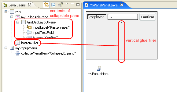
Assuming a vertical collapsing pane place a component that is configured to consume any extra space above or below the collapsible pane. This component will take up the extra space that becomes available when the panel collapses and will grow into that direction. Therefore the collapsible panel will shrink either from bottom to top or from top to bottom, depending on whether the "space consumer" is placed below or above, respectively. The example above simply employs a "vertical glue" RFiller component to consume the extra space.
2. Use a surrounding container with a Border Layout.
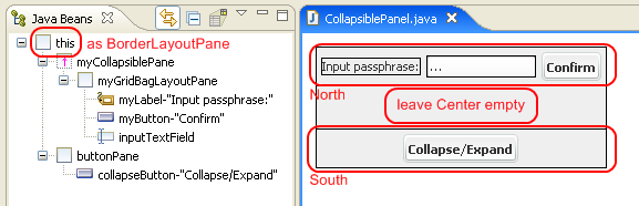
Assuming a vertical collapsing pane place the collapsible pane either into the north or south area of the surrounding container. If the panel collapses, the center area will receive and consume all extra space automatically and give it to the component which is placed there (if any). Therefore the collapsible panel will shrink either from bottom to top or from top to bottom, depending on whether is placed in the north or south area, respectively. Typically all other areas of the surrounding border layout pane stay empty.
| Symbol on Palette |
|
| Category | Container widget |
| Purpose | A container which has the ability to collapse (i.e. hide) and expand (i.e. show) a single embedded component. |
| Events | Focus, Key |
| Important Properties | collapsed, animated |
Table 6.25. RCollapsiblePane Summary
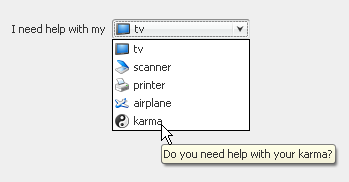
A combo box allows the user to select one from a pull-down list of multiple options.
A combo box generates an Action Event if an option is selected.
You can configure both the appearance and the source of the data that a combo box should show on the Combo Box data tab of the Widget Configuration View. You can specify text and/or icon as well as a tool tip for each entry depending on the entry's value itself.
The data source can either be a List, a Record
Set or an Enumeration. Depending on what is used, the
properties selectedListEntry, selectedRecord or
selectedEnumValue will return the currently selected value.
Note
If you have large lists to display in a Combo Box, you should set the
maximumRowCount property. This limits the number of rows that are shown
in the combo boxes drop-down list and instead offers a scroll bar to browse the whole
range of options.
Tip
The width of the combo box will be decided by the widest list entry of the provided
data. But what, if you load the data into the combo box lazily? Then the combo box will
change it's appearance after loading the data, which is often not desirable. You can
prevent this by setting a prototypeDisplayValue, which is a string that
will only be used to calculate the width of the initially shown combo box - but without
displaying the string itself.
| Symbol on Palette |
|
| Category | Data widget |
| Purpose | A combo box allows to select exactly one from a list of options. |
| Events | Action, Focus, Key |
| Important Properties | listData, recordsetData,
enumClassName, selectedIndex,
selectedListEntry, selectedRecord,
selectedEnumValue, maximumRowCount,
prototypeDisplayValue, font,
toolTip |
Table 6.26. RComboBox Summary
A combo box cell widget is similar to a normal combo box like the RComboBox.
A combo box allows the user to select one item from a pull-down list of multiple items.
A combo box generates an Action Event if a item is selected.
You can configure both the appearance and the source of the data that a combo box should show on the Combo Box data tab of the Widget Configuration View. You can specify text and/or icon as well as a tool tip for each entry depending on the entry's value itself.
The data source can either be a List, a Record
Set or a Enumeration. Depending on what is used, the
properties selectedListEntry, selectedRecord or
selectedEnumValue will return the currently selected value.
Note
You could define the mapped field between combo box value and the table cell value. See the Cell Widget Tab of the Widget Configuration View. for more details.
Note
If you have large lists to display in a Combo Box, you should set the
maximumRowCount property. This limits the number of rows that are shown
in the combo box drop-down list and additionally offers a scroll bar to browse the
whole range of options.
| Symbol on Palette |
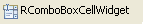
|
| Category | Data widget |
| Purpose | A combo box allows to select exactly one from a list of options. |
| Events | Action, Focus, Key |
| Important Properties | listData, recordsetData,
enumClassName, selectedIndex,
selectedListEntry, selectedRecord,
selectedEnumValue, maximumRowCount,
prototypeDisplayValue, font,
toolTip |
Table 6.27. RComboBoxCellWidget Summary
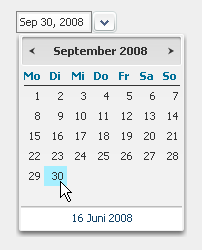
Date Pickers are used to query a date from an user. The date can either be entered
directly into the Date Picker's date field or be comfortably selected with the integrated
pop-up calendar (will start at the currently set date). The date picker widget is by default
not initialized (empty) , use the valueAsDate property to set another date. Use
the setDate() method with the parameter null to reset the
RDatePicker
The date picker widget generates an Action event if a new date has been selected.
Note
If you want to force a certain date format for a RDatePicker to show and
accept for input, then you should configure enable Validation in
the Widget Configuration view of the respective Date Picker widget. See also section
below.
The Widget Configuration View
shows an additional Validation
Tab if a RDatePicker is selected.
On this tab you can make this widget mandatory. You do not need any additional format validation for user entered dates, since the widget accepts only valid input. The widget uses the client language settings for date formatting.
Given that a valid format is ensured, you can access the value of a RDatePicker from
attributes date and valueAsDate.
The date field returns the selected/entered date value or
null if the input was invalid (be careful with Axon.ivy's Null Handling
feature).
The attribute valueAsDate delivers the selected date or a
Date.UNINITIALIZED_DATE value if the user input does not represent a
valid value.
The attribute firstDayOfWeek sets the day that starts the week. So that
setting e.g. the value "3" (which means Wednesdays, the default would be 1=Monday) then
weeks under each other will be displayed starting with Wednesdays. (see screenshot
below)
The attribute flaggedDates enables you to highlight some dates. You
should provide an array of dates that should be highlighted (just like on the screenshot
the 20 and 21.June).
The attribute daysOfTheWeek let you provide own titles for the days (see
screenshot: "Mi"=Wednesday, "do"=Thursday, etc.)
The attribute linkDate enables you to customise the label and the
destination date of the link at bottom of the picker (on the screenshot it is "3.Juni 2009", the default is today in the current
language).
The attribute timeZone let you change the time zone the date picker
should work with.
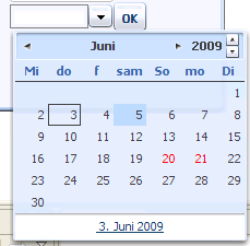
The date picker generates Action, Value Changed and as usual Focus Gained and Focus Lost events. The Action event occurs whenever a user picks a date, or when he enters it into the text field manually (and hits an Enter key or leaves the field). Meanwhile Value Changed occurs when a user leaves the widget and the value has changed.
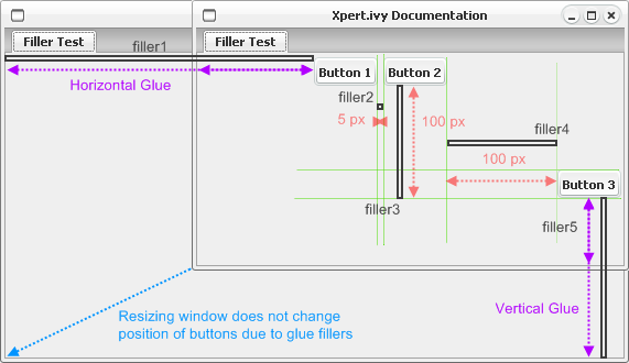
Fillers are invisible glue components that consume space in a specific layout. The can either have a rigid fixed size (in which case they simply keep a fixed distance between two components) or they can have a glue behaviour, in which case they consume additional space, e.g. if a window gets resized. The latter is typically the intended behaviour if fillers are used inside a GridBagLayout.
Tip
The real advantage of fillers only comes into play when they are used with style configurations. By using differently styled fillers you can later simply change the styles to adjust the distances kept instead of having to reconfigure each filler instance individually. However, when defining styles for fillers, keep in mind to use logical names for your styles: if you name a style "50x50px" it may lead to unclear behavior if you later redefine the filler style to occupy 40x30 pixels.
The style configuration of a filler define whether it is used as glue or as a rigid size block.
If the preferredIsExactSize style property of a filler is set to true, then the filler will
never change it's preferred size, no matter whether the layout changes due to resizing. In other words: the minimum and maximum
size will be set to the preferred size and all other properties will be ignored.
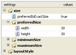
If the property is set to false, then the filler will behave as configured by the rest of the style properties, i.e. it will request to be displayed with it's preferred size, but may change size to the specified minimum and maximum size, if the managing layout manager (typically GridBagLayout) requests so, due to size changes of the surrounding container. In this way, the described glue behaviour can be achieved. By default, the styles verticalGlue and horizontalGlue are already available for all fillers.
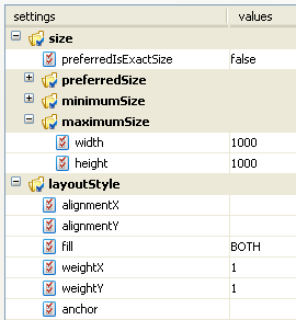
| Symbol on Palette |
|
| Category | Layout Helper widget |
| Purpose | Fillers consume space between widgets in a configured way. |
| Events | No events |
| Important Properties | Do not set properties of a filler directly, use pre-configured Styles instead. |
Table 6.29. RFiller Summary
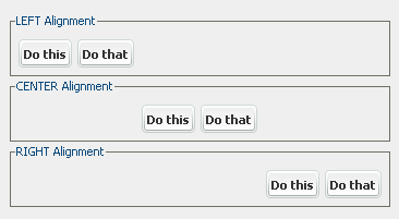
A flow layout pane is the simplest container layout available. It uses a Flow Layout where all added components are arranged in a single row. The row's contents are aligned either left, right or centered if extra space is available.
The desired alignment of components can be set with the alignment property.
The amount of horizontal spacing that is used between the components can be specified by setting
the hGap attribute. The amount of space that is added above and below the
components can be set with the vGap attribute.
Note
Usage of RFlowLayoutPane is generally not recommended. Use a flow layout only as a simple
solution if you need to arrange few (one or two) widgets of about equal height in a single row and
if you know that you have enough space available.
A common use is to put a flow layout into the north or south area of a RBorderLayoutPane to add, for example, a single button or a label. The surrounding flow layout will then prevent the automatic horizontal stretching of the component(s). But even here you should consider using a RGridBagLayoutPane with some horizontal glue filler components instead, because you'll stay more flexible.
| Symbol on Palette |
|
| Category | Container Widget |
| Purpose | A container which aligns it's added component left, centered or right in a single row. |
| Events | Focus, Key |
| Important Properties | alignment, hGap, vGap |
Table 6.30. RFlowLayout Summary
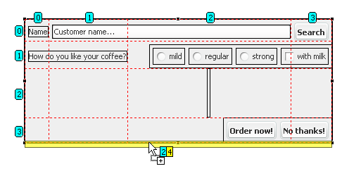
A grid bag layout pane is the most powerful container in terms of layouting, it uses a GridBag Layout to arrange it's components. In a grid bag layout components are arranged and aligned in a grid, but each component may span several grid cells both horizontally and vertically. The sizes of grid cells are generally determined by the tallest and widest components in their row or column, respectively. If a component has more space available than it's preferred size measures, then it may be instructed to consume the additional horizontal or vertical space or to align itself inside the cell, either at north, northwest, west, southwest, south, southeast, east, northeast or northwest position. By using nested containers that provide an own layout but for the area they occupy the design of forms is very flexible.
Because components can be configured to consume extra available space, grid bag layout containers are largely insensitive with respect to size changes of a window, for example. Components maintain their relative positions and may grow or shrink according to the configuration. By using RFiller components, placeholders can be used that have the sole purpose of consuming as much space as possible either horizontally or vertically or both.
Tip
When designing complex layouts with grid bag it is generally advisable to first sketch the screen that you want to create with a pencil on a piece of paper before starting to design on screen. In a next step you should then identify (perhaps with another color) the groups of components that might be layouted by a sub-container as well as the major horizontal and vertical layout guide lines, which will usually indicate the row and column borders. Finally you should then identify the components that may grow and shrink if the container is resized and possibly place filler components in strategic places, which may take up extra space.
Warning
The flexibility and power of grid bag layout may lead to some undefined results if configured improperly, especially when using cell spanning. Make sure that you understand the possibilities of the layout if you intend to create complexly layouted screens. You may for example consult GridBag Layout for a more detailed explanation of the features of this layout.
The following layout style properties are available for all components that are contained inside a grid bag layout pane:
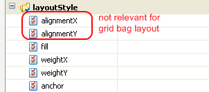
| Property Name | Description |
|---|---|
fill | Defines whether the component should consume extra space that becomes available. Options are: horizontal, vertical, both or none. |
weightX | Specifies the percentage of any extra available horizontal space that the component will consume. 0 means none and 1 means all. This value should add up to 1 over all components in a column. If the cumulated value is greater or smaller than 1 then the available space will be distributed to the components relatively to the specified values. |
weightY | Same as weight X, but for the extra vertical space. |
| Anchor | This setting has only an effect, if fill is not equal to both.
In the event of any extra available space the component will then "stick" to the position defined here, e.g.
to the top of the cell if north is defined or in the lower left corner if southwest
is defined.
|
Table 6.31. Style Properties for Grid Bag Layout
| Symbol on Palette |
|
| Category | Container widget |
| Purpose | A container with a very flexible and powerful row/column based layout manager. |
| Events | Focus, Key |
| Important Properties | - |
| Component Layout Properties | fill, weightX, weightY, anchor (see above) |
Table 6.32. GridBagLayoutPane Summary
A grid layout pane arranges it's components in n rows and m columns in cells of equal size according by using a Grid Layout. The size of the grid cells is determined by the tallest and the widest contained component. All components are stretched to this size. Components can not span across multiple columns or rows.
The horizontal and vertical space between rows and columns can be configured by setting
the hGap and vGap properties, respectively. The number of desired
columns and rows can be configured by setting
the columns and rows properties, respectively. The number of
columns will increase automatically by one, if more than n x m
components are added, but the number of rows stays constant at the configured value.
Because all contained components are forced to have the same size, this pane is usually only employed in special situations, e.g. for button panels, where it is desired for aesthetic reasons that all buttons have the same size, independent of the length's of their texts.
Note
Arranging the components of a grid layout pane in the editor area of the Visual Editor can be tricky or even impossible. You should always use the Java Beans View to line up the components in the correct sequence. The grid layout pane will fill then the grid in a row-by-row manner, starting with the first component in the top row.
If you want to keep grid cells "empty" you should place RFiller widgets as placeholders into the sequence of components. Inserting filler with a rigid size that is larger than those of all other components can also be used to define a prototype cell size which will be used for all other cells.
| Symbol on Palette |
|
| Category | Container widget |
| Purpose | A container which arranges it's components in n x m grid cells of equal size. |
| Events | Focus, Key |
| Important Properties | rows, columns, hGap, vGap |
Table 6.33. RGridLayout Summary
The html pane widget can be used to render a (small) HTML document on a label. Actually
it is between RBrowser and RLabel. RBrowser is capable to render more complicated HTML
pages, and it allows navigation for a user just like RHtmlPane per default. RLabel can also
render HTML content if you surround content with the <HTML> tag. Meanwhile
working with RHtmlPane we recommend starting the text that the widget should display with an
<HTML> tag.
Warning
RHtmlPane enables navigation just like a browser through HTML links per default.
Tip
To disable hyperlink navigation use the property veto to true. This case you may add VetoListeners that can decide if a Hyperlink navigation should be enabled. Per default there is no such VetoListener added, so that Hyperlinks will have no effect.
| Symbol on Palette |
|
| Category | Label widget |
| Purpose | A multi-line label which can display HTML texts with links. |
| Events | Focus, Key, Hyperlink |
| Important Properties | text, toolTip, veto |
Table 6.34. RHtmlPane Summary
A hyperlink can be used in place of a button. It takes less room and may look better in some places. An optional icon can also be provided, the configuration possibilities are equal to those of a button.
Hyperlinks are rendered in a different color, once they have been activated. The hyperlink generates both an Actionevent and a Clicked event if it is clicked.
| Symbol on Palette |
|
| Category | Action widget |
| Purpose | A hyperlink that can be activated with a mouse click. |
| Events | Action, Clicked, Focus, Key |
| Important Properties | text, icon, focus, key, toolTip |
Table 6.35. RHyperlink Summary
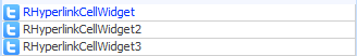
Hyperlinks are typically used to start an action or to generate an event. The hyperlink generates an Action Event if it is clicked. The hyperlink text, icon and tooltip are taken from the cell value.
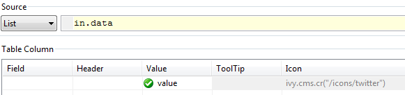
You will usually use RHyperlinkCellWidget if you need a clickable icon and / or text cell.
To process the action event of the hyperlink, map the event to a Rich Dialog Process start in the Rich Dialogs panel logic. In the code tab of the Event Start Process step enter the following code:
import ch.ivyteam.ivy.richdialog.widgets.components.customrenderers.RHyperlinkCellWidget;
Object source = event.getSource();
if(source instanceof RHyperlinkCellWidget) {
	RHyperlinkCellWidget hyperlink = source as RHyperlinkCellWidget;
	ivy.log.debug("" + hyperlink.getRow() + " : " + hyperlink.getColumn());
}
| Symbol on Palette |
|
| Category | Action widget |
| Purpose | A hyperlink with a text and / or icon to start an action. The cell value is displayed as text. |
| Events | Action, Focus, Key |
| Important Properties | text, icon |
Table 6.36. RHyperlinkCellWidget Summary
Labels are used to write short texts on the UI, e.g. for labelling text fields or for writing status or title messages. A label can have an optional icon to display, the relative position of text and icon can be configured, as well as the gap between them.
Labels are also capable of displaying simple HTML. Start the text that the label should display with an <html> tag. This way you can for example use the <font> tag to show parts of a text in a different color, or use <b> to render text or in bold type. Use <br> to render multiple lines.
Labels can be assigned to another widget by using the labelFor property. If this
property is set, the focus will be forwarded to the assigned widget, if the label receives it.
| Symbol on Palette |
|
| Category | Label widget |
| Purpose | A label which can display plain or simple HTML texts. |
| Events | Focus, Key |
| Important Properties | text, icon, toolTip, labelFor, font |
Table 6.37. RLabel Summary
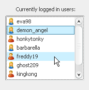
The list widget shows an arbitrary number of entries which are also available for (multi-) selection.
A list generates a List Selected Event if an entry is selected and an Action event if a list entry is double clicked.
You can configure both the appearance and the source of the data that a list should show on the List Data tab of the Widget Configuration view. You can specify text and/or icon as well as a tool tip for each entry depending on the entry's value itself.
The data source can either be a List or a Record
Set. Depending on what is used, the properties selectedListEntry;
selectedListEntries or selectedRecord; selectedRecords will
return the currently selected value(s). The selection mode (single selection, single
interval selection or multiple selection) can be set with the selectionMode
property.
With the property autoSelectFirstEntry you can have the widget select the
first data entry automatically (if data is present). This has also the effect, that a
call to clearSelection() will reset the selection to the first data entry
(instead of clearing). The property is set to false by default.
Note
Because lists tend to contain many items, it is recommended that you place RList widgets inside an RScrollPane container, so that they become scrollable if the number of items becomes too large for the allocated view port size.
| Symbol on Palette |
|
| Category | Data widget |
| Purpose | A list shows an arbitrary number of items and allows the user to select one or multiple entries from that list. |
| Events | List Selected, Action, Focus, Key |
| Important Properties |
listData, recordsetData, selectedIndices,
selectedListEntry, selectedListEntries, selectedRecord,
selectedRecords, autoSelectFirstEntry
|
Table 6.38. RList Summary
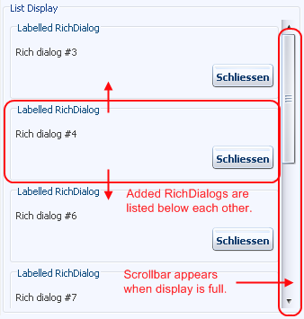
Displays are placeholder widgets onto which Rich Dialogs can be loaded dynamically at runtime. A List Display shows the loaded Rich Dialog panels as entries of a list.
A list display automatically shows a scroll bar if the number of loaded Rich Dialogs
exceeds the available space. You can configure and override this behavior by setting the
properties horizontalScrollBarPolicy and
verticalScrollBarPolicy to the respective values NEVER, AS_NEEDED
or ALWAYS in the properties view (the default is AS_NEEDED).
The RListDisplay does not support selection or offer selection events, but a Rich Dialog
can be scrolled into the visible area by either selecting it on the display with it's name
(i.e. the name that is provided by a call to
IRichDialogPanel.getName()).
Warning
In order to being able to address a display widget (when loading a Rich Dialog with a Rich Dialog Process element) you must not forget to assign the display an unique id on the displayId property. If you fail to do so then the display might not be found at runtime and Rich Dialogs may not be loaded correctly.
| Symbol on Palette |
|
| Category | Display widget |
| Purpose | Placeholder for Rich Dialogs that are loaded dynamically at runtime. Shows loaded components in a scrollable list. |
| Events | Focus, Key |
| Important Properties | displayId, horizontalScrollBarPolicy,
verticalScrollBarPolicy, toolTip
|
Table 6.39. RListDisplay Summary
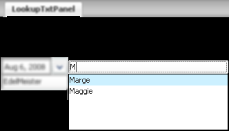
The RLookupTextField is a mixture between RTextField and RComboBox. The text field shows a list of suggestions while typing, the suggestions are filtered according to the entered text, as the user continues typing. At any point of typing, the user may choose to select one of the suggestions or stay with his input.
The selection of a suggested entry is performed if the user hits either Enter or Tab during typing. The user may use the up and down Arrow Keys or the mouse to select a specific entry from the suggestion list.
Events
As well as RTextField, RLookupTextField also offers events like Value Changed Event, Key Event and Selection Changed events.
Key Event is sent when ever a key is typed, the Value Changed Event is only sent when the user leaves the text field and the value has changed.
The Value Changed Event is transmitted synchronously and the Key Event is transmitted asynchronously.
Data
Data for an RLookupTextField is configured very similar to a RComboBox.You can configure both the appearance and the source of the suggestions that the text field shows on the Data tab of the Widget Configuration view. You can specify the display strings of the suggestions for each entry depending on the entry's value itself.
The data source can either be a List or a Record
Set. Depending on what is used, the properties
getSelectedListEntry() or getSelectedRecord() will return the
currently selected value. If no value from the suggestion list has been chosen, then
null will be returned by those methods.
Use getText() to get the text that is actually shown in the text field, which
may be different from the associated selection's model entry (e.g. if the user has entered a
text that does not match an entry, or if the entry's display string is different from the
entries value).
Special Properties
With the property lazyLookupIdleTime you can set an idle time in
milliseconds. The text field will wait for a pause in typing that is longer than this idle
time, before the entered text is sent to the server (thus filtering the displayed
suggestions). Setting an higher idle time is recommended, if your users type very fast and
feel annoyed by the fact, that the outgoing requests to filter large suggestion lists block
their input.
If the property forceSelection is set to true then only
selections from the suggestion list are accepted. The text field is then used merely to
filter the proposals. If the entered text does not match any of the suggestions it will be
marked as invalid. When leaving the text field, then invalid text will be discarded and the
text will be reset to the last selected valid value (which is possibly empty).
If the property forceSelection is set to false, then user input
which is not among the proposed entries will also be accepted. In this case, it may occur
that querying the selected value with getSelectedRecord() or
getSelectedEntry() results to null, because the user input
does not match any of the proposals. In this case you should use getText() to
access the text that was entered by the user.
If autoSelectFirstEntry is set to true, then the text of the
RLookupTextField will be initialized with the first entry of the data list.
| Symbol on Palette |
|
| Category | Input widget |
| Purpose | An RTextField that offers a lookup function to help text
selection from a list. As you begin to type your text a selection list
will appear. This list shows prefix matches with the text you typed
in. |
| Events | Key, Focus, Value Changed |
| Important Properties | listData, recordsetData,
selectedListEntry, selectedRecord,
valueAsString, lazyLookupIdleTime
autoSelectFirstEntry, forceSelection,
autoSelectFirstEntry |
Table 6.40. RLookupTextField Summary
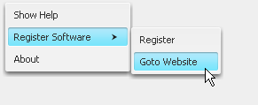
A menu is a container for RMenuItem (and similar) widgets. It can be nested within other menus, including RPopupMenu. Menus can also be added to a RMenuBar.
Menu widgets do not provide any events and they don't have any special properties worth mentioning, use the Widget Configuration Text/Icon Tab to set text and optional icon of a menu.
Since menu widgets do not have a visual representation on the panel they should be placed directly inside the widget tree of the Java Beans view. This view allows you to comfortably set up menu hierarchies using sub menus and menu items:
| Symbol on Palette |
|
| Category | Container widget |
| Purpose | Provide a container for menu items and thereby define contents of a menu. |
| Events | - |
| Important Properties | - |
Table 6.41. RMenu Summary

Menu bars are containers for RMenu widgets. A menu bar is constantly visible (as opposed to a RPopupMenu which only appears on demand) and shows the available top level menus with their name. If a menu is clicked, then it unfolds and displays it's entries which are then available for selection. Menu bars are typically placed at the top of a screen, but they don't have to.
Menu bars do not support any events and they don't have any special properties worth mentioning.
Note
Although menu bars do have a visual representation on the edited panel, the added menus should not be dropped onto the menu bar component inside the visual editor area. Instead they should be inserted below the menu's representation in the Java Beans view, where the hierarchical structure of the menu components becomes apparent.
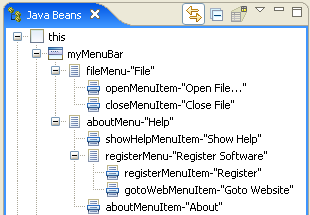
| Symbol on Palette |
|
| Category | Container widget |
| Purpose | A container for menu objects. |
| Events | - |
| Important Properties | - |
Table 6.42. RMenuBar Summary
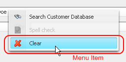
Menu items are the standard entries for RMenu and RPopupMenu widgets. They can have a text and/or icon. In fact, a menu item behaves exactly the same as a RButton in all aspects of its use.
Menu items generate an Action event if they are selected.
Since menu items do not have a direct visual representation they should be placed directly on or below a menu widget inside the Java Beans view. This view allows you to comfortably set up menu hierarchies using sub menus and menu items:
Note
In the current version of Axon.ivy you are not yet able to map the action for menu entries to process starts with drag and drop, as with button actions for example.
To map menu entries you have to open the New Event Mapping dialog
from the context menu of any RMenuItem widget (or a subclass thereof) inside the
Rich Dialog editor.
| Symbol on Palette |
|
| Category | Action widget |
| Purpose | A clickable item of a menu. |
| Events | Action, Key, Focus |
| Important Properties | text, icon |
Table 6.43. RMenuItem Summary
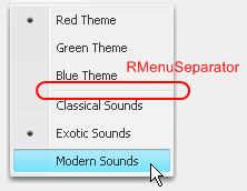
Menu separators are used to visually separate menu items into groups. Simply place them between any menu items of a menu container in the Java Beans view.
Menu separators do not generate any events.
Since menu separators do not have a direct visual representation they should be placed directly on or below a menu widget inside the Java Beans view. This view allows you to comfortably set up menu hierarchies using sub menus and menu items:
| Symbol on Palette |
|
| Category | Layout Helper widget |
| Purpose | Visually separate menu items into groups. |
| Events | - |
| Important Properties | - |
Table 6.44. RMenuSeparator Summary
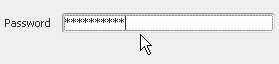
Password fields are used to query passwords from the user. The entered input is not rendered in clear text but as * characters. The text field generates a Value Changed event and a Key event every time a key is typed and an Action event if the return/enter key is pressed.
The Value Changed event is transmitted synchronously and the Key event is transmitted asynchronously. Since the synchronous event handling may lead to a blocking of the UI if the user types too fast, it is generally recommended to map the asynchronous Key event instead (will keep the UI responsive).
| Symbol on Palette |
|
| Category | Input widget |
| Purpose | A field where the user can enter a password. |
| Events | Key, Focus, Action, Value Changed |
| Important Properties | text, echoChar, toolTip, font |
Table 6.45. RPasswordField Summary
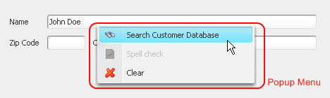
A popup menu is a container for RMenuItem (and similar) widgets. It can be associated with a component or a container and will normally appear when the user clicks the right mouse button on that component.
RPopupMenu widgets do not provide any events and they don't have any special properties worth mentioning.
Since popup menus do not have a visual representation on the panel they must be placed next to the panel rather than on the panel itself:
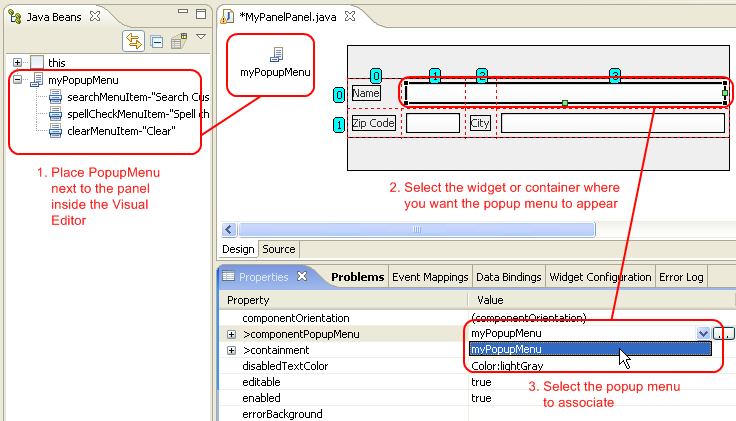
To associate a popup menu with a component, you first select the component inside the Visual Editor or inside the
Java Beans view and then set the menu object to be associated
on the componentPopupMenu attribute in the Properties view,
as demonstrated above.
Note
The popup menu can also be inherited from a parent component, i.e. you can associate a popup menu with a top level container (e.g. the panel itself) and can then reuse it on the inner components. If you consult the Java Beans view, you can easily identify the components that are able to inherit the popup-menu of a container.
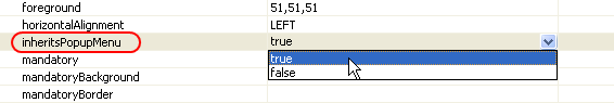
By inheriting the popup menu of a parent component you don't have associate a popup menu with each sub component again, if you should decide to use another menu on the parent. Inheritance is supported over multiple levels, as long as the direct parent component also inherits the menu.
| Symbol on Palette |
|
| Category | Container widget |
| Purpose | Define the contents of a context / popup menu on a component. |
| Events | - |
| Important Properties | - |
Table 6.46. RPopupMenu Summary
A progress bar can be used to inform the user about the amount of completed work or to
show a percentage graphically. Progress bars can either have a
horizontal or vertical orientation, which can be
specified with the orientation property. Progress bars are pure information
widgets, i.e. the displayed information can not be altered directly by the user in any way.
.
The appearance and behavior of a progress bar can be configured: The minimum and maximum value can be set and an optional label string can be defined which can be rendered over the progress bar.
Tip
When you update progress (value property) the GUI on the client side will only be updated when you leave the process you are currently in. So that you have to use a timer with callback method to show a changing progress bar.
| Symbol on Palette |
|
| Category | Information widget |
| Purpose | Show a percentage value graphically. |
| Events | Focus, Key |
| Important Properties | value, maximum, minimum,
orientation, string,
stringPainted, toolTip
|
Table 6.47. RProgressBar Summary
Radio buttons are used give the user the possibility to select exactly one from a number of options. The radio button will generate both an Action event and a Value Changed event if it is selected or deselected.
You can provide your own selected and unselected icons (if you want to replace the standard radio mark).
Note
Radio buttons should always be used in conjunction with a ButtonGroup to ensure that only one can be selected at a given time.
| Symbol on Palette |
|
| Category | Action / Selection widget |
| Purpose | A radio button that allows to select exactly one from multiple options. |
| Events | Action, Focus, Key, Value Changed |
| Important Properties | text, toolTip, selected, group |
Table 6.48. RRadioButton Summary
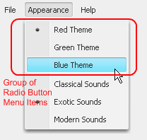
Radio button menu items are typically used in groups of at least two and represent a number of
exclusively selectable options.
They can be used both inside RMenu
and RPopupMenu widgets.
The standard radio button icon of a RRadioButtonMenuItem can be replaced by setting a different
Icon Uri and Selected Icon Uri in the
Widget Configuration Text/Icon Tab.
Generally, radio button menu items behave exactly the same as a
RRadioButton widgets.
Radio button menu items generate both an Action event and a Value Changed event if they are selected or deselected.
Since radio button menu items do not have a direct visual representation they should be placed directly on or below a menu widget inside the Java Beans view. This view allows you to comfortably set up menu hierarchies using sub menus and menu items:
Note
Radio button menu items should always be used in conjunction with a ButtonGroup to ensure that only one can be selected at a given time.
| Symbol on Palette |
|
| Category | Action widget |
| Purpose | One of a number of exclusively selectable items in a menu. |
| Events | Action, Value Changed, Key, Focus |
| Important Properties | text, selected, toolTip, group |
Table 6.49. RRadioButtonMenuItem Summary
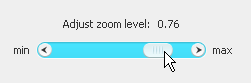
A standalone scroll bar can be used to let the user adjust a property in a continuous way; e.g. as an
alternative to a RSlider widget which only
offers to select a range value in discrete steps. Scroll bars can either have a horizontal
or vertical orientation, which can be specified with the orientation property.
A scrollbar produces continuously Adjustment events if the knob is dragged with the mouse.
The scrollbar's position value is a value between 0 and 1, indicating the percentage at which the bar's knob is positioned.
| Symbol on Palette |
|
| Category | Input widget |
| Purpose | Select a value between 0 and 1 in a continuous way, by positioning the scrollbar knob with the mouse. |
| Events | Adjustment, Focus, Key |
| Important Properties | position, orientation, unitIncrement, blockIncrement,
toolTip |
Table 6.50. RScrollBar Summary
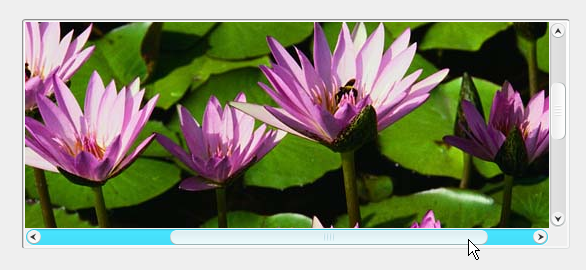
A scroll pane provides a "viewport" (i.e. a window) that can be moved about a single sub component which is
typically larger than the area taken up by the scroll pane container. Different scroll bar policies both for
vertical and horizontal scrolling can be configured by setting the properties verticalScrollBarPolicy and/or
horizontalScrollBarPolicy to AS_NEEDED, ALWAYS
or NEVER respectively. Scrolling with the mouse wheel can be enabled or disabled
by setting the property wheelScrollingEnabled.
| Symbol on Palette |
|
| Category | Container widget |
| Purpose | A for a single sub-component providing horizontal and vertical scrollbars to move the viewport about the contents of the subcomponent. |
| Events | Focus, Key |
| Important Properties | verticalScrollBarPolicy, horizontalScrollBarPolicy, wheelScrollingEnabled |
Table 6.51. RScrollPane Summary
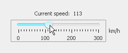
A slider widget can be used to let the user adjust a property in a discrete or continuous way.
Sliders can either have a horizontal or vertical orientation,
which can be specified with the orientation property. With the inverted
property the orientation of the range of values can be selected.
The appearance and behavior of a slider can be further configured: The maximum and minimum range value can be set, as well as the minor and major tick spacing. You can define whether the ticks should be painted, whether the track should be painted and whether the knob should snap to the tick marks or not.
A slider produces Value Changed events if the knob is dragged with the mouse.
| Symbol on Palette |
|
| Category | Input widget |
| Purpose | Select an numerical value between a defined minimum and maximum, by positioning the slider knob with the mouse. |
| Events | Value Changed, Focus, Key |
| Important Properties | value, minimum, maximum, orientation,
inverted, minorTickSpacing, majorTickSpacing
paintTicks, snapToTicks, toolTip |
Table 6.52. RSlider Summary
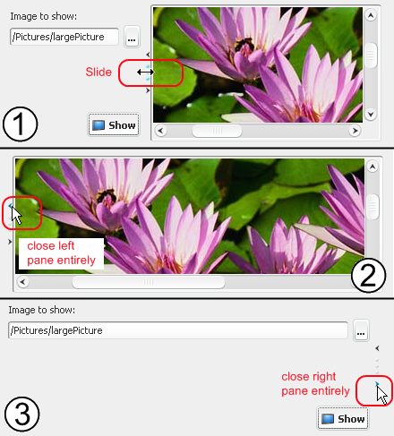
A split pane divides the available space into two areas, either left and right or top and bottom, into each of which exactly one component or sub-container may be placed.
In between the two areas, a divider component allows to distribute
the available space with the mouse. Use the orientation property to set the
split pane's orientation to either horizontal split or
vertical split. The dividerLocation attribute may be
used to initially place the divider.
The divider can either be continuously dragged with the mouse or any of it's two arrow
icons can be clicked, in which case it will move completely to the indicated side, hence
closing the component on this side entirely (see examples above). If you set the
oneTouchExpandable property to true then the divider
may be moved to the opposite side with a single mouse click (this behaviour is
off by default).
Normally the two components are only re-layouted when the user let's the divider go. If
you want a continuous re-layouting during the drag then you must set the
continuousLayout property to true.
Note
Initially the split pane container shows with two "dummy" buttons in it's left and right (or upper and lower) half. Those buttons are not really contained on the panel and only shown as visual help. Simply drop a component on top of the respective button to replace it.
Warning
Unfortunately the initial location of the split pane divider can only be set in absolute pixels (and not relative in %). Since you may not always know the size that your split pane will receive initially it is recommended to set a preferred or minimum size of the split pane and then position the slider with respect to the width (or height) of the configured size. This is not a perfect solution but for many cases an acceptable workaround.
Tip
Resizing split pane does not work as you expect?
The dividerLocation seems to change in its own way. Take a look at the
setResizeWeight(double) method to control
distribution of extra space.
| Symbol on Palette |
|
| Category | Container widget |
| Purpose | A two-area container with a movable divider to redistribute space. |
| Events | Focus, Key |
| Important Properties | orientation, dividerLocation, resizeWeight,
oneTouchExpandable, continuousLayout,
dividerSize |
Table 6.53. RSplitPane Summary
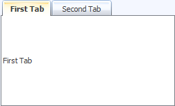
Displays are placeholder widgets onto which Rich Dialogs can be loaded dynamically at runtime.
A RTabbedDisplay shows the loaded Rich Dialog panels as tabs.
A tabbed display generates a Selection Changed event if one of its tabs (i.e. loaded Rich Dialogs panels) is selected. This also happens if a new Rich Dialog is loaded onto the display, because it will become the selected tab.
Warning
In order to being able to address a display widget (when loading a Rich Dialog with a
Rich Dialog Process element) you must not
forget to assign the display an unique id on the displayId
property. If you fail to do so then the display might not be found at runtime and Rich Dialogs may not
be loaded correctly.
| Symbol on Palette |
|
| Category | Display widget |
| Purpose | Placeholder for Rich Dialogs that are loaded dynamically at runtime. Shows loaded components as tabs. |
| Events | Selection Changed, Focus, Key |
| Important Properties | displayId, tabPlacement, toolTip |
Table 6.54. RTabbedDisplay Summary
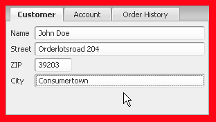
A tabbed pane is a container which arranges its components behind each other (similar to
RCardPane) but making each
one directly accessible by providing tabs. By clicking on a tab the associated component is
brought to front. The location of the tabs can be configured as top,
bottom, left and right
with the property tabPlacement. The currently selected tab can be set
with the selectedIndex attribute. The added components are associated
with an index starting at 0.
Any kind of widget or container can be a "tab" on a tab pane. Typically tabs are containers, i.e. sub-panels, with an individual layout.
Each tabbed component can have it's tab labelled be given a tool tip by setting the
properties title and toolTipText inside the
containment attribute, respectively.
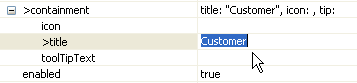
Note
As you can see in it is also possible to set an icon for each tab. However this is currently not well supported by Axon.ivy. To do so, you should copy the image that you want to use (png, gif or jpg format) to a source folder of the project and then link it with the inline editor of the Properties View by selecting it. Do never link from the file system as this will not work in a productive environment.
Tip
When you work with a tabbed pane in the Visual Editor then the editor area will only show the currently selected tab. To change this (i.e. make another tab visible) simply select one of the sub components of the tabbed pane in the Java Beans view.
The indices of the tabbed components correspond to the order in which they are displayed in the Java Beans view, i.e. the first component has index 0 and the last one has index (number of tabs) -1.
| Symbol on Palette |
|
| Category | Container widget |
| Purpose | A container which arranges it's components behind each other, making them accessible with a tab. |
| Events | Focus, Key |
| Important Properties | selectedIndex, tabPlacement |
Table 6.55. RTabbedPane Summary
Table widgets are used to show tabular data.
A table generates a List Selected Event if a row is selected, an Action Event if a row is double clicked and a Value Changed Event if one of the RTable cell values has changed.
You can configure both the appearance and source of the data that a table should show on the Table Data tab of the Widget Configuration view. There you can specify a style configuration for each column cell as well as icon, text and tool tip for each column, based on the value of the cell or the whole row data. The widget config also allows you to specify the table columns as editable and/or sortable. The column entries are sorted according to the value they represent if you double click on the header of a column.
Note
The column value are sorted according to the value they represent. If the column is configured to show a Recordset field or a List entry, then the column is sorted against the original value from the Recordset or the List. E.g. if you transform the original data to a string in the Widget Configuration then the column sorting ignores the transformation for the sorting. If you do not specify any source for a column, then the column will be sorted according to the string representation of the cell value.
The Widget Configuration lets you define each column to be editable or not, by ivyScript.
The edited values are stored in the data model directly (List or Recordset). There is no
event at the moment, that signals a change in the RTable data.
The appearance of the table widget itself can be further configured by setting the
properties showGrid, showHorizontalLines and
showVerticalLines.
The data source for a table can either be a List of Lists with equal
length or a Recordset. Depending on what is used, the
properties selectedListEntry; selectedListEntries or selectedRecord;
selectedRecords will return the currently selected list or record. The selection
mode (single selection, single interval selection
or multiple selection) can be set with the selectionMode
property.
With the property autoSelectFirstEntry you can have the widget select the
first data entry automatically (if data is present). This has also the effect, that a call
to clearSelection() will reset the selection to the first data entry (instead
of clearing). The property is set to false by default.
Note
Because tables tend to contain many items, it is recommended that you place table widgets inside an RScrollPane container, so that they become scrollable if the number of items becomes too large for the allocated view port size.
The headers, if any, are only displayed if the RTable resides inside a
RScrollPane.
Tip
To process the Value Changed event, map the event to a Event Process Start element in your Rich Dialog logic. Enter the following script into the code tab of the Event Process start element:
import ch.ivyteam.ivy.richdialog.widgets.components.RTableValueChangedEvent;
RTableValueChangedEvent changedEvent = event as RTableValueChangedEvent;
int row = changedEvent.getFirstRow();
int column = changedEvent.getColumn();
| Symbol on Palette |
|
| Category | Data widget |
| Purpose | A table can show a (large) amount of tabular data and allows the user to select one or multiple rows from the spread sheet. |
| Events | List Selected, Action, Focus, Key, Value Changed |
| Important Properties | listData, recordsetData,
selectedListEntry, selectedListEntries,
selectedRecord, selectedRecords,
selectionMode, autoSelectFirstEntry |
Table 6.56. RTable Summary
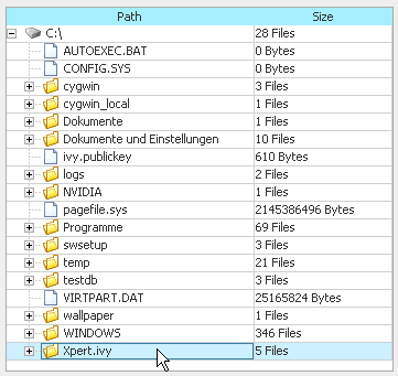
The RTableTree widget is a combination of the RTable and RTree widgets. It therefore offers
the combined amount of events and configuration possibilities. Please consult the
documentation of the mentioned widgets for a detailed explanation of the respective aspects.
Use the Widget Configuration TableTree data tab to configure the table tree widget style and data settings.
With the property autoSelectFirstEntry you can have the widget select
the first data entry automatically (if data is present). This has also the effect, that a
call to clearSelection() will reset the selection to the first data entry
(instead of clearing). The property is set to false by default.
Note
Because table trees tend to contain many items, it is recommended that you place tree widgets inside an RScrollPane container, so that they become scrollable if the number of items becomes too large for the allocated view port size.
The headers, if any, are only displayed if the RTableTree resides inside a
RScrollPane.
| Symbol on Palette |
|
| Category | Data widget |
| Purpose | A table displays hierarchical tree data in a tabular fashion. Nodes/rows can be selected, expanded and collapsed. |
| Events | Tree Selection, Tree Load (configurable), Tree Expansion, List Selected, Action, Focus, Key |
| Important Properties | treeData, listData, recordsetData,
selectedTreeNode, selectedTreeNodes,
selectedListEntry, selectedListEntries,
selectedRecord, selectedRecords,
selectionMode, autoSelectFirstEntry, rootVisible |
Table 6.57. RTableTree Summary
A RTaskPane is essentially the same as a
RCollapsiblePane, with the difference that it provides a title bar which consists of
a title text, an optional icon and a collapse/expand button. Any kind of widget or container
can be the content of a task pane on a task pane container.
Task panes are best used inside a RTaskPaneContainer, which is a parent container designed specifically to show task panes in a side bar below each other. The task pane container takes care of taking up the extra space if a pane is collapsed and shifts the other panes accordingly. Task pane container can also be configured to ensure that at most a single task pane is open at one time.
If you want to use a task pane outside a task pane container then you have to take care of correct re-layouting yourself (i.e. provide other components that take up extra available space in case of collapsing). Consult the documentation of RCollapsiblePane for more information on this matter.
Use the Widget Configuration text/icon tab to
set title and icon of a task pane. The state of a task pane (i.e. collapsed or expanded) can be defined by
setting the expanded attribute.
Tip
To initially add contents (e.g. an empty panel) to a task pane you simply drop the component either on the task pane's title bar (in the Visual Editor area) or onto the task pane node inside the Java Beans view. The task pane will then expand and show the added contents so that you can continue to edit it.
| Symbol on Palette |
|
| Category | Container widget |
| Purpose | A collapsible container with a title bar intended to be used inside a RTaskPaneContainer. |
| Events | Focus, Key |
| Important Properties | text, icon, expanded |
Table 6.58. RTaskPane Summary
A task pane container is a container for
RTaskPane components only. The added task panes are arranged vertically below each other.
The task pane container itself has only limited configuration possibilities: if you set
singleTaskPaneOpen to true, then only one
task pane can be opened at a time (i.e. the previously opened task pane will be closed before opening
a new one).
Any kind of widget or container can be the content of a task pane on a task pane container. See RTaskPane to learn how to configure a single task pane.
The task pane container will show the contained task panes in exactly the state as they were configured in the Rich Dialog editor. I.e. all closed panes will be initially shown in collapsed state and all open panes will be initially shown in expanded state.
Tip
To add contents (e.g. an empty panel) to a previously added task pane you simply drop the component
either on the task pane's title bar (in the Visual Editor area) or onto the task pane node inside
the Java Beans view. The task pane will then expand
and show the added contents so that you can continue to edit it. If you want to close an
RTaskPane
then you have to set it's expanded property to false.
| Symbol on Palette |
|
| Category | Container widget |
| Purpose | A container for RTaskPane widgets. |
| Events | Focus, Key |
| Important Properties | singleTaskPaneOpen |
Table 6.59. RTaskPaneContainer Summary
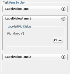
Displays are placeholder widgets onto which Rich Dialogs can be loaded dynamically at runtime.
A Task Pane Display shows the loaded Rich Dialogs as individual Task Panes
on a Task Pane Container. By setting the property singleTaskPaneOpen to true
you can configure that at most one task pane should be open (i.e. the previously open task pane will be closed if another
task pane is selected or opened).
A task pane display does not generate any non-standard events.
Warning
In order to being able to address a display widget (when loading a Rich Dialog with a
Rich Dialog Process element) you must not
forget to assign the display an unique id on the displayId
property. If you fail to do so then the display might not be found at runtime and Rich Dialogs may not
be loaded correctly.
| Symbol on Palette |
|
| Category | Display widget |
| Purpose | Placeholder for Rich Dialogs that are loaded dynamically at runtime. Shows loaded components as task panes. |
| Events | Focus, Key |
| Important Properties | displayId, singleTaskPaneOpen, toolTip |
Table 6.60. RTaskPaneDisplay Summary
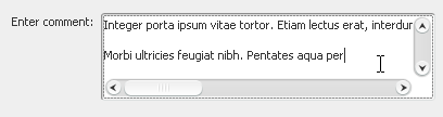
Text areas are used to allow the user to enter multi-line texts. The text area generates a Value Changed event and a Key event every time a key is typed.
The Value Changed event is transmitted synchronously and the Key event is transmitted asynchronously. Since the synchronous event handling may lead to a blocking of the UI if the user types too fast, it is generally recommended to map the asynchronous Key event instead (will keep the UI responsive).
Use the attributes lineWrap and wrapStyleWord to
enable/disable line wrapping and to enable/disable whole word wrapping, respectively.
Obviously the setting second attribute has only an effect, if line wrapping is enabled.
Note
Although the text area allows for multi-line input, it will not automatically show scroll bars if the edited text grows out of the available space, either horizontally or vertically. Placing the text area widget inside a RScrollPane container resolves this issue. The scroll pane container allows you to configure individual policies for the horizontal and vertical scroll bars (show always, show if needed, never show).
Note
To append a complete line (including line break) to the end of a text area's text, you can use
the method appendLine(String).
The Widget Configuration view shows an additional Validation Tab if a text area is selected.
By selecting a specific validation configuration you can define the format of the input.
You can edit existing configurations or add new ones in the Widget Input Validation subtree of the Configuration Editor. You can specify Number, Date, Percent, String/Regular Expression based validations.
Tip
Most of the existing validation configurations do not support multiple lines input. Thus they will not suite ideally for a text area. Therefore, it is recommended to create regular expression based validation configurations specific to the text area. In order to support multiple lines, the existence of newline characters (\r\n) must be considered.
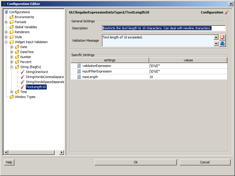
| Symbol on Palette |
|
| Category | Input widget |
| Purpose | An area where the user can enter a multi-line text. |
| Events | Key, Focus, Value Changed |
| Important Properties | text, lineWrap, wrapStyleWord,
caretPosition, toolTip, font |
Table 6.61. RTextArea Summary
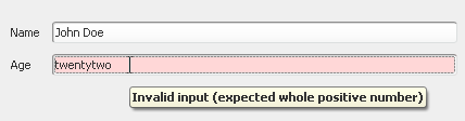
Text fields are used to get (single line) input from the user. The text field generates a Value Changed event and a Key event every time a key is typed.
The Value Changed event is transmitted synchronously and the Key event is transmitted asynchronously. Since the synchronous event handling may lead to a blocking of the UI if the user types too fast, it is generally recommended to map the asynchronous Key event instead (will keep the UI responsive).
Tip
The text that the user enters in a text field can be restricted and/or validated. If it does not match the required format, then an (automatic) visual feedback can be given to the user. Read the validation section below to learn how this can be done.
The Widget Configuration view shows an additional Validation Tab if a text field is selected.
By selecting a specific validation configuration you can define the format of the input.
You can edit existing configurations or add new ones in the Widget Input Validation subtree of the Configuration Editor. You can specify Number, Date, Percent, String/Regular Expression based validations.
Given that a valid format is ensured, you can access the value of a text field from
the specialized attributes valueAsNumber, valueAsDate and
valueAsString.
Note that the return value is a e.g. Date.INVALID if the user input does
not represent a valid value.
Warning
Be aware that the accessing of a text field's value as number or as date will fail with an exception at runtime if the input entered by the user does not match the requested format. Therefore you should always enforce valid input with a proper Validation Configuration if you intend to access an entered date and number directly with the respective attribute.
| Symbol on Palette |
|
| Category | Input widget |
| Purpose | A text field where the user can enter a string. |
| Events | Key, Focus, Value Changed |
| Important Properties | text, valueAsDate,
valueAsString, caretPosition,
toolTip, font |
Table 6.62. RTextField Summary
Text fields are used to get (single line) input from the user in a RTable.
For more informations about this widget see the documentation of RTextField. The possibilities and functionalities are quite the same.
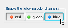
Toggle buttons are used to let the user visually enable an option in an on/off style. If a toggle button is clicked, it will stay in pushed state if it was previously unselected or vice versa. A toggle button will generate both an Action event and a Value Changed event if it is selected or deselected.
| Symbol on Palette |
|
| Category | Action / Selection widget |
| Purpose | A toggle button with text and/or icon that allows to select/deselect an option. |
| Events | Action, Focus, Key, Value Changed |
| Important Properties | text, toolTip, selected |
Table 6.63. RToggleButton Summary
A tool bar lines up widgets in a dock. Although any kind of widget or container can be a component of a tool bar, typically buttons are used. The look and feel of a tool-bar is determined by the kind of components it contains, but generally it will remove any borders of the added contents to make them look smoothly integrated. When rolling the mouse over the contents of a tool bar then the currently pointed at component appears enhanced.
A tool bar can have a horizontal or vertical orientation
which can be set with the orientation attribute.
Tip
By using buttons as components with or without text you can create tool bars with or without labels.
| Symbol on Palette |
|
| Category | Container widget |
| Purpose | A tool bar contains other widgets (typically buttons) and aligns them in a dock style either horizontally or vertically. |
| Events | Focus, Key |
| Important Properties | orientation |
Table 6.64. RToolBar Summary
Tree widgets are used to display hierarchically organized data.
A tree generates a Tree Selection event if a node is selected and an Action event if a node is double clicked. To support the lazy loading of data, the generation of a Tree Load event can be configured in the Tree Data tab of the Widget Configuration view. Additionally the tree widget supports Tree Expansion Events that occur whenever a node is expanded or collapsed.
The data source of a tree is always a Tree object. The Widget Configuration Tree Data tab allows you to define the appearance and rendering of each tree node, which can be based on the tree's value object and/or on a separate info string. It possible to define style, text, icon and tool tip for each rendered tree label.
The appearance of the rendered tree can be further configured by setting the properties
rootVisible (i.e. whether the root node should be displayed or not)
and showsRootHandles (i.e. whether the root node should be displayed
with an expand/collapse handle in front).
The tree widget supports multi-selection of nodes by default. The properties
selectedTreeNode; selectedTreeNodes will return the currently
selected node(s).
With the property autoSelectFirstEntry you can have the widget
select the first data entry automatically (if data is present). This has also the
effect, that a call to clearSelection() will reset the selection to
the first data entry (instead of clearing). The property is set to
false by default.
Note
Because trees tend to contain many items, it is recommended that you place tree widgets inside an RScrollPane container, so that they become scrollable if the number of items becomes too large for the allocated view port size.
| Symbol on Palette |
|
| Category | Data widget |
| Purpose | A tree displays hierarchical data. Nodes can be selected, expanded and collapsed. |
| Events | Tree Selection, Tree Load (configurable), Tree Expansion, Action, Focus, Key |
| Important Properties | treeData, selectedTreeNode, selectedTreeNodes,
autoSelectFirstEntry, rootVisible |
Table 6.65. RTree Summary
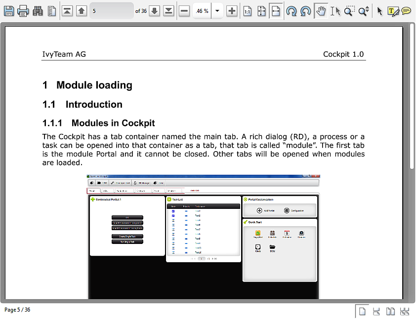
There are two ways to display PDF documents in a Rich Dialog based process. First you can open the PDF in the RBrowser widget. Internally the RBrwoser widget then opens a real browser in a separate operating system process and in there the embedded PDF plugin (usually Acrobat Reader) will be used to display the PDF. This has the disadvantage that you have no real control about the PDF viewing, e.g. if the browser decides to open the PDF document in its own window there is nothing you can do about it. To avoid such problems, you can use the ULCVPdfViewer widget which is purely Java based and does not use any external operating system processes. So, you can fully control where the PDF is displayed.
To add a PDF viewer widget to a Rich Dialog use the Choose Bean entry from the palette in the Visual Editor. Then
choose the ULCVPdfViewer and place it on the Rich Dialog. The widget must
be used primarily with a Java API as there is only limited tool support in Axon.ivy,
e.g. there is no Drag and Drop of events for the event
mapping or there is no widget
configuration view.
To open a PDF document, you simply use the method openDocument(java.net.URL).
The PDF viewer does support most of the actions that users expect from a PDF viewer like
printing, zooming, searching or navigating the document trough the built-in tool bar and status bar. If not required then you can switch off the
tool bar and status bar with setToolBarVisible(false) and
setStatusBarVisible(false) .
Developers can use the setXyzToolBarVisible() or
setXyzButtonVisible() methods to define whether they want that their users
can use the corresponding command groups or commands respectively. And end users can
customize the tool bar groups and buttons themselves with a popup menu. All these settings
are stored when a Rich Dialog is closed and restored at the next start. If you don't want to
allow this to your users, then use the method setToolbarPopupMenuVisible().
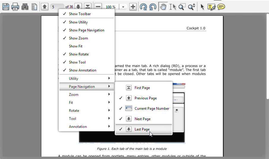
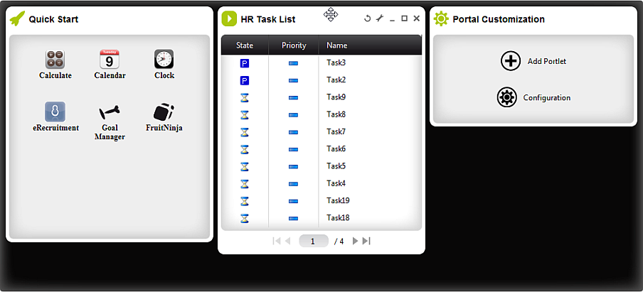
With the portal display you can create your own portal with Rich Dialogs (from now on called Portlets) . Use the User Dialog Call element to load your Portlets asynchronously into the display exactly like you do with other displays. The display then arranges them in a column layout where the number of columns and the column width ratio can be configured.
Note
There is only limited further tool support in Axon.ivy, e.g. there is no Drag and
Drop of events for the event mapping or there is no widget configuration view. To
add a portal display widget to a Rich Dialog use the Choose Bean entry from the palette in the Visual Editor. Then
choose the LiquidPortalDisplay and place it on the Rich Dialog. Alternatively
you can use the widgets by adding the corresponding code in the Java source of the
Rich Dialog yourself. Most of the widget's properties can be set in the properties
view of the Rich Dialog perspective. But to access the full API please write your
code in the Rich Dialog source view file or in IvyScript on the Rich Dialog
logic.
The display adds to every Portlet a title bar that offers some generic features. Each Portlet supports off-the-shelf closing, minimizing, maximizing and title renaming. All without adding a single line of code. Furthermore you can Drag and Drop each Portlet in the portal and move it to a new position. The portal supports even two more operations, refresh and handling a configuration dialog for a Portlet. Let's see how these features can be used:
If you want to use the refresh feature, two things must be done:
-
The corresponding button must be visible in the title bar. To do that add the Custom Panel Display Parameter refreshable with the value true in the Display tab of the User Dialog Call element.
-
The actual refresh must be implemented. To do that the portlet must have a Rich Dialog Method
doRefresh()with no parameters and no return value. Do in this method whatever you need to do.
If you want your Portlet to be configurable, then the portal offers some nice facilities to make life easier for you. Four steps have to be fulfilled:
-
Configuration button in the title bar:
To see that button, just add the Custom Panel Display Parameter configurable with the value true in the Display tab of the User Dialog Call element that loads the Portlet into the display.
-
Opening the configuration dialog::
As soon as the user clicks on the configuration, the portal fires a Rich Dialog Event with the signature
openConfigurationDialog(String)from the Portlet. So, you need to add the event to the Rich Dialog Interface of the Portlet Rich Dialog. TheStringparameter carries a unique ID for the Portlet. The internal name of the Portlet is used for that. See below for details.To catch the event, add a Broadcast Event to the Portlet Rich Dialog. In the implementation of the Broadcast you should first find out whether the configuration dialog should be opened for the correct instance of the Portlet because the same Portlet can exist multiple times in the display. Here the Portlet ID comes in very handy. Use it to compare to
panel.getName(). The second thing to do in the Braodcast implementation is to open the configuration dialog in a Rich Dialog call element. Load your configuration dialog asynchronously into the saem window and display as your Portlet. The only special thing you have to do, is to provide the Custom Panel Display Parameter portletID with the Portlet ID.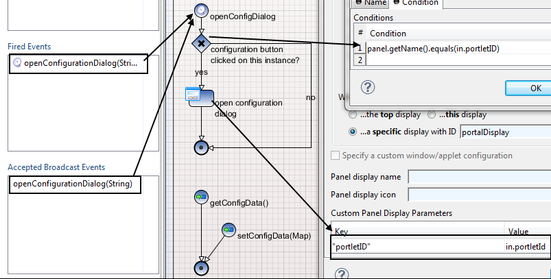
-
Exchanging the configuration data:
The Portlet and the configuration dialog must have some shared data. That's the configuration data that is used to retrieve or render the content of the Portlet. That's also the same data that is manipulated in the configuration dialog. The portal uses simple getter and setter Rich Dialog Methods to achieve that.
-
From Portlet to the configuration dialog: First the portal calls the Rich Dialog Method
getConfigData():java.util.Mapon the Portlet. Hereby you are completely free what to put in that map. In a second step the portal then takes this map and calls the Rich Dialog MethodsetConfigData(java.util.Map)on the configuration dialog so that it can work with the map. -
From the configuration dialog to the Portlet: When the user hits Ok on the configuration dialog, then the reverse thing happens. First the portal gets the interesting data by calling the Rich Dialog Method
getConfigData():java.util.Mapon the configuration dialog. Then this is given to the Portlet by calling the Rich Dialog MethodsetConfigData(java.util.Map).
-
-
Refreshing:
To reflect the changes from the configuration, the portal automatically calls the refresh feature (see above) if the Portlet supports it. If not it is your turn to make sure that a configuration change takes effect.
This chapter shows how Web Pages and -content are used within Axon.ivy.
As an alternative to User Dialogs, you can display Web Pages or other web resources to the user of an Axon.ivy process application in a Browser to let her interact with the executed process.
Such content is embedded within a business process by using the Web Page element or by using end pages for various elements in a process (End Page element, a Simple Task Switch element or a Task Switch element). Whenever the process reaches such an element, then the defined content is presented to the user.
You are free to use HTML-based content (plain HTML, JSP) or other resources (such as images, text files, RTF and many more) as long as they can be displayed in a web browser. In addition, you are free to use resources from the CMS or from the web content folder of the project.
Warning
When you re-use resources like JSP pages in different process elements, you need to carefully consider how to integrate the content with the process. When you access members of the data class (e.g. in the JSP) you must ensure that this member is accessible in all processes that use the resource. Furthermore, in Web Page elements you need to ensure that a) there is a way to continue with the process, e.g. an out-link and that b) that way can be used in all usages of the resource.
Warning
Please bear in mind that Web Pages can only be used if a single HTTP request is available from the client. This means, that you cannot use Web Pages if at least one of the following conditions apply:
-
The current request was not triggered by HTTP (e.g. started by an Event Bean).
-
The current task is executed by SYSTEM.
-
The process is running in a parallel execution section, e.g. after a Split element.
A Web Page can be created or accessed directly from the process. Open the inscription mask of any page-capable process element. Depending on whether the page is already defined or not, you will be presented with either of the two scenarios described in the sections below.
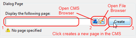
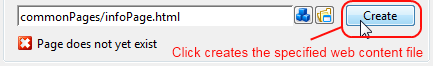
You can define the Web Page that should be displayed by using one of the following three methods:
-
Enter the path to an existing page by hand. Specify either a CMS path (e.g.
/HtmlPages/myPage) that points to a content object or give a path to a web content file (e.g.commonPages/infoPage.html) instead.Note that content object paths do not have a file extension, but web content paths do. Web content paths are always specified relative to the webContent folder of the current project.
If you enter a path to a non-existing web content resource, then pressing the Create button will create an empty file at the specified location in the webContent folder and open Eclipse's default editor on it.
If you enter the name of a non-existing content page, then pressing the Create button will have the same effect as described under (3).
-
Select an existing content object by using the content smart button or an existing web content file by using the file smart button.
You can select any content object and any file, but a "wrong type" error will be displayed if the selected content object is not suitable as a page. Likewise a "invalid web content path" error will be shown, if you select a file outside the project's web content folder.
-
Click Create to generate an entirely new page in the content management system.
A dialog will appear that allows you to enter the name and type (normal or JSP) of the new page. The created page will be associated with the current element and it will be placed appropriately inside the CMS ProcessPages/<ProcessName> folder (see below).
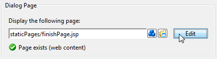
Click on Edit to open the specified page either in the content editor (if it is a content object) or the system's default editor (if it is a web content file) so that you can edit it's contents. You can change the default editor for any file type by opening Window/Preferences and navigating there to /General/Editors/File Associations.
Alternatively you can use the content smart button or the file smart button to select an entirely different page to be displayed.
You can also edit the specified path by hand if you like.
The page that is displayed is either stored in the CMS or in the web content folder of the project.
By default, CMS pages are stored in the ProcessPages hierarchy in a
further sub folder named after the containing process (e.g.
ProcessPages/Main/MyPage). Although it is not required to store the
pages within this scheme, it is recommended to keep your pages separated. All
content objects that can be downloaded can be used, especially the Page and JSP types, but also some Document (e.g. RTF, HTML, PDF
or Plain Text) and other types are working.
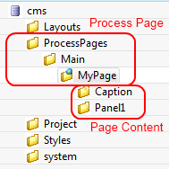
Pages in the web content folder can be stored in any hierarchy below the project's web content folder (it is not allowed to use or reference content that is stored outside the project's web content folder). You can use any type as long as it is possible to render it in the browser of the user.
Note
Some browsers delegate the displaying of certain file types to third party plugins and/or applications depending on the configuration of the client. Thus this behaviour cannot be controlled by Ivy.
There are a number of specific content object types that are uniquely used inside HTML Dialog pages. All of them have their own editors, the usage of which is described in the following sections.
Note
Web Pages can be accessed without starting a process. This allows you to create for example a translated start page with some process start links. See also chapter Access CMS Content with a Browser.
The Page Editor is used to specify the Style Sheet and Layout of a page. They can either be inherited from their parent objects in the CMS hierarchy or can be set explicitly. Use the combo boxes to set one of the style sheets, i.e. page layouts which are contained in the corresponding CMS top level folders. The Search... buttons on the other hand opens a dialog which does show all CSS and Layout content objects in the whole CMS to select one. So the children content objects of the page represent the selected Layout (see Layout Editor). The missing or obsolete parts (i.e. children in the CMS hierarchy) of a page (e.g. after changing layout) may be created or deleted with the corresponding buttons at the bottom of the editor.
This is the most important editor to edit your HTML content. Each Web Page (see Page Editor) has sections that are called Panels and which are defined by the page's layout. Generally, a page has as many panels as are specified by it's associated layout (see Layout Editor).
In the panels of a page, the actual content of the page is defined. Each content part of a panel is stored as an own content object below that panel's content object inside the content management:
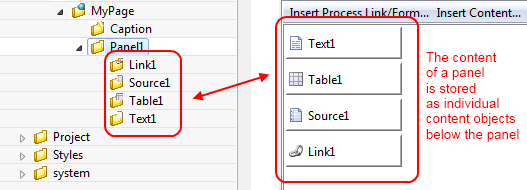
The contents of a panel are arranged in a table from left to right and from top-to bottom in a structured manner. Each table cell contains a single content object or some custom HTML or JSP code.
A panel can be rendered as plain HTML or as a HTML table. If it is rendered with plain
HTML cells are simply rendered one after another. Rows are separated with a
<br> tag. On the other hand, if it is rendered as a HTML table, each
cell will be rendered as a cell of the table. You can switch the rendering kind using
the checkbox As HTML Table. Switching the rendering
influences the available context menu items of a cell and the buttons Table, Row and Cell.
You can switch between the Edit and the Source View of a panel. The Edit View as explained above shows the table of the panel with its cells. The Source View on the other hand shows the JSP Code that is generated from the Edit View.
- Insert Process Link/Form ...
-
Use this menu to insert a link or form that triggers the continuation of the process after the page element.
- Insert Content ...
-
Use this menu to create sub content objects (Texts, Strings, Sources, Process Links, Tables, Result Tables, Smart Tables, Images) and insert them or already existing content objects into the panel.
- Insert Attribute
-
Use this menu to insert process attribute values into the panel. The menu will open an Attribute Browser where you can choose the process attribute to insert. You can specify a condition that gets evaluated during the rendering of the panel to control whether the content of the cell is rendered into the panel or not. Moreover you can specify how the process data value should be formatted.
- Insert JSP
-
Use this menu to insert JSP code into the panel.
- Edit
-
Opens the type specific editor (Attribute, Content, JSP, ...) of the selected cell.
- Edit Condition
-
Opens an IvyScript editor to edit the condition that controls whether the content of the cell is rendered or not.
- Move
-
Use this menu to move the current cell to another location.
- Remove
-
Removes the selected cell.
- HTML Attributes <...> Table
-
Opens an HTML attribute editor to edit the HTML attributes of the table.
- HTML Attributes <...> Row
-
Opens an HTML attribute editor to edit the HTML attribute of the currently selected table row.
- HTML Attributes <...> Cell
-
Opens an HTML attribute editor to edit the HTML attributes of the currently selected table cell.
- Insert Row
-
Inserts a row above the selected cell.
- Delete Row
-
Deletes the row of the selected cell.
- Merge Cell Left
-
Merges the selected cell with the cell at the left side.
- Merge Cell Right
-
Merges the selected cell with the cell at the right side.
- Merge Cell Up
-
Merges the selected cell with the cell at the top.
- Merge Cell Down
-
Merges the selected cell with the cell at the bottom.
- Split Cell into Rows
-
Splits the selected cell into multiple cells one cell for each row.
- Split Cell into Columns
-
Splits the selected cell into multiple cells one cell for each column.
- As HTML Table
-
Use this checkbox to switch the rendering kind of the panel from raw HTML to HTML table and vice versa.
- Table
-
Use this button to open an HTML attribute editor to edit the HTML attributes of the table.
- Row
-
Use this button to open an HTML attribute editor to edit the HTML attribute of the currently selected row.
- Cell
-
Use this button to open an HTML attribute editor to edit the HTML attribute of the currently selected cell.
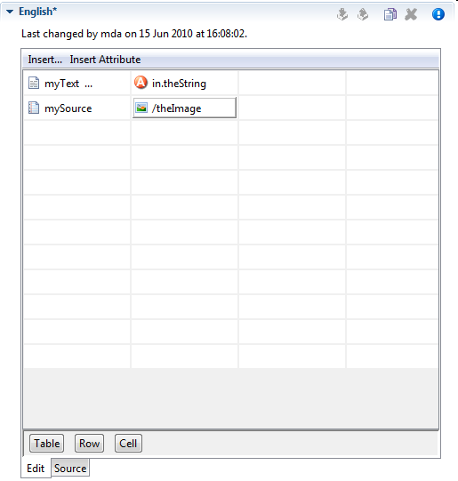
The HTML Table editor can be used to configure a HTML table. In contrary to the Result Table the numbers of rows and columns is defined here statically. And for each cell the content must be chosen specifically although the content itself may be generated dynamically at run-time. Using the menu Insert... it is possible to use Text, Source or CMS elements and using the menu Insert Attribute it is possible to use attributes from the process data in the cell content.
Tip
A Text element can be inserted in a cell by just selecting the cell and starting to type the text. The Text Editor opens automatically then.
With the buttons Table, Row and Cell or the corresponding entries in the popup menu the HTML attributes for the corresponding table part can be manipulated. Furthermore you can add/delete table rows and merge or split table cells to influence the layout of the table. The source tab allows to view and edit the generated HTML code directly.
Typically a table object is not created as an independent content object in the CMS tree, but rather inserted below a Page content object. The cell contents are no first-class CMS elements but are stored within the HTML table content object itself.
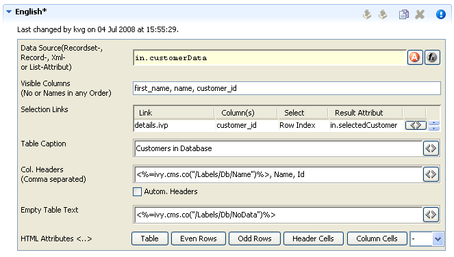
The Result Table editor is used to configure the dynamic generation of (HTML) data tables on either DB page or Page process elements. Typically a result table object is not created as an independent content object in the CMS tree, but rather inserted below a Page content object when a table gets inserted onto one of the pages panels (using the Panel Editor).
- Data Source
-
Specify here the source of the result table's data. You can select a recordset or a list as data source from the process data attributes.
- Visible Columns
-
Select the columns that should be rendered by the result table. You can either use the column numbers (1,5,8,2,3) or column names (name, first_name, customer_id) in a comma-separated list to specify subset and order.
- Selection Links
-
Hers it is possible to select which column entries that should be turned into a link for the one of the page's output links. The select entry specifies what value that should be assigned to which result value (a process attribute). This is used to identify the selected record on the next process element.
- Table Caption
-
A caption text for the rendered result table. Macros may be used.
- Column Headers
-
Specify the names of the columns as they should appear in the header row as a comma-separated list. Macros may be used, the order must be the same as specified in the Visible Columns field.
- Automatic Headers
-
If selected, then the column headers will be selected from the specification in the database.
- Empty Table Text
-
The text to display if the source data is empty. May contain macros.
- HTML Attributes
-
Specify the HTML attribute values for table, even rows, odd rows, header cells and column cells.
For almost all of the above described features, the attributes of the corresponding HTML tags can be edited explicitly by clicking on the HTML tag button.
Link editor is used to render process and static links. Whereas the execution of a process link will lead to the continuation of the process (i.e. activate a specific arc in the process model) and the activation of a static link leads to some other HTML page independent of the process.
Links can be rendered in many different forms, e.g. both the "classical" hyperlink as well as the display of a form with a submit button are considered to be special forms of links.
All of those different link types are configured with the HTML Link Editor. The link editor can be opened in two different ways: either by selecting a link content object below a page in the CMS editor tree or by double clicking on a link field in the HTML Panel Editor.
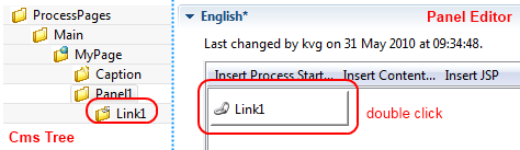
The following options can be configured for all links:
- Link Target (Href)
-
Specify the target of the link that will be jumped when the link is activated. If this is the configuration of a process link, then a macro that specifies the link that should be executed will already be specified (see example image above). However, any valid HTTP-link is accepted as value for this field, e.g.
http://www.acme.com. - Link Type
-
Specifies the visual appearance (type) of link that should be configured. Depending on the type that is selected, the configuration fields below this attribute will change.
Depending on the selected Link Type, additional options are available for configuration.
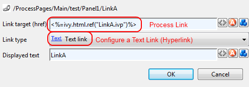
For Text, Button, Image and Timed Auto-Redirect, the Link Editor allows for configuration of rather simple additional options. The smart buttons at the right side of the macro fields can be used to either configure the HTML attributes of the rendered link source or to insert and expand process attributes and content objects.
The following options can be configured for those link types (configuration of a Form Link is described in the next section):
- Displayed Text
-
Specifies the text that will be shown to the user and presented as link. This option is available for the link types Text, Button and Image + Text.
- Alternate Text
-
Specifies the alternate text that will be set on the displayed image (is shown by most browsers as tool-tip when the mouse hovers over the image). This option is only available for the link type Image.
- Time to go in Seconds
-
Specifies number of seconds to wait before the link is activated automatically. This option is only available for the link type Auto-Redirect (timed).
When selecting Form as Link Type the link editor will show a sub-editor that allows you to specify a form and all form fields, that are initialized and/or set from/to process data. Furthermore, you can configure whether a Submit and/or a Reset button should be displayed (including the text of the buttons). At the bottom you even have the choice to change the editor's view for either designing the tabular layout of the form in a graphical editor or directly editing the HTML code.
At run-time the form defined in the Form Field Editor will be rendered in a HTML page. Clicking the submit button results in the continuation of the process of this element. Therefore, if you disable the submit button you have to ensure that a process link for process continuation is part of the HTML page (e.g. by adding such a link in the HTML view of the editor).
If the Details button of a form field is clicked (when configuring a Form Link) a specialized sub-editor is presented to the user. This editor allows to configure in detail how a specific form field is to be rendered in HTML.
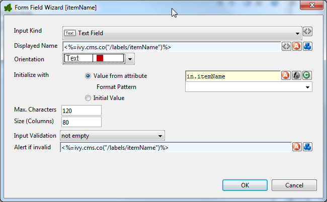
Several types of input kinds for the form fields are available such as text fields, lists or date pickers. For each type, the configuration and therefore the layout of this editor may differ slightly and some parts (irrelevant to the chosen) may be invisible. For most form fields you can define the layout, the default value and the validation.
- Input Kind
-
Input Kind Image Description HTML Tag Text Field 
A single line input field for text of all kind. <input type="text"> Password Field 
The same as the text field but each inserted character is displayed as black bullet. <input type="password"> Text Area 
This is a multi line input field for text of all kind. <textarea> Check Box 
A simple box to selecting zero, one or more of two or more options (ideally for yes/no or true/false information). The data that is associated with the chosen option is saved. <input type="checkbox"> Radio Button 
It is sort of a button for selecting one and only one of two or more options which are mutually exclusive. The data that is associated with the chosen option is saved. <input type="radio"> Combo Box 
A text field with an attached drop-down list to select from several predefined values. <select size="0"> List 
A list to choose from several predefined values. <select size="nbOfOptions"> File Upload 
With this input kind, the user can choose a file to upload to the Axon.ivy Engine file area. <input type="file"> Hidden Field 
Hidden fields can be used to transfer additional data invisible for the user (for use in e.g. JavaScript or e-mail transfer of forms) <input type="hidden"> Date Picker 
To choose a date. Note that the date is displayed according to the language set in the browser of the user (while simulating in the Designer you can set the language with a toolbar button). Note too, that if dates are entered in a 2-digit format, then Axon.ivy will interpret numbers within the next 20 years as years in the future. All other numbers are interpreted as years from the past (e.g. in 2010 entering 30 leads to 2030 whereas entering 35 leads to 1935). The Javascripts used for the Date Picker are copied into the webContent folder of the project to scripts/datepicker and scripts/jquery. Implemented in Java Script Table 6.66. All the different input kinds
- Displayed Name
-
Axon.ivy adds a text label to the form field for reference. The text of this label can be set here using process data or CMS entries.
- Orientation
-
It is possible to choose how the label and the form field are positioned to each other, either side by side or super-imposed.
- Initialize with...
-
You can use process data, function return values (both value from attribute) or plain text (initial value) to set a default value for the form field. For Check Boxes it is additionally possible to select whether it is checked or not.
Warning
Make sure that the data types of the default value matches to the chosen form field otherwise an error will be thrown at runtime.
- Maximum Characters
-
The maximum number of characters which are allowed to enter. The user will not be able to enter more characters.
- Size (Columns)
-
You can set the width of the form field to layout your forms nicely.
- Options
-
Here the content of the list based form fields (Combo Box, List, Check Box, Radio Button) can be defined. You can either choose an Ivy Script recordset or list (select options form attribute) or you can define the content in a table with values and display texts. For recordset based content, the first column is used as values and the second column as display texts (all other columns are omitted). For list based content all the list entries are used as value and as display names.
- Values per Row
-
For check boxes and radio buttons it is possible to define how many options are rendered in the same line (or row)
- Rows
-
Only used for the list form field. It represents the number of visible rows in the list. If more items than rows are defined, the list will have scroll bars.
- Mime Type
-
Is only used for the file upload form field. The mime type corresponding to the type of file which can be uploaded.
- Input Validation
-
By selecting an input validation script you may validate the values that an user enters in a specific field on the client, e.g. before the form is submitted. If the user tries to submit a form but input validation fails on some of the form fields, then a message will be displayed to the user and the form will not be sent.
Axon.ivy offers you a number of built in validation functions that can be selected from the Input Validation combo box. The scripts that are available depend on the input kind of the currently edited form field (e.g. different scripts are available for checkbox and text input fields).
If the built-in scripts do not satisfy your needs, you may provide your own validation scripts written in JavaScript. Read the section How to provide own Validation Scripts to learn more about this topic.
Warning
Please note, that JavaScript must be enabled in your client's browsers in order for the validation scripts to work!
- Alert message if invalid
-
For any selected Input Validation a predefined warning message exists. If you don't like the default message, you may specify a custom message that will be displayed if the entered value is invalid.
You may use the content smart button to select and insert a textual content object that should be displayed as message or as part of your message. This allows you to specify messages in multiple languages.
If you leave the field empty, the default message of the selected validation script will be displayed.
On the Smart Table Content editor you configure what content to show in the smart table. You can configure the data source for the table. Furthermore, you can influence the visual look and feel and set options such as header, body or footer label texts, for each entry in the table.
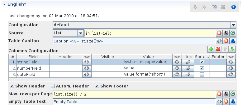
- Configuration
-
Select the Renderer Configuration which is used when the Smart Table is rendered and then displayed on the client browser. See the Smart Table Configuration for more details.
- Source
-
Select the type of the source for your Table. Either
List,RecordsetorRecord. Define in the IvyScript text field the path to your source. - Table Caption
-
Enter a text to display as caption of the table. Use IvyScript macros if needed. example:
<%=ivy.cms.co("/labels/header")%> - Columns Configuration:
-
- Columns (a column configuration is shown as row in the editor)
-
Field: Define the name of the field of your data source to map to the current column. If your data source is a list, then the list elements must contain a field or method with the configured name (e.g.
userNameorgetUserName()). If your data source is a recordset, then the records must have a field with the configured name. The value of the field is mapped to the variablevaluewhich you can use in the IvyScript text field of the Value field.Header: Enter a text to display as header of the column. Use IvyScript macros if needed, e.g.
<%=ivy.cms.co("/labels/header")%>. Note hat this has only an effect if the Show Header check box is selected too.Visible: Enter a IvyScript expression which results in a Boolean value, to configure the visibility of the column. If no condition is set, then the column is visible.
Value: Enter a IvyScript expression to configure what label that should be displayed in the table cell. This IvyScript is executed for every cell in this column (once per row in the table).
Link: Choose the link where the process goes if we click on a cell on this column. It is also possible to define the process attributes where to store the row index, the column index or the column name.
Sortable: Activate this check box if you want your table to be sortable. Clicking on the header of a column triggers then a sorting of the whole table according to the selected column. The variable
valueis used for sorting which is defined in the column Field.Footer: Enter a IvyScript expression to configure what label that should be displayed in the table footer.
<>: Allowed to edit the HTML attributes for the table header, body or footer cells. E.g. choose colors or borders. Note that this specific settings of HTML attributes will override any settings from the configuration.
- Actions
-
Add: Adds a new column configuration to your table definition. The column configuration will be shown as row in the Columns Configuration table.
Remove: Removes the selected Column Configuration(s) from your Columns Configuration table.
Up: Moves the selected Columns Configuration(s) up in the table. This means that the column(s) moves one position to the left in the resulting table.
Down: Moves the selected Columns Configuration(s) down in the table. This means that the column(s) moves one position to the right in the resulting table.
Show Header: Activate this check box if you want your table to have a header row.
Autom. Header: Activate this check box if you want the system to label your headers.
Show Footer: Activate this check box if you want your table to have a footer row.
- Variables
-
in: The process data at the point of time when this CMS element is executed.
index: Table index of the currently selected table entry.
originalIndex: Index of the currently selected entry in the data source (without respect to the visual order, e.g. after a sorting).
value: The value of the currently selected field (as defined in the field column) in the data source element (i.e. record).
it: The currently rendered element of this widget's list data source (only available, if the source is of type List).
list: The list defined as data source (only available, if the source is of type List).
record: The currently selected record (only available, if the source is of type Recordset).
recordset: The recordset defined as data source (only available, if the source is of type Recordset).
- Max. rows per Page
-
Enter a IvyScript expression to configure the maximum number of rows are shown per page.
- Empty Table Text
-
Enter a plain text that will be displayed if the table source is empty.
The JSP editor is used to edit a JSP content object which can be used in the Web Page, End Page, Task Switch or Simple Task Switch process elements.
Inside JSP content objects you can make use of the Environment Variable ivy. It is imported and declared as follows:
    <%@ page import="ch.ivyteam.ivy.page.engine.jsp.IvyJSP"%>
    <jsp:useBean id="ivy" class="ch.ivyteam.ivy.page.engine.jsp.IvyJSP" scope="session"/>
You
can also use the in object (i.e. process data) of the process where
the associated process element is located. You can access the process data by using the
ivy.html.get() method, e.g.:
    <%=ivy.cms.co("myUri")"%>
    <%=ivy.html.get("in.myString")%>
Furthermore you can insert references to content from the web content directory into your JSP content objects, e.g.:
    <jsp:include page="/jspToInclude/include.jsp" />
    <img src="images/myImage.jpg" >
The Layout editor is used to edit a JSP Layout content object which defines the Layout of an HTML dialog page (see Page Editor).
Inside the Layout JSP content objects you can make use of the Environment Variable ivy or you can insert references to content from the web content directory (see JSP Editor).
For the layout creator there are some useful functions on the ivy variable:
| Layout functions | Description |
|---|---|
ivy.style() | Returns the URL to the CSS style, which is set on the current HTML dialog page (see Page Editor). |
ivy.content("coName","coType") | The layout creator can define a placeholder for content, that the page designer should fill in. When a page with this layout is created the specified placeholder is created as a content object with the given name and type under the HTML dialog page whose value is set by the page designer. At execution time the value of the content object is set as a String into the layout. |
ivy.panel("panelName") | This creates a Panel content object with the specified name under the HTML dialog page when a page with this layout is created. |
A very simple JSP Layout example which includes the style of the page, creates a content object named Caption with the type String and a Panel content object with the name Panel1 looks as follows:
<%@ page import="ch.ivyteam.ivy.page.engine.jsp.IvyJSP"%>
<jsp:useBean id="ivy" class="ch.ivyteam.ivy.page.engine.jsp.IvyJSP" scope="session"/>
<!DOCTYPE HTML PUBLIC "-//W3C//DTD HTML 4.01 Transitional//EN"
       "http://www.w3.org/TR/html4/loose.dtd">
<html>
<head>
  <link rel="stylesheet" type="text/css" href="<%=ivy.style()%>"/>
  <title><%=ivy.content("Caption","String")%></title>
</head>
<body>
<jsp:include page='<%=ivy.panel("Panel1")%>' flush="true"/>
</body>
</html>
The link browser can be used to insert a HTML <a href="..."> link tag.
The appearing dialog shows the available link types to choose from. If you select a link
type and then press Ok (or double-click the link type), then another dialog
appears to configure the link.
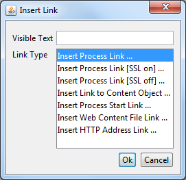
- Visible Text
-
The visible text of the HTML link that will be inserted. Or, in HTML language, the text between the
<a>and the</a>tags. - Link Type
-
The type of link to insert.
| Link Type | Description | HTML href link target |
|---|---|---|
| Process | A link to continue the process with the corresponding sequence flow out of the Web Page element that shows this page. The link target is addressed relatively, i.e. uses the same protocol like the request to the page. See the section for the inscription mask of the web page element for further information about process links. | <%=ivy.html.ref("MyLink.ivp")%> |
| Process (SSL on) | Same as the process link, but addresses the process link absolutely using HTTPS. | <%=ivy.html.ref("MyLink.ivp", true)%> |
| Process (SSL off) | Same as the process link, but addresses the process link absolutely using HTTP. | <%=ivy.html.ref("MyLink.ivp", false)%> |
| Content Object | This is a link to a content object in the CMS. Note that not all content object types may be used but only the ones that represent file-based resources. This holds true especially for file-based content objects such as images or documents. | <%=ivy.html.coref("/uri/to/my/jpeg")%>"> |
| Process Start | A link that starts a new process. Note that the process is started in a new case. | <%=ivy.html.startref("myPID/start.ivp")%> |
| Web Content | For linking to a resource in the web content folder | <%=ivy.html.wr("myResource")%> |
| HTTP Address | Inserts a link to an arbitrary web resource such as a web page or a video on the web. | http://www.example.com |
Table 6.67. Link Types
Content editors that are not described in this chapter are described in the Content Object Value Editor chapter.
Although it is recommended that you store all (or most of) your content in the project's CMS, as an alternative you can place web resources into a folder within the root folder of your project with the name webContent.
These web content files can be referred from CMS pages either by addressing them
relatively (to the web content directory) or by using the method
ivy.html.wr(fileNameRelative). Of course, you can also reference
directly from one web content file to another (e.g. a web content HTML file that
displays a web content image with a img tag.). It is even possible to mix
references between CMS and web content files (e.g. a JSP in the web content includes a
JSP in the CMS which imports a JavaScript file in the web content and so on).
Warning
Web content files can always be referenced relative to the web content folder. But in contrast to content objects in the CMS, resources in the web content folder are only visible in the same project. If the resource is not found then there is no lookup in the required projects.
Tip
To gain access to Axon.ivy functionality please insert the following code to your hand-made JSP page in the web content folder:
    <%@ page import="ch.ivyteam.ivy.page.engine.jsp.IvyJSP"%>
    <jsp:useBean id="ivy" class="ch.ivyteam.ivy.page.engine.jsp.IvyJSP" scope="session"/>
Inside the Form Field Details Editor you may specify client side validation scripts to validate user input before submitting a form. If the validation fails (i.e. some user input is invalid) then the form will not be submitted.
Out of the box, Axon.ivy allows you to select from a number of predefined scripts, e.g. Integer > 0 as shown below:
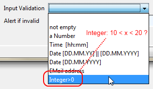
Testing for Integer > 0 may be fine for some cases, but what if you need to test whether an integer value is greater than 10 and smaller than 20? In this case you need to provide your own validation script to test your specific input requirements.
HTML validation scripts are written in JavaScript and are stored in a *.js file. The script file contains a header line and a check function. For example:
<!--ivy.input_validate name_de="Ganzzahl: 10 < x < 20" name_en="Integer: 10 < x < 20"-->
function integerBetween10And20(field,msg,loc)
{
  msg_en=field.name+" must be a Number between 10 and 20";      // default message en
  msg_de=field.name+" muss eine Zahl zwischen 10 und 20 sein";  // default message de

  if(field.value.length==0
     || isNaN(new Number(field.value))
     || !(field.value > 10 && field.value < 20)) // check function
  {
    if(msg!=null && msg.length>0)
      alert(msg);     // alert with custom message, if defined
    else if(loc=="de")
      alert(msg_de);  // alert with default german message
    else
      alert(msg_en);  // alert with default english message
    return false;
  }
  else
  {
    return true;
  }
}
The header of the script file defines the name of the script as it is displayed in the validation combo box of the Form Field Details Editor.
The JavaScript validation function must always define the same 3 parameters:
field is the field that is being validated, msg is the
custom validation alert message that may optionally be defined when selecting a
validation script and loc is the language code that will be provided by
the Axon.ivy runtime system.
The above defined checks if the given input field contains a number between 10 and
20 and if so, true is returned. If the value is not a number or not
between 0 and 20, then an alert message is shown to the user and false
will be returned (which will prevent the sending of the form, as long as the field
value is not correct).
In order for the script to be able to selected from the Form Field Details Editor, it must be located in the webContent/scripts/validation folder of the Axon.ivy project where it will be used:
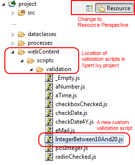
Once you have copied your script to this location, it will become available in the validation selection combo box of the Form Field Detail Editor:
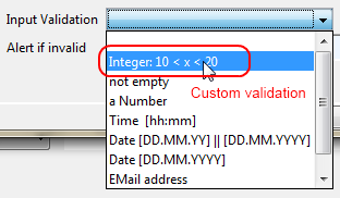
Tip
If you don't like the behavior of any built-in scripts then you may change them as well. Simply edit the associated validation script file.
You may generally edit the available validation scripts at any time. The changes will become effective immediately on save (unless browsers or other internet entities use a previously cached copy of an old script).
Warning
Please note, that JavaScript must be enabled in your client's browsers in order for any validation scripts to work!
Also make sure that the name of your script function and the name of your script file are exactly identical (including capitalization). The script will be referred by name of the file. If it does not match the actual function name, then the script will not be executed, and validation will not take place without any obvious error.