User Dialogs
A User Dialog is one of the two possibilities to interact with the user in a process. The other possibility are simple Web Page. User Dialogs are based on Java Server Faces (JSF) technology.
In Axon.ivy we use Html Dialogs - or HD for short - as the name for a User Dialog Component built with JSF.
User Dialog Concept
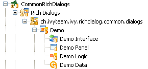
The concept of a User Dialog follows the famous Model-View-Controller pattern. It consist of the following parts:
Data - The internal data of the User Dialog (the model)
View / Panel - The visual representation of the User Dialog (the view)
Logic - The implementation of the functionality (the behavior) of the User Dialog (the controller)
Interface - A description of the capabilities of the User Dialog
The logic (i.e. controller) of User Dialogs is implemented in a process based manner. This means that all the GUI events (which are generated by the user who interacts with the dialog) are handled by means of a corresponding UI process in the logic of the User Dialog component. So the behaviour of the User Dialog is not implemented by writing source code in a programming language (such as Java, Visual Basic or C#) but rather by graphically modeling a process logic in Axon.ivy.
The multi-part structure of a User Dialog becomes also evident when looking at its representation in the Axon.ivy project tree:
Interface
The interface of a User Dialog defines its behavior in an abstract way and independent of its implementation. In other words it defines what a User Dialog is capable to do. In more detail, the interface defines Start Methods and Methods of a User Dialog. The interface can be viewed with the User Dialog Interface Editor.
Logic
The logic of a User Dialog defines how a User Dialog performs its work by means of a process model. For each UI Event (triggered by the actual user, e.g. by clicking on a button) and for each Start Method and Method defined on the interface you may implement a process to handle these events.
The logic of a User Dialog is edited and defined using the Process Editor.
To build the logic of a User Dialog the Process Editor offers a set of process elements that is somewhat different from the standard set. The extra User Dialog drawer of the Process Editor palette contains elements, which can only be used within User Dialog logic:
Icon |
Title |
Short Description |
|---|---|---|
|
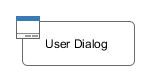
User Dialog |
Opens another User Dialog |
|
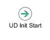
Init Start |
Invoked when the User Dialog is started. This element is executed at most once and initializes the User Dialog and its data. |
|
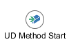
Method start |
Invoked when one of the methods declared in the User Dialog Interface is called. |
|
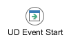
Event Start |
Invoked when a mapped widget event is received from the view of the User Dialog. |
|
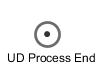
Process End |
Ends a User Dialog UI process. |
|
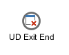
Exit End |
Exits and closes this User Dialog and continues with the calling process (if opened synchronously). |
On the other hand, some elements of the Dialog & Control drawer are missing, because they are forbidden:
Icon |
Title |
Short Explanation |
|---|---|---|
|
Request Start |
The normal Request element is replaced with the User Dialog start element. |
|
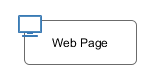
Web Page |
The Page element is HTML-specific and thus not available in the User Dialog logic. |
|
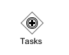
Tasks |
The Tasks element is not available because role change and task data persistence can only happen between User Dialogs. |
|
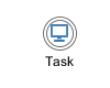
Task |
The Task element is not available because role change and task data persistence can only happen between User Dialogs. |
|
Event Start |
Start Event Beans are currently not supported inside User Dialogs. |
|
Intermediate |
Intermediate Events are currently not supported inside User Dialogs. |
|
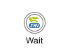
Call & Wait |
Call & Wait are currently not supported inside User Dialogs. |
|
Process End |
The regular Process End element is replaced with the User Dialog End element. |
|
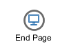
End Page |
The End Page element is HTML-specific and thus not available in the User Dialog logic. |


Warning
When invoking callables from inside a User Dialog you have to bear in mind, that the callable process will be executed within the scope of the User Dialog that executes it, i.e. the same restrictions apply as if the callable was defined right inside the User Dialog’s logic. This ultimately means that you have to ensure that the called (business) process does not contain any of the forbidden elements mentioned above. Otherwise you will experience failures or unpredictable results during execution of the callable process.
Data
The data of a User Dialog define its internal state (if you are familiar with the MVC pattern, you should consider the data as the Model of a User Dialog). The data of a User Dialog has private scope (i.e. is not visible from outside). Access can be granted by defining and implementing methods that return or manipulate internal data. The data of a User Dialog is edited with the Data Class Editor.
User Dialog Interface Editor
The User Dialog Interface editor is used to define the API (Application Programming Interface) of a User Dialog. Since User Dialogs are components which are intended for reuse, they must define a stable interface on which other clients (i.e. processes or User Dialogs) can rely upon. An interface is defined independently from the implementation of the User Dialog and therefore separates the way of how a User Dialog performs its work from the declaration of what it is capable to do.
Accessibility
Axon.ivy Project Tree -> double click on the Interface node below a User Dialog in the tree.
Interface tab
The User Dialog Interface editor consists of the sections for the declaration of Start Methods and Methods. Each section can have multiple entries.
Tip
It is strongly recommended to write a short description for each declared interface part in the Description area of the details pane. This will help clients of the User Dialog to understand the characteristics of the respective part.
Start Methods
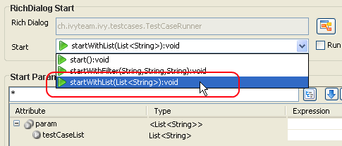
Start methods define different entry points into a User Dialog. A User Dialog can be started with different parameters and return different values, depending on which entry point is chosen at call time.
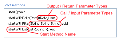
To add/edit a Start method you must add/edit a ‘Init start’ on the according process. You must provide a name as well as input and output parameters.
Tip
If the name/parameter combination (the so called signature) of the Start method as defined so far is identical to the signature of another Start method, then a validation error will be displayed. The warning disappears when either arguments are added or argument types are changed or if the name of the method is altered accordingly, i.e. the signatures are no more identical.
Note
Start methods visible in the User Dialog Interface can be selected inside a User Dialog when the respective User Dialog is chosen to be started.
Methods
In the Methods section of the User Dialog Interface Editor the regular interaction methods of a User Dialog are visualized. The declaration of Methods is absolutely similar to the declaration of Start methods, with the sole difference that a Method can only have a single return parameter (or none). The Methods can only be called from the User Dialog Method Start.
Metadata tab
You can define a textual description, a set of tags (keywords) for each User Dialog. These can be searched by the Ivy search page.
- Description
A description of the User Dialog
- Tags
The tags are a space separated list of keywords used to categorize User Dialogs. We suggest to define a vocabulary of tags within your team/company to always use the same terms.
New User Dialog Wizard
The New User Dialog wizard lets you create a new User Dialog. This can be a Html Dialog or an Offline Dialog.
The wizard creates several resources for the new User Dialog:
- View
The visual component of the User Dialog (different technologies are possible).
- Process
The Process that contains the logic of the User Dialog.
- Data Class
The Data Class that holds the data of the User Dialog.
- Interface
The Interface list the ways of interaction with other User Dialogs or business processes.
Accessibility
File -> New -> Html Dialog
Page 1: Dialog Definitions
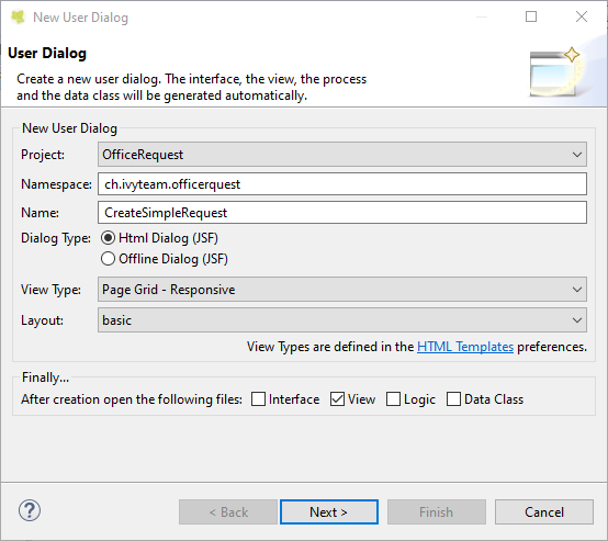
The New User Dialog Wizard Page 1
- Project name
Choose the project that your User Dialog belongs to.
- Namespace
Enter a namespace for your User Dialog. Use namespaces to group your User Dialogs. The grouping hierarchy is separated by the dot character. This is a similar concept as packages in the Java programming language.
- Name
Enter the name of the User Dialog that you want to create.
- Dialog Type
Select the type of the User Dialog that you want to create.
Tip
Since Html Dialog as well as Offline Dialog both base on JSF technology, it’s possible to switch between those two dialog types after creation.
- View Type
A view type defines how the User Dialog will be. It depends on the dialog type. You can choose if a User Dialog should be created with the css grid, so it acts responsive to the display width or not. If you want a reusable Html component, select a Component type.
- Layout
The layout can only be changed if you choose Html Dialog and not Component as view type. All your templates which are located in your webContent/layouts folder are listed here.
Page 2: Dialog Data
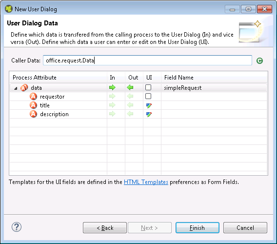
The New User Dialog Wizard Page 2
This page provides the functionality to create necessary configuration of a User Dialog simple and quickly. The starting point is a data class. e.g. the data class of the process that calls the User dialog. Based on this data class the following configuration could be created:
- Start-Method
A start method is created based on the selected In and Out attributes. The necessary parameter mapping will be automatically generated.
- Data Class fields
For each selected In/Out attribute a field will be created in the Data Class of the User Dialog. The name of the created field could be defined in the column ‘Field Name’.
- Form (for Html/Offline Dialogs)
For each selected UI attribute a form field is created in the view. E.g. for a field birthday, of type Date, a label and a datepicker will be generated.
Tip
Create a User Dialog in the context of a User Dialog Process Element: If the New User Dialog Wizard is opened on a User Dialog Process Element, the initial Caller Class will be the class of the calling process and the in/out parameter mapping from the process to the User Dialog and back will be generated automatically.
Tip
Create a User Dialog in the context of a Data Class: If the New User Dialog Wizard is started via the context menu on a Data Class, the initial Caller Class will be the selected Data Class.
Html Dialogs
An Html Dialog (in the following abbreviated as HD) is one of two possibilities to implement a User Dialog Component. HDs are implemented using the Java Server Faces technology.
This means, that the view of an HD is defined with the means of an XHTML document and that it is displayed in a web browser.
PrimeFaces JSF Component Library
Axon.ivy is bundled with the JSF component library PrimeFaces, an open source JSF component library developed by Prime Teknoloji. It provides a collection of mostly visual components (widgets). These can be used by JSF programmers in addition to the small set of basic components that are shipped with the core JSF platform. A very good starting point to learn more about PrimeFaces can be found in the PrimeFaces Showcase. Detailed PrimeFaces widget API documentation can be found in the PrimeFaces VDL doc.
Tip
The Html Dialog Editor supports PrimeFaces during design time. This means that you can profit from code completion support, tag validation, structured properties in the property view and a graphical representation in the preview part for all PrimeFaces widgets.
The elements of the PrimeFaces library are introduced with the <p:>
namespace on your XHTML page. In addition also the
primefaces-extension<pe: widget library is included in the
Axon.ivy installation.
Note
It is also possible to install and use additional JSF libraries. To do so you copy the concerning .jar file into the folder /webapps/ivy/WEB-INF/lib of Axon.ivy Designer and Axon.ivy Engine respectively. Then you have to add a namespace attribute xmlns:xx on your html pages to use the widgets.
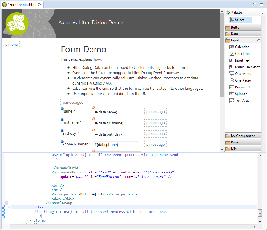
Html Dialog Data Binding and Event Mapping
An Html Dialog follows the model-view-controller pattern of the Axon.ivy User Dialog Concept. So part of an implemented HD is a data class (the model) whose data fields can be bound to widget properties of the view. To define such a binding, Axon.ivy provides the special object data.
On the other hand, the controller part of an Html Dialog is implemented by a series of UI processes that can be mapped to events on the view such as mouse clicks. To define such an event mapping, Axon.ivy provides the keyword logic to call an event process or a method process in the logic.
Look at the following small code sample of a form with a mapped data attribute on an input text field and a button with a bound event process:
<h:body>
  <h3>My JSF Form</h>
  <h:form id="myForm">
      <p:outputLabel value="#{ivy.cms.co('/labels/street')}" for="street" />
      <p:inputText value="#{data.address.street}" id="street" />
      <p:commandButton value="#{ivy.cms.co('/labels/submit')}" actionListener="#{logic.submit}"/>
  </h:form>
</h:body>
Data Class Auto Initialization
Data Classes are automatically initialized if an Html Dialog sets a property on it.
E.g. If data.address is null and a form is submitted with a
value for data.address.street then a data.address object is
automatically created.
See also Public API ch.ivyteam.ivy.scripting.objects.jsf.el.AutoInitializable.
Html Dialog Editor
The Html Dialog editor allows to implement the view of an Html Dialog (i.e. the JSF view). The Html Dialog editor consists of two views, the source view and the graphical view. In the source view you can read and edit the JSF (or xhtml) source in a text-based editor. In the graphical view you can preview and edit the visual representation of the JSF page. Both views are linked to each other and every change is synchronized to the other view. So a change in one view is automatically reflected in the other one, e.g. if I change the text of a h1 HTML element in the source view then the design view is immediately updated and shows the new text. There are options to arrange the two views in horizontal or vertical panes or to show only one of them.
The third element is a palette with drawers for the most important Primefaces and JSF components and widgets that can be used in views. Such components/widgets can be dragged from the various palette drawers and then be dropped onto both the design view or onto the source view As well the rearrangement of already positioned widgets is possible in both views.
Accessibility
Axon.ivy Project Tree -> double click on the View node of a Html Dialog:
Graphical View
The graphical view of the Html Dialog editor allows to compose an Html Dialog view in a graphical mode by selecting a UI element from the palette and positioning it on the view. Similarly, already positioned elements can be dragged to another position on the view, simply by selecting and dragging them with the mouse. In the same way, just select an element and press the delete key to remove an element from the JSF page. As the graphical and the source views are linked together, all these actions are synchronized to the source view.
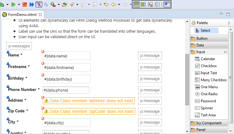
Tip
The graphical view displays the JSF page as realistic as possible. It also shows all the content from the template or from includes. But you cannot select or edit these elements.
Default Actions
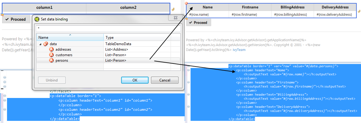
If you double click on one of the most important elements (the ones that you find in the palette) then the default action of this element is triggered. It depends on the element what happens. For example for a Primefaces OutputLabel you can edit the text of the label or choose a CMS content object for it. On the other hand, for the Primefaces DataTable you can select which list from the data class will be used as data source for the table.
Visual Markers
The graphical view displays overlay markers for some elements:
CMS markers are displayed if you use the CMS for displaying text or an image. This helps you to verify very fast whether your JSF page is properly translated/internationalized.
Data binding markers are visible when the value of an input element is bound to a data element with an EL expression. You can use these markers to verify whether all your inputs are bound to data or a backing bean.
You see logic mapping markers if you call a Html Dialog logic element in a button or link. Use these to verify if all your actions are properly mapped to logic elements.
Source View (Code)
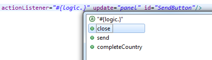
For each element that has been dropped on the view the corresponding code is generated in the source. Alternatively you can use the auto completion support in the source editor. Just enter the first letter(s) of a valid code fragment and a selection list of matching elements pops up.
Content Assist (Ctrl+Space)
In addition to the auto completion support you get further assistance
for writing expressions if you press Ctrl+Space on an expression to
get a pop-up with context aware list of proposed code fragments to
select from.
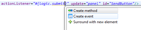
Quick Fix (Ctrl+1)
There are Quick Fixes available to create missing events, methods and
data attributes on the current Html Dialog. Simply press Ctrl+1 on a
logic or data expression respectively.
CMS Quick Assist (Ctrl+1)
There are Quick Assists available to create or use content objects in
the current Html Dialog. Simply press Ctrl+1 on a text attribute or
on text between xml tags.
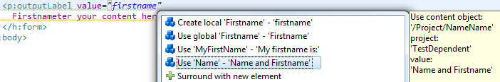
Tip
If a new content object is created with the Quick Assist you can
directly rename the created content object in the Html Dialog Editor.
Just type a new name and confirm with Enter, to abort the
renaming press Esc.
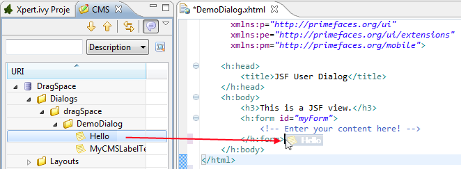
CMS Drag & Drop support
CMS contents can directly be dragged from the CMS View into the Html Dialog Editor. The dropped content will be automatically converted into a valid JSF tag or EL-expression. Currently the content types String and Text as well as all Images-types support drag & drop operations.
Linking to CMS content (F3 or Ctrl)
There is a shortcut to navigate to CMS content. Simply press F3 on a
ivy.cms.co(…) expression to jump to the corresponding object in
the CMS. Alternatively press Ctrl and click on the link.
Linking to Data Class (F3 or Ctrl)
There is a shortcut to navigate to a data class definition. Simply press
F3 on a data.xyz expression to jump to the corresponding Data
Class. Alternatively press Ctrl and click on the link.
Linking to Logic (F3 or Ctrl)
There is a shortcut to navigate to a logic element definition. Simply
press F3 on a logic.xyz expression to jump to the corresponding
logic element. Alternatively press Ctrl and click on the link.
Properties View
Together with the Html Dialog Editor you will want to use the Eclipse properties view to define attributes for the UI elements of your dialog. Simply switch to the Process Development Perspective that will display the properties view at the bottom left area of the workbench window.
Html Dialog Themes
With themes the visual appearance of the application such as the color scheme and the decoration of components can be changed. PrimeFaces comes with a number of predefined themes where you can choose from. Or you can create your own theme using the theme generator tool jQuery ThemeRoller. To learn more about PrimeFaces themes, the web site PrimeFaces Themes is the right starting point:
The theme called modena-ivy is configured as the default. New dialogs will be created with the serenity-ivy theme, if you choose a standard version 8 layout. However, you can easily configure another default theme with the following steps:
The PrimeFaces Community Themes and Serenity Themes are already included in the product. To use a own theme copy your themeXY.jar file into the folder /webapps/ivy/WEB-INF/lib of Designer and Engine respectively
The parameter
primefaces.THEMEcan be set as a head attribute in your template.xhtml file.<h:head> ... <f:attribute name="primefaces.THEME" value="serenity-ivy"/> ... </h:head>
If not defined as head attribute, the theme can be configured by application. See app.yaml
The application configuraiton can also be overridden per session by using
ch.ivyteam.ivy.jsf.primefaces.IvyPrimefacesThemeResolver.setSessionTheme(String theme)
Serenity Themes
If you choose a serenity theme, you have the possibility to choose all default serenity themes or the serentiy-ivy theme. If you do so you have to import an additional layout.css file:
e.g. serenity-lime theme

<h:head>
  <f:attribute name="primefaces.THEME" value="serenity-lime" />
  <h:outputStylesheet name="css/layout-lime.css" library="serenity-layout" />
  ...
</h:head>

or the serentiy-ivy theme

<h:head>
  <f:attribute name="primefaces.THEME" value="serenity-ivy" />
  <h:outputStylesheet name="css/layout-ivy.css" library="serenity-layout" />
  ...
</h:head>
Color Customizing
In our age, customizing is important so that a customer feels at home when he opens a page where the company colors are used. And fortunately for everyone, new technologies makes customizing much easier.
With our serenity-ivy theme, we want to give you a theme that is very neutral, but also allows you to easily change the colors according to your wishes. For this purpose, we provide you css-variables that you can overwrite.
To do so, you have to add a new css file to your resources and import it into your template:
<h:outputStylesheet name="layouts/styles/color-customize.css" />
Within this file you can overwrite some colors. For example, the primary-color:
:root {
   --primary-color-h:195;
   --primary-color-s:100%;
   --primary-color-l:29%;
   --primary-color:hsl(var(--primary-color-h), var(--primary-color-s), var(--primary-color-l));
}
Note
We use hsl colors, and you will notice that some of them are split into the individual values. These are important for some color effects (e.g when you move the mouse over a button).
For all possible variables, have a look at our HtmlDialogDemos. These use an additional file color-customize.css to override colors.
Html Dialog View Types
An Html Dialog is either a page or a component. Both are complete Html Dialogs and have therefore their own view, model (data class) and controller (logic). This concept allows to build up component oriented UI design.
Note
The templates for page and component are configured in the Html Dialog Preferences.
Html Dialog Page
An Html Dialog page represents a full page that is finally displayed in the web browser. Therefore a page can be opened by a User Dialog.
Html Dialog Layouts
An Html Dialog Page uses an Html Dialog Layout. An Html Dialog Layout is the concept of a master page that defines a common layout for a number of similar dialogs. An Html Dialog Page references a layout and implements defined parts of it. For example the layout provides the header- and footer-area whereas the content-area is individually implemented on each dialog.
Axon.ivy brings a set of predefined layouts. The layout (together with the view type) is chosen in the New User Dialog Wizard.
For more information about templating have a look at the official JSF documentation.
Custom Html Dialog Layouts
Axon.ivy is not limited to the usage of the built-in Html Dialog Layouts. Custom layouts can be added with small effort.
In order to add a custom layout - which is a normal .xhtml file - it needs to be stored into the folder web content folder of the project. In doing so, the custom layout can now be referenced as a layout inside an Html Dialog.
To make the custom layout show up in the
New User Dialog Wizard
(for selection of the view type),
it must be stored in the folder webContent/layouts of the project.
The folder structure of webContent/layouts should follow the
following contract:
webContent/layouts/[MyTemplateName].xhtmlwebContent/layouts/[A sub folder]/[for additional template content]
Note
A layout can be anywhere in the webContent folder, but as mentioned
before we recommend to store it in the webContent/layouts folder.
Please don’t store it into the webContent/view folder. This location
is intended for Static JSF Pages, which would mean that you could
call the layout directly.
Html Dialog Component
A component can be embedded into other Html dialog or again in another component.
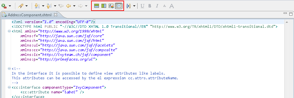
View Definition
The view consists of two parts, an interface and the implementation. The
interface is constituted by a
<cc:interface componentType="IvyComponent"> tag and is followed by
an optional list of component attributes. The implementation part starts
with a <cc:implementation> tag and the component attributes can be
accessed with the expression cc.attrs.attributeName
The following code fragment defines an example Html Dialog component:
<cc:interface componentType="IvyComponent">
    <cc:attribute name="caption" />
</cc:interface>
<cc:implementation>
    <p:fieldset legend="Address Component">
        <h:outputLabel value="#{cc.attrs.caption}" />
        <h:panelGrid columns="2">
            <p:outputLabel value="Street" for="street" />
            <p:outputLabel value="Country" for="country" />
            <p:inputText value="#{data.address.street}" id="street" />
            <p:inputText value="#{data.address.country}" id="country" />
        </h:panelGrid>
    </p:fieldset>
</cc:implementation>
Usage
A component could be inserted with the <ic:-tag. E.g.
<ic:my.namespace.ComponentName ... />.
Tip
In the Html Dialog Editoryou have pretty nice tool support for inserting components. You can drag and drop an available component from the palette. You can select one from the auto completion popup list and you can define required attributes in the properties view.
Start Method
Optionally you can define the start method that should be used to start
the embedded component with the attribute startMethod. If you do not
define the start method, then a default start method will be used.
Parameters of the start method can be defined by adding them as named
attributes. Parameters are mapped by name, i.e. an attribute of the tag
will be mapped to the start method parameter with the same name.
Furthermore you can set the component attributes that you defined in the
interface of the component by simply adding them as attributes of the
tag too.
Note
You can not override start methods. So do not use multiple start methods with the same name but different parameter lists.
See the following code fragment that inserts a Html Dialog component.
The start method start(data.person.BillingAddress:address) will be
used, the current value of the data class property billingAddress
will be used as parameter for the start method and the component
attribute caption will be set to the value “Billing Address”
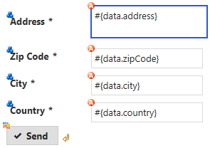
<h:panelGrid columns="2">
    <ic:ch.ivyteam.htmldialog.demo.component.AddressComponent
        startMethod="start" address="#{data.person.billingAddress}"
        caption="Billing Address">
    </ic:ch.ivyteam.htmldialog.demo.component.AddressComponent>
</h:panelGrid>
Html Dialog Preferences
In the Axon.ivy Designer preferences you can configure the templates used for the creation of Html Dialogs and Offline Dialogs.
Note
There are different templates for Html Dialogs and Offline Dialogs. Whereas Html Dialog templates are targeted to make use of the full JSF stack, Offline Dialog templates are designed to work without enduring connection to the Engine and are optimized for use on rather small mobile devices with touch input.
Accessibility
Axon.ivy Designer Menu -> Windows -> Preferences -> Web -> HTML Files -> Editor -> Templates
Html Dialog View Type Templates
View Type Page and View Type Component are the predefined view types for Html Dialogs. Furthermore every template with a name that starts with ‘View Type’ is considered as an Html Dialog View Type and therefore listed in the New User Dialog Wizard.
Offline Dialogs have only one predefined view type called Offline View Type Page. Custom templates for Offline Dialogs have to start with ‘Offline View Type’
Tip
When the template for a View Type contains
<ui:composition template="${layout}">, it will be a template for
an Html Page. Otherwise it will be a template for an Html Component.
Form Field Templates
Every template with a name pattern ‘form field [Type]’ (for Html Dialogs) respectively ‘offline form field [Type]’ (for Offline Dialogs) is considered as a form field template of the specified type. The form field templates are used during the creation of a Html Dialog by the New User Dialog Wizard.
Tip
Each template can be inserted into an Html Dialog view via the auto complete function (CTRL+Space).
Html Dialog with Multiple Views
To implement a user interaction that consists of several pages (for example a wizard), one Html Dialog can have multiple views (.xhtml files). This allows to enclose a complex user interaction in one Html Dialog and to abstract it from the business process.
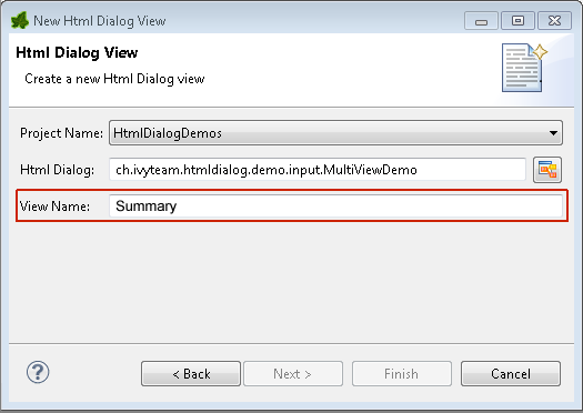
How to add a view
In the New menu in the Axon.ivy project tree you find the New Html Dialog View wizard to add a view to a Html Dialog. Just enter the name of the view and the xhtml file for the view is created and added to the Html Dialog. In the ivy project tree all view files of a Html Dialog are displayed below the main node of that Html Dialog.
How to switch views during runtime
If you have created a Html Dialog with several views you have to
implement the navigation between the views for the user on your own. The
basic solution is a commandButton with an update attribute to
load the next view.
You find an example of a multi view Html Dialog in the HtmlDialogDemos project that is provided with the Axon.ivy Designer.
<h:form id="myForm">
    <p:panel header="Multi View Demo" id="panel">
    <h3>Payment - Credit Card</h3>
    <p:messages id="msgs"/>
    <h:panelGrid columns="2">
        <p:outputLabel value="Credit Card Number"/>
        <p:inputMask required="true" value="#{data.creditCardNumber}"
            id="CreditCardNumber" mask="9999-9999-9999-9999"></p:inputMask>
    </h:panelGrid>
    <p:commandButton value="Next" update="myForm" action="#{logic.nextView('CreditCard')}"/>
    </p:panel>
</h:form>
Converters
Converters are used to convert number or date/time values for string
representation and vice versa. If you want to display a Number or
Date/DateTime process data attribute well formated in an input
widget then use the basic converters provided by the JSF core framework:
convertNumber and convertDateTime.
See this code fragment from an input form:
<p:calendar id="Birthday" value="#{data.birthday}" navigator="true"
        required="true" pattern="dd.MM.yyyy">
    <f:convertDateTime pattern="dd.MM.yyyy" />
</p:calendar>
Custom Faces Converters
Custom Faces Converters can be implemented as a Java class with a
specific FacesConverter annotation and then be used in your Axon.ivy
project.
Example:
@FacesConverter("MyCustomFacesConverter")
public class MyCustomFacesConverter implements Converter
Validators
The JSF core framework provides a number of basic validators that can be used to validate the entered values in an input form.
validateDoubleRangevalidateLengthvalidateLongRangevalidateRegexvalidateRequired
Example code fragment from an input form:
<p:inputText value="#{data.zipCode}" id="ZipCode" required="true">
    <f:convertNumber integerOnly="true" groupingUsed="false"/>
    <f:validateLength minimum="4" maximum="5"/>
</p:inputText>
Client Side Validation
In some cases it makes sense to perform the validation of the entered values before they are sent to the server (e.g. in an Offline Dialogs). For this reason, Primefaces provides a client side validation framework. Client side validation is added as addition to the JSF validators. Thus, it can give instant feedback - even while typing - to the user. Since the JSF validators (see above) remain still active, the data is also validated on server side after the form has passed client side validation and is submitted.
Example code fragment from an input form:
<p:inputText value="#{data.zipCode}" id="ZipCode" required="true">
    <f:convertNumber integerOnly="true" groupingUsed="false"/>
    <f:validateLength minimum="4" maximum="5"/>
    <p:clientValidator event="keyup" />
    <p:clientValidator event="blur" />
</p:inputText>
<p:message for="ZipCode" display="text" showDetail="true" />

<p:commandButton actionListener="#{logic.close}" value="Proceed" validateClient="true" icon="ui-icon-check"  />
Tip
It’s useful to add the client validators to the desired input field and also to trigger client side validation on the submit button. This way you make sure, that client side validation is performed during field modification, but also if the user tries to submit the from without any modification.
In order to provide a good instant feedback, a message element dedicated to the input field might be quite helpful.
Managed Beans
In Html Dialogs it is possible to communicate with normal Java objects by using ManagedBeans. Use the following annotations to define the lifecycle scope of the managed bean:
@ApplicationScoped- the bean instance is created at creation of the application or at the engine startup and destroyed when the application is either deleted or the engine shuts down.@SessionScoped- the bean lives for the whole duration of the session@RequestScoped- an instance of the bean is created for each new request and thrown away after the response has been sent. This is the default scope that will be used when no scope is set specifically.
Note
JSF 2.0 introduced an additional scope @ViewScoped and offers the possibility to define custom scopes. This is basically also supported in Axon.ivy, but it is recommended to use it with care since it might not behave as expected.
In the HtmlDialogDemo Project that is included in the Axon.ivy Designer you find an example.
Bean Validation (JSR 303)
The JSR 303 is a specification that defines a metadata model for bean validation. The fields of the JavaBean classes, that are used for storing the data, are annotated to describe the constraints and their validation. Experienced programmers can use JSR 303 annotations in Axon.ivy projects. The validation information will then be considered by Html Dialogs when the field of the class is bound to a widget. There is no validation information given in the *.xhtml file of the Html Dialog itself. However, the Html Dialog uses the annotations of the fields to validate the user input.
All annotations defined in the package javax.validation.constraints are supported. For the validation messages you can use Ivy macros to get the message content from the Content Management System. For example:
@NotNullmeans that a value is required@Sizerestricts the length of a string or array or the size of a collection or map@Maxrestricts the maximum allowed value@Minrestricts the minimum allowed value@Patternrestricts a string to a given regular expression@Digitsrestricts the maximum number of digits of the integer and faction part@Futurerestricts a date to the dates in the future@Pastrestricts a date to the dates in the past
@SessionScoped
public class Person
{
    @Size(min=3, max=10, message="<%=ivy.cms.co(\"/ch.ivyteam.htmldialog.demo/BeanValidationDemo/between3And10Characters\")%>")
    @NotNull(message="<%=ivy.cms.co(\"/ch.ivyteam.htmldialog.demo/BeanValidationDemo/notnull\")%>")
    private String name;

    @Pattern(regexp="[1-9][0-9]{2}\\.[0-9]{2}\\.[1-8]([0-8][0-9]|9[012])\\.[0-9]{3}", message="<%=ivy.cms.co(\"/ch.ivyteam.htmldialog.demo/BeanValidationDemo/socialSecurityNumber\")%>")
    @NotNull(message="<%=ivy.cms.co(\"/ch.ivyteam.htmldialog.demo/BeanValidationDemo/notnull\")%>")
    private String socialSecurityNumber;
There will always be validation requirements for which these standard annotation will not suffice. For these cases it is possible to create your own annotation. You find an example in the HtmlDialogDemo Project.
public class Person
{
    @LicensePlate(message="<%=ivy.cms.co(\"/ch.ivyteam.htmldialog.demo/BeanValidationDemo/licensePlate\")%>")
    private String vehicleLicense;
// re-use other existing constraints:
@NotNull
@Size(min=4, max=20)
@UpperCase // custom constraint in same package
@StartsWith(prefix="ZG") // custom constraint in same package

//only show the validation message from this annotation and not from it's re-used types:
@ReportAsSingleViolation

@Target( { METHOD, FIELD, ANNOTATION_TYPE })
@Retention(RUNTIME)
@Constraint(validatedBy = {})
@Documented
public @interface LicensePlate {
    String message() default "Field does not contain a valid license plate";
    Class<?>[] groups() default {};
    public abstract Class<? extends Payload>[] payload() default {};
}
Ajax Method Call API
Methods of a Html Dialog can be called with JavaScript through a REST like interface. This Ajax method call API of Axon.ivy can be used to integrate JavaScript libraries like D3, jQuery or your own JavaScript scripts. See the Ajax Method Call Demo in the Html Dialog Demo Project:
<script type="text/javascript">
          // jQuery is used to intercept the click on the Button with id #hello
          $("#hello").click(function(){

                  // The ivyajaxapi.js script provides the logic object,
                  // which contains a function for each method available on the dialogs interface.
                  // If you would like to use the REST API in a more advanced way or without jQuery,
                  // have a look at the generated ivyajaxapi.js script to see how the REST API is used.
                  logic.helloWorld(

                      // The first parameter is a data structure, which represents the list of parameters
                      {"name": "World"},

                      // The second parameter is a function, which is called on a successful response.
                      function(returnData)
                      {
                          // returnData is a JavaScript Object containing one field for each Method return value.
                          // returnData.result accesses the return value named result.
                          $("#result").html(returnData.result);
                      });
          });
  </script>
Error Handling
The exception handling in HTML Dialogs can be customized. Depending on the request type the customization differs.
Error Pages
Error pages inform the user on unexpected errors that occurred during the execution of process activities or HTML dialog interactions.
The default error pages can be examined in the product (see webapps/ivy/ivy-error-page.xhtml).
These pages can be customized to met the look of your workflow application and your
companies identity.
Moreover, you can adjust the displayed information. The ErrorPageMBean is
accessible within error pages to provide context information on the error and its engine state.
Other IVY APIs are not intended to work in case of an error.
Custom errors pages must be registered in the global web.xml.
Tip
Keep in mind that error pages and its configuration do not live within the project. Therefore it is crucial to document or automate their deployment. Otherwise error page configurations might get lost during migrations to newer version of Axon.ivy.
AJAX Errors
If an exception occurs in an ajax-based HTTP request, the configured
Primefaces ajax exception handlers comes into play. The handler must be
defined as part of the *.xhtml file. In the provided standard
layouts, handlers are already configured. See webContent/layouts/includes/exception.xhtml for details.
<p:ajaxExceptionHandler update="ajaxExceptionDialog" onexception="PF('ajaxExceptionDialog').show();"/>
The above ajax exception handler will catch every exception of every
type. If an exception occurs the action in onexception will be
executed. In this example, a Primeface dialog will be shown.
<p:p:dialog id="ajaxExceptionDialog" header="Error" widgetVar="ajaxExceptionDialog" height="400px">
    <p:h:outputText value="Error Id: #{errorPage.exceptionId}"/>
    <p:br/>
    ...
<p:/p:dialog>
The errorPage bean is available within the ajax exception handling.
Properties like exceptionId or message can be used to provide
specific error information to the user.
View Expired Exception
If the view or the session of a user expires then there is a possibility to catch that exception with a specialized ajax exception handler. Instead of catching all exceptions you can specify the type of the exception to catch.
<p:ajaxExceptionHandler
    type="javax.faces.application.ViewExpiredException"
    update="viewExpiredExceptionDialog"
    onexception="PF('viewExpiredExceptionDialog').show();"/>
This handler will only catch exceptions of type
javax.faces.application.ViewExpiredException. The exception handler
with the most specific type of exception will be used.
<p:dialog id="viewExpiredExceptionDialog" header="View or Session Expired" widgetVar="viewExpiredExceptionDialog" height="50px">
    <h:outputText value="The view or session has expired."/>
    <br/>
    <h:outputLink value="#{ivy.html.loginRef()}">Please login again.</h:outputLink>
</p:dialog>