Web Page
This chapter shows how Web Pages and -content are used within Axon.ivy.
Using Web Pages (web content) in a Business Process
As an alternative to User Dialogs, you can display Web Pages or other web resources to the user of an Axon.ivy process application in a browser to let him or her interact with the executed process.
Such content is embedded within a business process by using the Web Page element or by using end pages for various elements in a process (Process End Page, a Task Switch Event element or a Task Switch Gateway element). Whenever the process reaches such an element, then the defined content is presented to the user.
You are free to use HTML-based content (plain HTML, JSP) or other resources (such as images, text files, RTF and many more) as long as they can be displayed in a web browser. In addition, you are free to use resources from the Content Management System or from the web content folder of the project.
Warning
When you re-use resources like JSP pages in different process elements, you need to carefully consider how to integrate the content with the process. When you access members of the data class (e.g. in the JSP) you must ensure that this member is accessible in all processes that use the resource. Furthermore, in Web Page elements you need to ensure that a) there is a way to continue with the process, e.g. an out-link and that b) that way can be used in all usages of the resource.
Warning
Please bear in mind that web pages can only be used if a single HTTP request is available from the client. This means that you cannot use web pages if at least one of the following conditions apply:
The current request was not triggered by HTTP (e.g. started by an Event Bean).
The current task is executed by SYSTEM.
The process is running in a parallel execution section, e.g. after a Split element.
Creating and Editing Web Pages from within the Process
A web page can be created or accessed directly from the process. Open the inscription mask of any page-capable process element. Depending on whether the page is already defined or not, you will be presented with either of the two scenarios described in the sections below.
No page has been specified yet
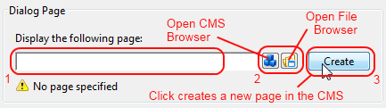
You can define the Web Page that should be displayed by using one of the following three methods:
Enter the path to an existing page by hand. Specify either a CMS path (e.g.
/HtmlPages/myPage) that points to a content object or give a path to a web content file (e.g.commonPages/infoPage.html) instead.Note that content object paths do not have a file extension, but web content paths do. Web content paths are always specified relative to the
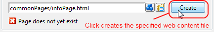
webContentfolder of the current project.If you enter a path to a non-existing web content resource, then pressing the Create button will create an empty file at the specified location in the
webContentfolder and open Eclipse’s default editor on it.If you enter the name of a non-existing content page, then pressing the Create button will have the same effect as described under (3).
Select an existing content object by using the content smart button or an existing web content file by using the file smart button.
You can select any content object and any file, but a “wrong type” error will be displayed if the selected content object is not suitable as a page. Likewise a “invalid web content path” error will be shown, if you select a file outside the project’s web content folder.
Click Create to generate an entirely new page in the content management system.
A dialog will appear that allows you to enter the name and type (normal or JSP) of the new page. The created page will be associated with the current element and it will be placed appropriately inside the CMS ProcessPages/<ProcessName> folder (see below).
A page is already specified
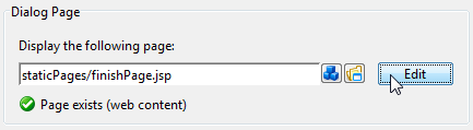
Click on Edit to open the specified page either in the content editor (if it is a content object) or the system’s default editor (if it is a web content file) so that you can edit its contents. You can change the default editor for any file type by opening Window/Preferences and navigating there to /General/Editors/File Associations.
Alternatively you can use the content smart button or the file smart button to select an entirely different page to be displayed.
You can also edit the specified path by hand if you like.
Where Web Pages are stored
The page that is displayed is either stored in the Content Management System or in the web content folder of the project.
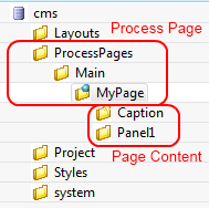
By default, CMS pages are stored in the ProcessPages hierarchy in a
further sub folder named after the containing process (e.g.
ProcessPages/Main/MyPage). Although it is not required to store the
pages within this scheme, it is recommended to keep your pages
separated. All content objects that can be downloaded can be used,
especially the Content Object Types and
JSP types, but also some
Document (e.g. RTF, HTML, PDF or
Plain Text) and other types are working.
Pages in the web content folder can be stored in any hierarchy below the project’s web content folder (it is not allowed to use or reference content that is stored outside the project’s web content folder). You can use any type as long as it is possible to render it in the browser of the user.
Note
Some browsers delegate the displaying of certain file types to third party plugins and/or applications depending on the configuration of the client. Thus this behaviour cannot be controlled by Ivy.
HTML content in the CMS
There are a number of specific content object types that are uniquely used inside HTML Dialog pages. All of them have their own editors, the usage of which is described in the following sections.
Note
Web Pages can be accessed without starting a process. This allows you to create for example a translated start page with some process start links. See also chapter Access CMS Content with a Browser.
Web Page Editor
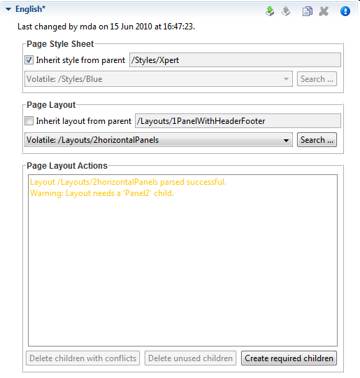
The Page Editor is used to specify the Style Sheet and Layout of a page. They can either be inherited from their parent objects in the CMS hierarchy or can be set explicitly. Use the combo boxes to set one of the style sheets, i.e. page layouts which are contained in the corresponding CMS top level folders. The Search… buttons on the other hand opens a dialog which does show all CSS and Layout content objects in the whole CMS to select one. So the children content objects of the page represent the selected Layout (see Layout Editor). The missing or obsolete parts (i.e. children in the CMS hierarchy) of a page (e.g. after changing layout) may be created or deleted with the corresponding buttons at the bottom of the editor.
HTML Panel Editor
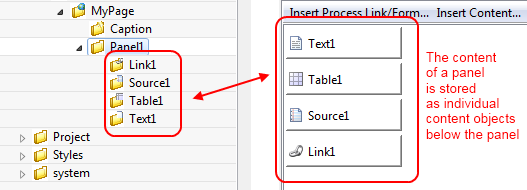
This is the most important editor to edit your HTML content. Each Web Page (see Web Page Editor) has sections that are called Panels and which are defined by the page’s layout. Generally, a page has as many panels as are specified by its associated layout (see Layout Editor).
In the panels of a page, the actual content of the page is defined. Each content part of a panel is stored as an own content object below that panel’s content object inside the content management:
The contents of a panel are arranged in a table from left to right and from top-to bottom in a structured manner. Each table cell contains a single content object or some custom HTML or JSP code.
A panel can be rendered as plain HTML or as a HTML table. If it is
rendered with plain HTML cells are simply rendered one after another.
Rows are separated with a <br> tag. On the other hand, if it is
rendered as a HTML table, each cell will be rendered as a cell of the
table. You can switch the rendering kind using the checkbox As HTML
Table. Switching the rendering influences the available context menu
items of a cell and the buttons Table, Row and Cell.
You can switch between the Edit and the Source View of a panel. The Edit View as explained above shows the table of the panel with its cells. The Source View on the other hand shows the JSP Code that is generated from the Edit View.
Buttons and Check boxes
- As HTML Table
Use this checkbox to switch the rendering kind of the panel from raw HTML to HTML table and vice versa.
- Table
Use this button to open an HTML attribute editor to edit the HTML attributes of the table.
- Row
Use this button to open an HTML attribute editor to edit the HTML attribute of the currently selected row.
- Cell
Use this button to open an HTML attribute editor to edit the HTML attribute of the currently selected cell.
HTML Table Editor
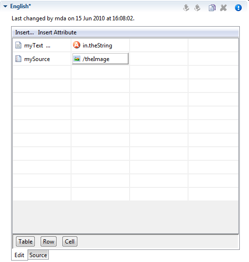
The HTML Table editor can be used to configure a HTML table. In contrary to the Result Table Editor the numbers of rows and columns is defined here statically. And for each cell the content must be chosen specifically although the content itself may be generated dynamically at run-time. Using the menu Insert… it is possible to use Text, Source or CMS elements and using the menu Insert Attribute it is possible to use attributes from the process data in the cell content.
Tip
A Text element can be inserted in a cell by just selecting the cell and starting to type the text. The Text Editor opens automatically then.
With the buttons Table, Row and Cell or the corresponding entries in the popup menu the HTML attributes for the corresponding table part can be manipulated. Furthermore you can add/delete table rows and merge or split table cells to influence the layout of the table. The source tab allows to view and edit the generated HTML code directly.
Typically a table object is not created as an independent content object in the CMS tree, but rather inserted below a Page content object. The cell contents are no first-class CMS elements but are stored within the HTML table content object itself.
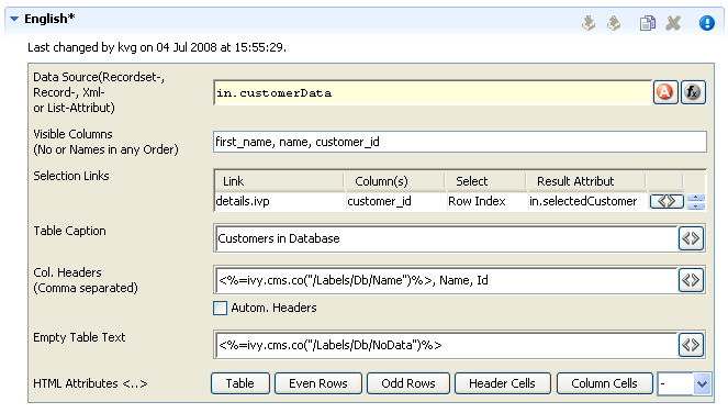
Result Table Editor
The Result Table editor is used to configure the dynamic generation of (HTML) data tables on either DB page or Page process elements. Typically a result table object is not created as an independent content object in the CMS tree, but rather inserted below a Page content object when a table gets inserted onto one of the pages panels (using the HTML Panel Editor).
- Data Source
Specify here the source of the result table’s data. You can select a recordset or a list as data source from the process data attributes.
- Visible Columns
Select the columns that should be rendered by the result table. You can either use the column numbers (1,5,8,2,3) or column names (name, first_name, customer_id) in a comma-separated list to specify subset and order.
- Selection Links
Hers it is possible to select which column entries that should be turned into a link for the one of the page’s output links. The select entry specifies what value that should be assigned to which result value (a process attribute). This is used to identify the selected record on the next process element.
- Table Caption
A caption text for the rendered result table. Macros may be used.
- Column Headers
Specify the names of the columns as they should appear in the header row as a comma-separated list. Macros may be used, the order must be the same as specified in the Visible Columns field.
- Automatic Headers
If selected, then the column headers will be selected from the specification in the database.
- Empty Table Text
The text to display if the source data is empty. May contain macros.
- HTML Attributes
Specify the HTML attribute values for table, even rows, odd rows, header cells and column cells.
For almost all of the above described features, the attributes of the corresponding HTML tags can be edited explicitly by clicking on the HTML tag button.
HTML Link Editor
Link editor is used to render process and static links. Whereas the execution of a process link will lead to the continuation of the process (i.e. activate a specific arc in the process model) and the activation of a static link leads to some other HTML page independent of the process.
Links can be rendered in many different forms, e.g. both the “classical” hyperlink as well as the display of a form with a submit button are considered to be special forms of links.
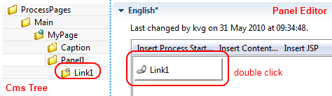
All of those different link types are configured with the HTML Link Editor. The link editor can be opened in two different ways: either by selecting a link content object below a page in the CMS editor tree or by double clicking on a link field in the HTML Panel Editor.
The following options can be configured for all links:
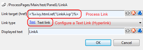
- Link Target (Href)
Specify the target of the link that will be jumped when the link is activated. If this is the configuration of a process link, then a macro that specifies the link that should be executed will already be specified (see example image above). However, any valid HTTP-link is accepted as value for this field, e.g.
http://www.acme.com.- Link Type
Specifies the visual appearance (type) of link that should be configured. Depending on the type that is selected, the configuration fields below this attribute will change.
Depending on the selected Link Type, additional options are available for configuration.
Configuring Text, Button, Image and Timed Auto-Redirect Links
For Text, Button, Image and Timed Auto-Redirect, the Link Editor allows for configuration of rather simple additional options. The smart buttons at the right side of the macro fields can be used to either configure the HTML attributes of the rendered link source or to insert and expand process attributes and content objects.
The following options can be configured for those link types (configuration of a Form Link is described in the next section):
- Displayed Text
Specifies the text that will be shown to the user and presented as link. This option is available for the link types Text, Button and Image + Text.
- Alternate Text
Specifies the alternate text that will be set on the displayed image (is shown by most browsers as tool-tip when the mouse hovers over the image). This option is only available for the link type Image.
- Time to go in Seconds
Specifies number of seconds to wait before the link is activated automatically. This option is only available for the link type Auto-Redirect (timed).
Configuring a Form Link
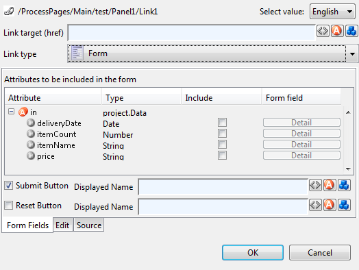
When selecting Form as Link Type the link editor will show a sub-editor that allows you to specify a form and all form fields, that are initialized and/or set from/to process data. Furthermore, you can configure whether a Submit and/or a Reset button should be displayed (including the text of the buttons). At the bottom you even have the choice to change the editor’s view for either designing the tabular layout of the form in a graphical editor or directly editing the HTML code.
At run-time the form defined in the Form Field Editor will be rendered in a HTML page. Clicking the submit button results in the continuation of the process of this element. Therefore, if you disable the submit button you have to ensure that a process link for process continuation is part of the HTML page (e.g. by adding such a link in the HTML view of the editor).
Configuring Form Field Details
If the Details button of a form field is clicked (when configuring a Form Link) a specialized sub-editor is presented to the user. This editor allows to configure in detail how a specific form field is to be rendered in HTML.
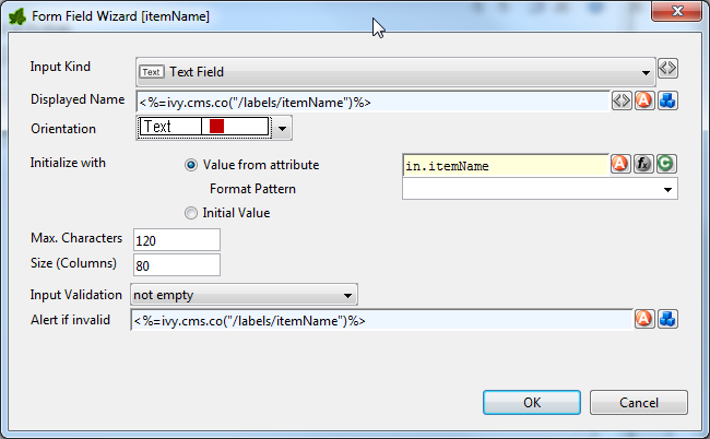
Several types of input kinds for the form fields are available such as text fields, lists or date pickers. For each type, the configuration and therefore the layout of this editor may differ slightly and some parts (irrelevant to the chosen) may be invisible. For most form fields you can define the layout, the default value and the validation.
- Input Kind
All the different input kinds¶ Input Kind
Image
Description
HTML Tag
Text Field

A single line input field for text of all kind.
<input
type="text">
Password Field

The same as the text field but each inserted character is displayed as black bullet.
<input
type="password"
>
Text Area

This is a multi line input field for text of all kind.
<textarea>Check Box

A simple box to selecting zero, one or more of two or more options (ideally for yes/no or true/false information). The data that is associated with the chosen option is saved.
<input
type="checkbox"
>
Radio Button

It is sort of a button for selecting one and only one of two or more options which are mutually exclusive. The data that is associated with the chosen option is saved.
<input
type="radio">
Combo Box

A text field with an attached drop-down list to select from several predefined values.
<select
size="0">
List

A list to choose from several predefined values.
<select
size="*nbOfOpti
ons*">
File Upload

With this input kind, the user can choose a file to upload to the Axon.ivy Engine file area
<input
type="file">
Hidden Field

Hidden fields can be used to transfer additional data invisible for the user (for use in e.g. JavaScript or e-mail transfer of forms)
<input
type="hidden">
Date Picker

To choose a date. Note that the date is displayed according to the language set in the browser of the user (while simulating in the Designer you can set the language in the toolbar). Note too, that if dates are entered in a 2-digit format, then Axon.ivy will interpret numbers within the next 20 years as years in the future. All other numbers are interpreted as years from the past (e.g. in 2010 entering 30 leads to 2030 whereas entering 35 leads to 1935). The Javascripts used for the Date Picker are copied into the webContent folder of the project to scripts/datepicker and scripts/jquery.
Implemented in Java Script
- Displayed Name
Axon.ivy adds a text label to the form field for reference. The text of this label can be set here using process data or CMS entries.
- Orientation
It is possible to choose how the label and the form field are positioned to each other, either side by side or super-imposed.
- Initialize with…
You can use process data, function return values (both value from attribute) or plain text (initial value) to set a default value for the form field. For check boxes it is additionally possible to select whether it is checked or not.
Warning
Make sure that the data types of the default value matches to the chosen form field otherwise an error will be thrown at runtime.
- Maximum Characters
The maximum number of characters which are allowed to enter. The user will not be able to enter more characters.
- Size (Columns)
You can set the width of the form field to layout your forms nicely.
- Options
Here the content of the list based form fields (Combo Box, List, Check Box, Radio Button) can be defined. You can either choose an Ivy Script Recordset or List (select options form attribute) or you can define the content in a table with values and display texts. For recordset based content, the first column is used as values and the second column as display texts (all other columns are omitted). For list based content all the list entries are used as value and as display names.
- Values per Row
For check boxes and radio buttons it is possible to define how many options are rendered in the same line (or row)
- Rows
Only used for the list form field. It represents the number of visible rows in the list. If more items than rows are defined, the list will have scroll bars.
- Mime Type
Is only used for the file upload form field. The mime type corresponding to the type of file which can be uploaded.
- Input Validation
By selecting an input validation script you may validate the values that an user enters in a specific field on the client, e.g. before the form is submitted. If the user tries to submit a form but input validation fails on some of the form fields, then a message will be displayed to the user and the form will not be sent.
Axon.ivy offers you a number of built in validation functions that can be selected from the Input Validation combo box. The scripts that are available depend on the input kind of the currently edited form field (e.g. different scripts are available for checkbox and text input fields).
If the built-in scripts do not satisfy your needs, you may provide your own validation scripts written in JavaScript. Read the section How to provide own HTML Validation Scripts to learn more about this topic.
Warning
Please note, that JavaScript must be enabled in your client’s browsers in order for the validation scripts to work!
- Alert message if invalid
For any selected Input Validation a predefined warning message exists. If you don’t like the default message, you may specify a custom message that will be displayed if the entered value is invalid.
You may use the content smart button to select and insert a textual content object that should be displayed as message or as part of your message. This allows you to specify messages in multiple languages.
If you leave the field empty, the default message of the selected validation script will be displayed.
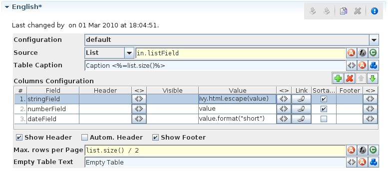
Smart Table Content Editor
On the Smart Table Content editor you configure what content to show in the smart table. You can configure the data source for the table. Furthermore, you can influence the visual look and feel and set options such as header, body or footer label texts, for each entry in the table.
Smart Table Content Editor
Accessibility
Content Management -> Smart Table Content Object
Features
- Configuration
Select the Renderer Configuration which is used when the Smart Table is rendered and then displayed on the client browser. See the Smart Table Configuration Editor for more details.
- Source
Select the type of the source for your table. Either
List,RecordsetorRecord. Define in the IvyScript text field the path to your source.- Table Caption
Enter a text to display as caption of the table. Use IvyScript macros if needed. example:
<%=ivy.cms.co("/labels/header")%>- Columns Configuration:
- Columns (a column configuration is shown as row in the editor)
Field: Define the name of the field of your data source to map to the current column. If your data source is a list, then the list elements must contain a field or method with the configured name (e.g.userNameorgetUserName()). If your data source is a recordset, then the records must have a field with the configured name. The value of the field is mapped to the variablevaluewhich you can use in the IvyScript text field of theValuefield.Header: Enter a text to display as header of the column. Use IvyScript macros if needed, e.g.<%=ivy.cms.co("/labels/header")%>. Note hat this has only an effect if theShow Headercheck box is selected too.Visible: Enter a IvyScript expression which results in a Boolean value, to configure the visibility of the column. If no condition is set, then the column is visible.Value: Enter a IvyScript expression to configure what label that should be displayed in the table cell. This IvyScript is executed for every cell in this column (once per row in the table).Link: Choose the link where the process goes if we click on a cell on this column. It is also possible to define the process attributes where to store the row index, the column index or the column name.Sortable: Activate this check box if you want your table to be sortable. Clicking on the header of a column triggers then a sorting of the whole table according to the selected column. The variablevalueis used for sorting which is defined in the columnField.Footer: Enter a IvyScript expression to configure what label that should be displayed in the table footer.<>: Allowed to edit the HTML attributes for the table header, body or footer cells. E.g. choose colors or borders. Note that this specific settings of HTML attributes will override any settings from the configuration.- Actions
Add: Adds a new column configuration to your table definition. The column configuration will be shown as row in the Columns Configuration table.Remove: Removes the selected Column Configuration(s) from your Columns Configuration table.Up: Moves the selected Columns Configuration(s) up in the table. This means that the column(s) moves one position to the left in the resulting table.Down: Moves the selected Columns Configuration(s) down in the table. This means that the column(s) moves one position to the right in the resulting table.Show Header: Activate this check box if you want your table to have a header row.Autom. Header: Activate this check box if you want the system to label your headers.Show Footer: Activate this check box if you want your table to have a footer row.- Variables
in: The process data at the point of time when this CMS element is executed.index: Table index of the currently selected table entry.originalIndex: Index of the currently selected entry in the data source (without respect to the visual order, e.g. after a sorting).value: The value of the currently selected field (as defined in the field column) in the data source element (i.e. record).it: The currently rendered element of this widget’s list data source (only available, if the source is of type List).list: The list defined as data source (only available, if the source is of type List).record: The currently selected record (only available, if the source is of type Recordset).recordset: The recordset defined as data source (only available, if the source is of type Recordset).
- Max. rows per Page
Enter a IvyScript expression to configure the maximum number of rows are shown per page.
- Empty Table Text
Enter a plain text that will be displayed if the table source is empty.
JSP Editor
The JSP editor is used to edit a JSP content object which can be used in the Web Page, Process End Page, Task Switch Event or Task Switch Gateway process elements.
Inside JSP content objects you can make use of the Environment Variable ivy. It is imported and declared as follows:
<%@ page import="ch.ivyteam.ivy.page.engine.jsp.IvyJSP"%>
<jsp:useBean id="ivy" class="ch.ivyteam.ivy.page.engine.jsp.IvyJSP" scope="session"/>
You can also use the in object (i.e. process data) of the process
where the associated process element is located. You can access the
process data by using the ivy.html.get() method, e.g.:
<%=ivy.cms.co("myUri")"%>
<%=ivy.html.get("in.myString")%>
Furthermore you can insert references to content from the web content directory into your JSP content objects, e.g.:
<jsp:include page="/jspToInclude/include.jsp" />
<img src="images/myImage.jpg" >
Layout Editor
The Layout editor is used to edit a JSP Layout content object which defines the Layout of an HTML dialog page (see Web Page Editor).
Inside the Layout JSP content objects you can make use of the Environment Variable ivy or you can insert references to content from the web content directory (see JSP Editor).
For the layout creator there are some useful functions on the ivy variable:
Layout functions |
Description |
|---|---|
|
Returns the URL to the CSS style, which is set on the current HTML Editor). |
|
The layout creator can define a placeholder for content, that the page designer should fill in. When a page with this layout is created the specified placeholder is created as a content object with the given name and type under the HTML dialog page whose value is set by the page designer. At execution time the value of the content object is set as a String into the layout. |
|
This creates a Panel content object with the specified name under the HTML dialog page when a page with this layout is created. |
A very simple JSP Layout example which includes the style of the page, creates a content object named Caption with the type String and a Panel content object with the name Panel1 looks as follows:
1 2 3 4 5 6 7 8 9 10 11 12 | <%@ page import="ch.ivyteam.ivy.page.engine.jsp.IvyJSP"%>
<jsp:useBean id="ivy" class="ch.ivyteam.ivy.page.engine.jsp.IvyJSP" scope="session"/>
<!DOCTYPE HTML PUBLIC "-//W3C//DTD HTML 4.01 Transitional//EN" "http://www.w3.org/TR/html4/loose.dtd">
<html>
<head>
<link rel="stylesheet" type="text/css" href="<%=ivy.style()%>"/>
<title><%=ivy.content("Caption","String")%></title>
</head>
<body>
<jsp:include page='<%=ivy.panel("Panel1")%>' flush="true"/>
</body>
</html>
|
Link Browser
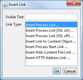
The link browser can be used to insert a HTML <a href="..."> link
tag. The appearing dialog shows the available link types to choose from.
If you select a link type and then press Ok (or double-click the
link type), then another dialog appears to configure the link.
- Visible Text
The visible text of the HTML link that will be inserted. Or, in HTML language, the text between the
<a>and the</a>tags.- Link Type
The type of link to insert.
Link Type |
Description |
HTML href link target |
|---|---|---|
Process |
A link to continue the process with the corresponding sequence flow out of the Web Page element that shows this page. The link target is addressed relatively, i.e. uses the same protocol like the request to the page. See the section for the inscription mask of the web page element for further information about process links. |
|
Process (SSL on) |
Same as the process link, but addresses the process link absolutely using HTTPS. |
|
Process (SSL off) |
Same as the process link, but addresses the process link absolutely using HTTP. |
|
Content Object |
This is a link to a content object in the CMS. Note that not all content object types may be used but only the ones that represent file-based resources. This holds true especially for file-based content objects such as images or documents. |
|
Process Start |
A link that starts a new process. Note that the process is started in a new case. |
|
Web Content |
For linking to a resource in the web content folder. |
|
HTTP Address |
Inserts a link to an arbitrary web resource such as a web page or a video on the web. |
|
Other content editors
Content editors that are not described in this chapter are described in the Content Object Value Editors chapter.
HTML content in the Web Content Folder
Although it is recommended that you store all (or most of) your content
in the project’s Content Management System, as an alternative you can place web
resources into a folder within the root folder of your project with the
name webContent.
These web content files can be referred from CMS pages either by
addressing them relatively (to the web content directory) or by using
the method ivy.html.wr(fileNameRelative). Of course, you can also
reference directly from one web content file to another (e.g. a web
content HTML file that displays a web content image with a img
tag.). It is even possible to mix references between CMS and web content
files (e.g. a JSP in the web content includes a JSP in the CMS which
imports a JavaScript file in the web content and so on).
Warning
Web content files can always be referenced relative to the web content folder. But in contrast to content objects in the CMS, resources in the web content folder are only visible in the same project. If the resource is not found then there is no lookup in the required projects.
Tip
To gain access to Axon.ivy functionality please insert the following code to your hand-made JSP page in the web content folder:
<%@ page import="ch.ivyteam.ivy.page.engine.jsp.IvyJSP"%>
<jsp:useBean id="ivy" class="ch.ivyteam.ivy.page.engine.jsp.IvyJSP" scope="session"/>
HTML Best Practice
How to provide own HTML Validation Scripts
Inside the Form Field Details Editor you may specify client side validation scripts to validate user input before submitting a form. If the validation fails (i.e. some user input is invalid) then the form will not be submitted.
Out of the box, Axon.ivy allows you to select from a number of predefined scripts, e.g. Integer > 0 as shown below:
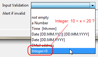
Testing for Integer > 0 may be fine for some cases, but what if you need to test whether an integer value is greater than 10 and smaller than 20? In this case you need to provide your own validation script to test your specific input requirements.
HTML validation scripts are written in JavaScript and are stored in a *.js file. The script file contains a header line and a check function. For example:
1 2 3 4 5 6 7 8 9 10 11 12 13 14 15 16 17 18 19 20 21 22 23 | <!--ivy.input_validate name_de="Ganzzahl: 10 < x < 20" name_en="Integer: 10 < x < 20"-->
function integerBetween10And20(field,msg,loc)
{
msg_en=field.name+" must be a Number between 10 and 20"; // default message en
msg_de=field.name+" muss eine Zahl zwischen 10 und 20 sein"; // default message de
if(field.value.length==0
|| isNaN(new Number(field.value))
|| !(field.value > 10 && field.value < 20)) // check function
{
if(msg!=null && msg.length>0)
alert(msg); // alert with custom message, if defined
else if(loc=="de")
alert(msg_de); // alert with default german message
else
alert(msg_en); // alert with default english message
return false;
}
else
{
return true;
}
}
|
The header of the script file defines the name of the script as it is displayed in the validation combo box of the Form Field Details Editor.
The JavaScript validation function must always define the same 3
parameters: field is the field that is being validated, msg is
the custom validation alert message that may optionally be defined when
selecting a validation script and loc is the language code that will
be provided by the Axon.ivy runtime system.
The above defined checks if the given input field contains a number
between 10 and 20 and if so, true is returned. If the value is not a
number or not between 0 and 20, then an alert message is shown to the
user and false will be returned (which will prevent the sending of
the form, as long as the field value is not correct).
In order for the script to be able to selected from the Form Field
Details Editor, it must be located in the
webContent/scripts/validation folder of the Axon.ivy project where
it will be used:
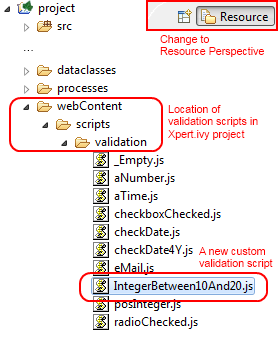
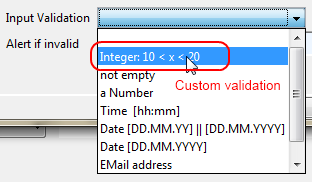
Once you have copied your script to this location, it will become available in the validation selection combo box of the Form Field Detail Editor:
Tip
If you don’t like the behavior of any built-in scripts then you may change them as well. Simply edit the associated validation script file.
You may generally edit the available validation scripts at any time. The changes will become effective immediately on save (unless browsers or other internet entities use a previously cached copy of an old script).
Warning
Please note, that JavaScript must be enabled in your client’s browsers in order for any validation scripts to work!
Also make sure that the name of your script function and the name of your script file are exactly identical (including capitalization). The script will be referred by name of the file. If it does not match the actual function name, then the script will not be executed, and validation will not take place without any obvious error.